Whimsical. A creative studio notebook that thinks it's a technical whiteboard.
- Productivity
- Light theme
- 14 colors
- 2 typefaces
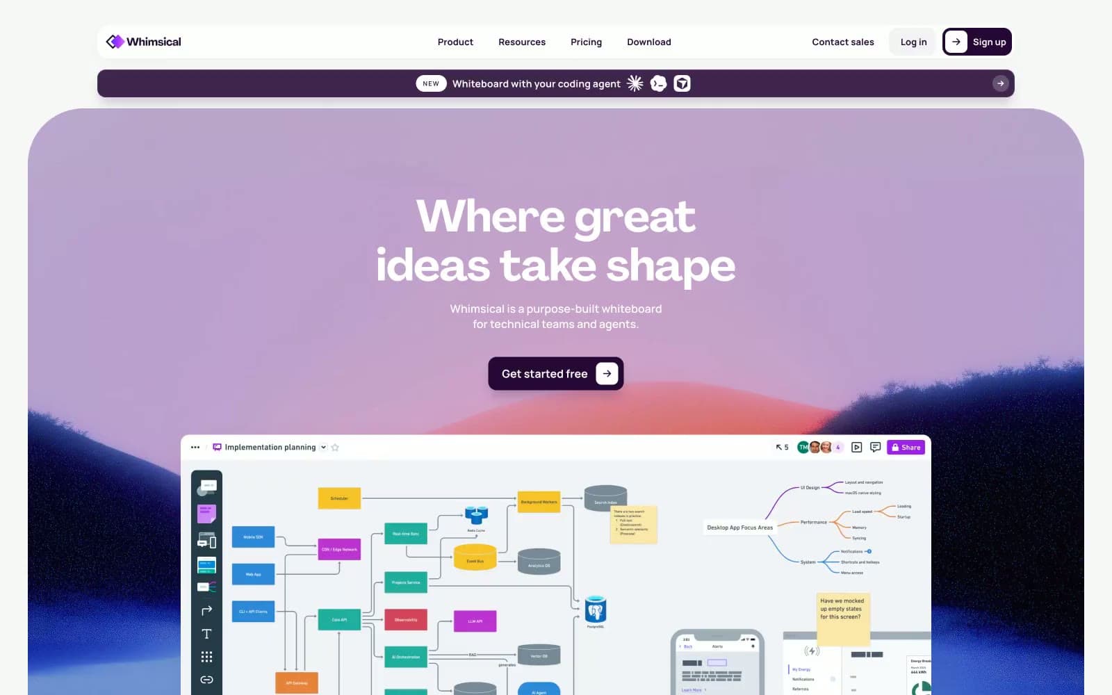
Whimsical operates as a dark-plum-on-cream workspace: a near-black purple (#250835) does the heavy structural work — nav borders, body text, primary buttons — while Agrandir display headlines at 48-96px float above the surface with generous negative tracking. The palette is deliberately narrow: two purples, one warm-gray-purple for muted copy, and vivid violet/blue accents that read as functional punctuation on links and icons rather than decorative noise. Sections break the monochrome discipline with full-bleed gradient washes (blue→violet→pink, purple→pink) that preview the product canvas. Cards live at 8-16px radius with plum-tinted shadows at very low opacity, and the white canvas carries a barely-there lavender undertone (#ebe6ee, #f5f4f5) rather than pure neutral gray — everything sits in the same purple family.
Whimsical design system

Brand4
Primary action fill, nav borders, headline text, card borders — the structural workhorse. High-contrast against white (18:1) lets it function as both color and text simultaneously
Secondary text and outlined action borders, muted plum that steps back from Deep Plum without leaving the family
Decorative gradient wash — purple-to-pink spectrum used in hero backgrounds and marketing sections
Full-bleed section gradient — blue→violet→pink sweep used on logo band and feature section dividers
Accent5
Accent link color, icon stroke — the brightest chromatic in the UI, used sparingly to mark interactive text and product iconography
Secondary accent on icons and flowchart elements — pairs with Vivid Violet to give the product canvas its dual-accent personality
Tertiary accent on icons, occasionally used in flowchart node color alongside Vivid Blue
Decorative card and heading highlight wash — the lightest purple tint, used as background accent on badges and inline highlights
Hero gradient warm stop, decorative card surface — the pinker end of the lavender family used in gradient transitions and product showcase backgrounds
Neutrals5
Muted body text, list dividers, secondary borders — stays in the plum family at lower chroma to avoid breaking the monochrome discipline
Box-shadow base tone — shadows are plum-tinted (rgba(37,8,53,…)) so elevation reads as on-brand even at low opacity
Cool decorative surface — the blue-tinted neutral used in card backgrounds and gradient cool stops to balance the purple warmth
Default border and divider color, low-contrast page texture — the neutral that replaces what most sites would do in #e5e5e5
Card surface slightly off-white to lift cards off the canvas without going full gray
Try a pairing
Pick any two colors from the palette to check whether text stays readable on top.
Aa
Soft White on Deep Plum
16.43 : 1 contrast
- Body textPasses AA 4.5
- Large textPasses AA 3
- StrictPasses AAA 7