Viewport. Mint sticky-notes on a glass desk.
- Productivity
- Light theme
- 11 colors
- 7 typefaces
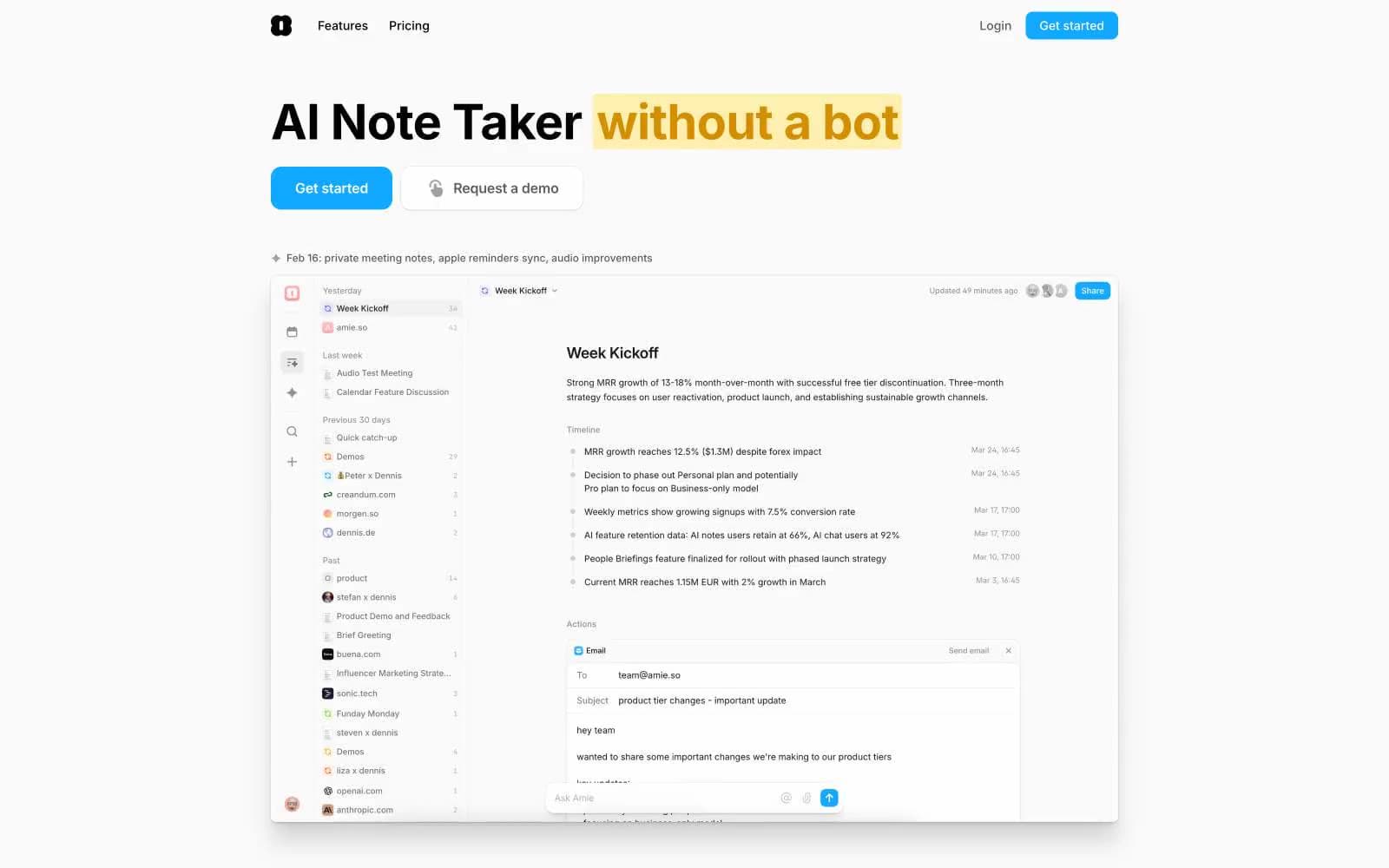
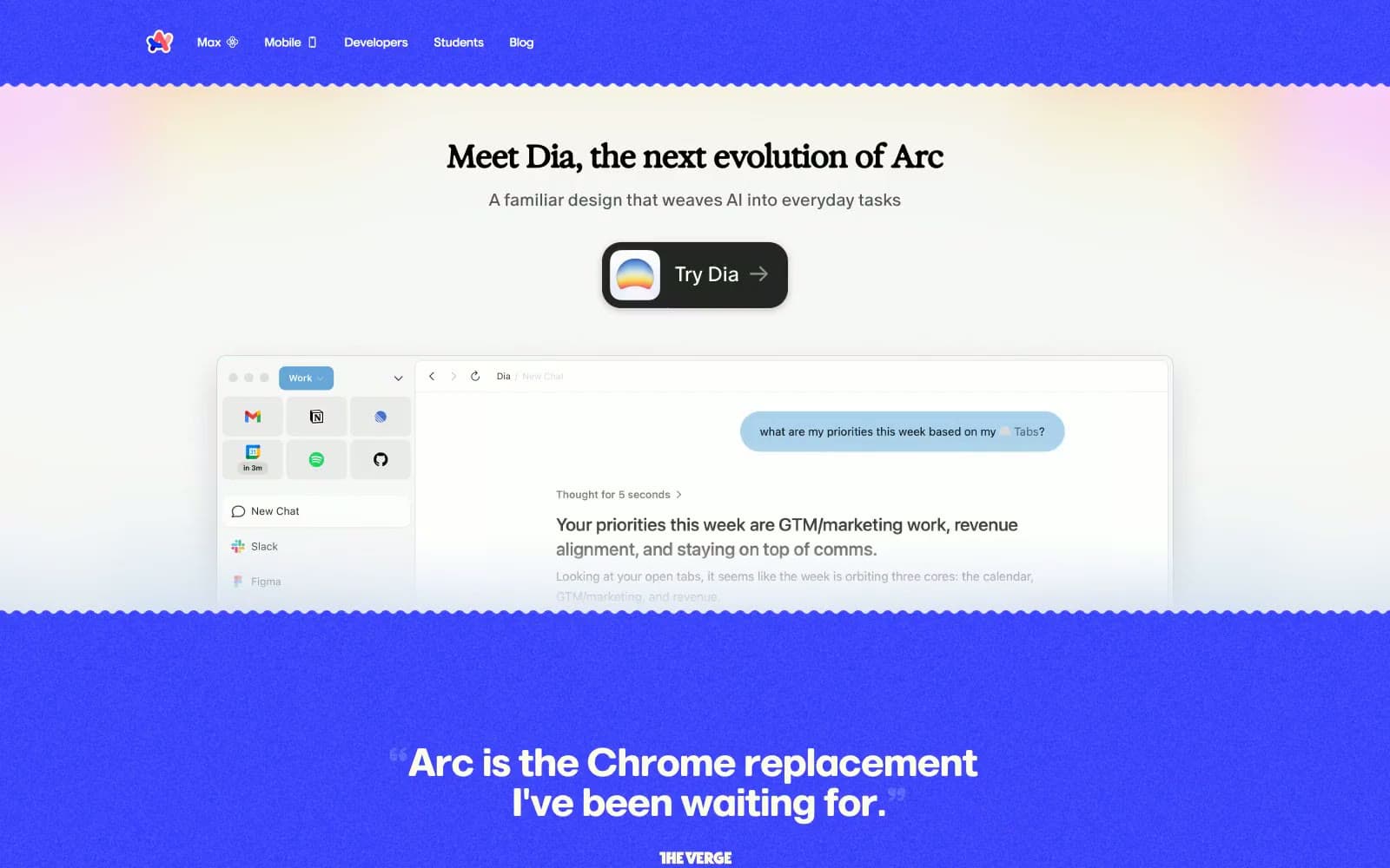
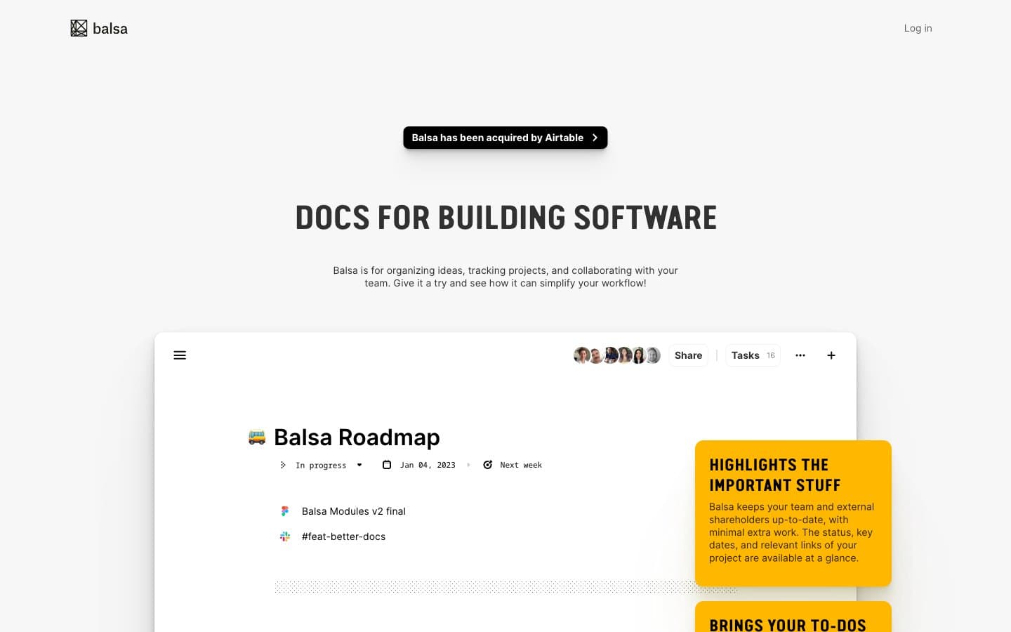
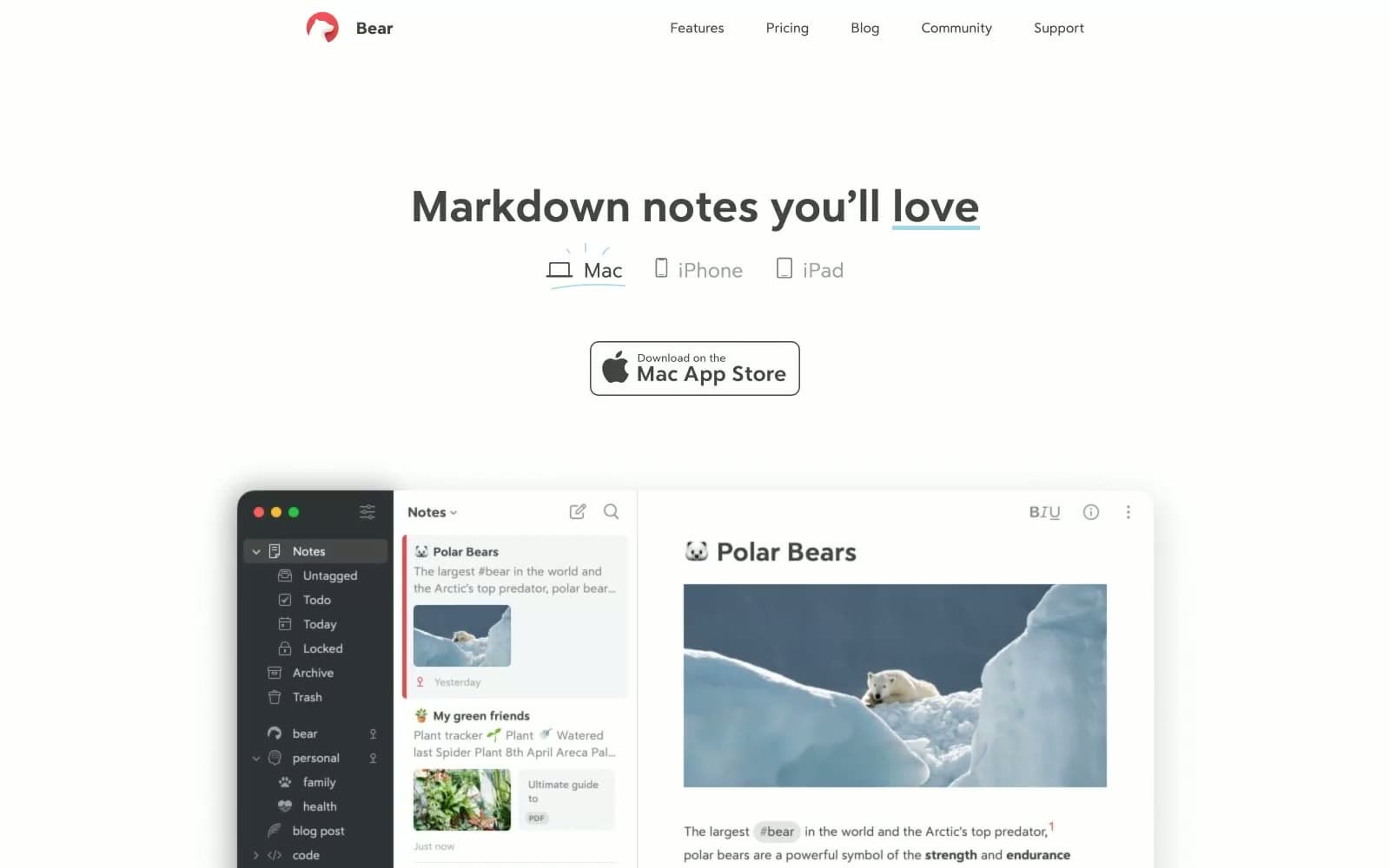
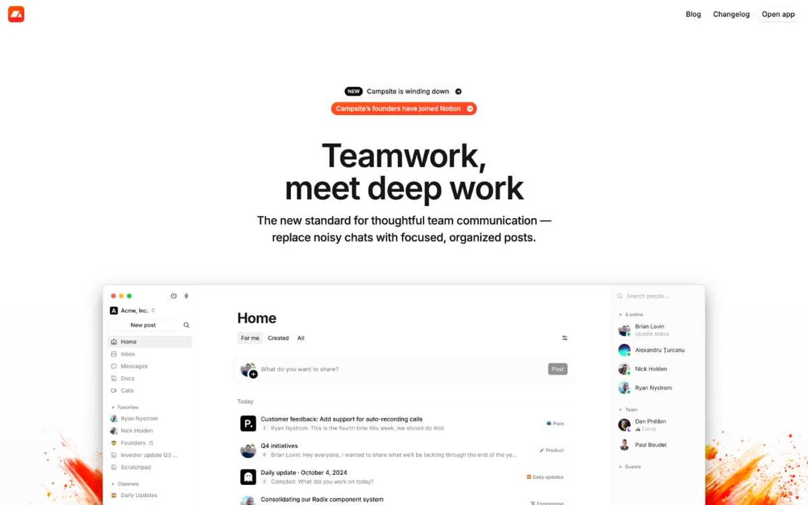
Viewport uses a bright, airy workspace language: pure white canvas, generous breathing room, and a signature mint-teal surface that softens sections without darkening them. The entire chromatic story is a tight two-color duo — vivid indigo for actions and mint-teal for surfaces — connected by a cyan-to-violet gradient that lives only on the primary CTA. Typography is calm and geometric: HK Sentiments Bold for headlines at a whisper-heavy 700 weight, Silka for everything functional at 14–18px, tracking pulled tight across the scale. Components feel like smooth tiles: large 16px radii on cards, 12px on buttons, 100px pills for tags, and shadows that are either barely-there gray or a branded cyan glow — never neutral mid-tones. Layouts center a single headline per section, then let wide product screenshots do the work, often floating over the mint surface like sticky notes on a glass desk.
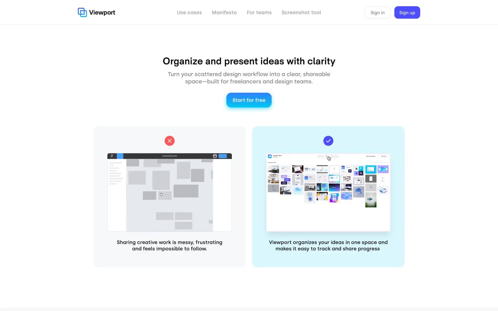
Viewport design system

Brand2
Primary action buttons, active nav states, accent borders, heading highlights — the sole chromatic brand color, making every interactive element unmistakable; Primary CTA button fill — the only gradient in the system, flowing from cyan to indigo vertically
Signature section surface — replaces gray for feature panels, product wrappers, and comparison cards; a soft teal that reads as a colored canvas rather than a colored card; Radial hero wash — cyan blooming into neutral gray for ambient atmosphere on showcase sections
Accent2
Gradient origin point and link glow shadow; appears only inside the cyan→indigo button gradient and the radial brand wash
Soft cyan used as a link-focus glow ring; bridges Mint Whisper and the gradient endpoints
Neutrals7
Primary text, icons, hairline borders, and image outlines — used at high frequency for structural edges rather than fills
Deep accent for headings and section frames where pure black would feel too sharp
Body helper text, link base color, icon fills, and secondary metadata — the de facto mid-neutral for prose
Muted borders and dividers; structural edges that need to be visible but never assertive
Tertiary card surface for grouped content blocks and inner panels
Secondary card and section surface — the next step up from pure white before reaching Mint Whisper
Page canvas, card surfaces, button text on indigo fills
Try a pairing
Pick any two colors from the palette to check whether text stays readable on top.
Aa
Ink Black on Cyan Pulse
10.73 : 1 contrast
- Body textPasses AA 4.5
- Large textPasses AA 3
- StrictPasses AAA 7