
Tracky. Doodled planner on warm paper.
- Productivity
- Light theme
- 10 colors
- 2 typefaces
Tracky reads like a creative's bullet journal that became a product: a warm light canvas (#f2f2f2) carries a near-black navy (#151b31) workhorse for text, borders, and primary actions, while coral red (#ff5858) and mint green (#86e0c1) appear as small functional punctuation for emphasis and live states. GRIFTER supplies the brand's voice at display scale — chunky, hand-printed, slightly loosened tracking — while Inter handles all UI and body work at compact, tightly-tracked sizes. Components sit on soft 8px and 16px radii with whisper-light shadows, generous section breathing, and hand-drawn illustration accents (doodles, organic blobs, bunny mascot) that make project management feel like doodling in a notebook rather than filing a ticket.
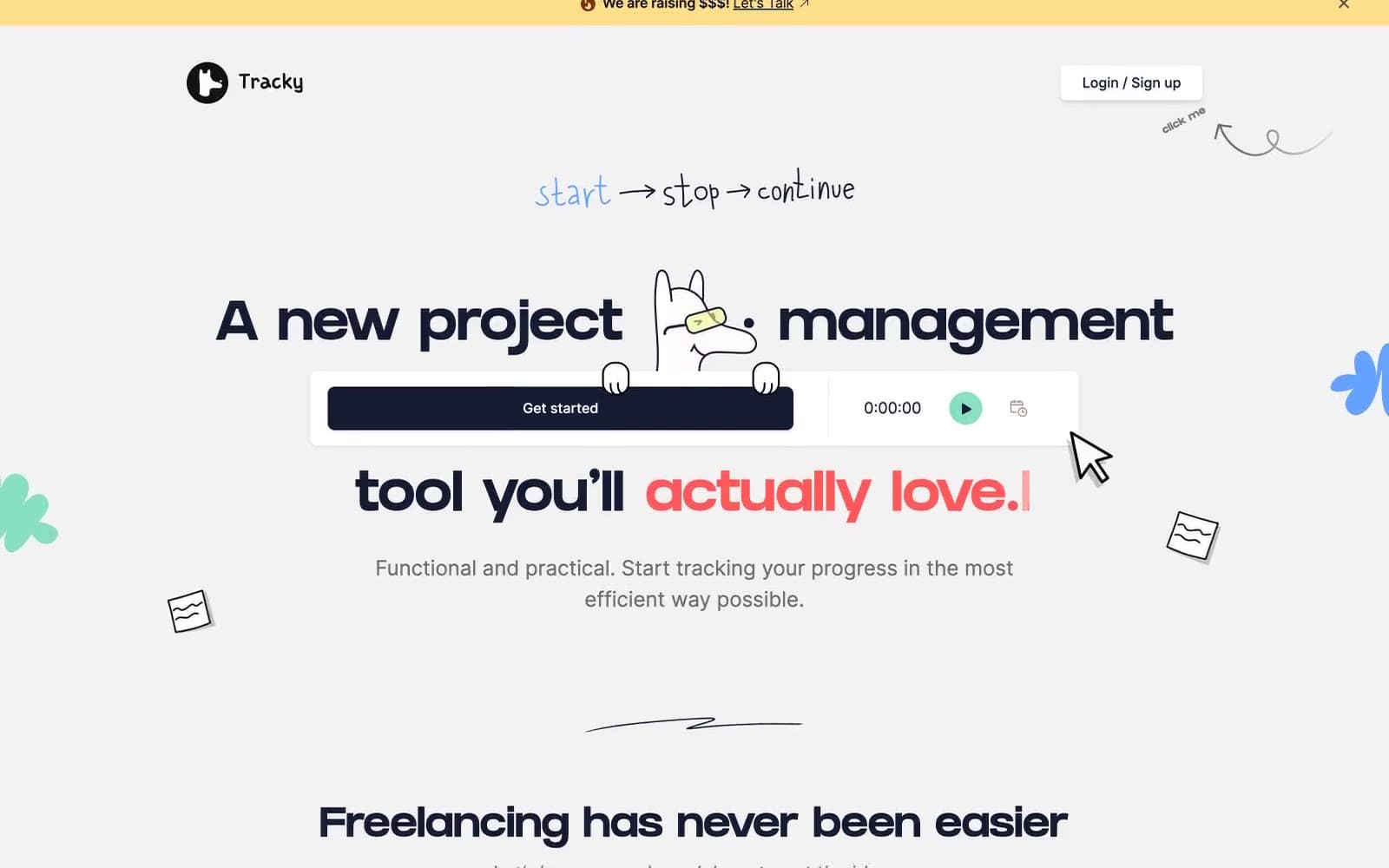
Tracky design system

Brand1
Primary buttons, dominant text and borders, dark feature card backgrounds — the workhorse near-black that reads as softer and warmer than pure #000
Accent2
Accent text for key words in headlines, emphasis highlights, and selective links — warm red against navy creates playful energy without corporate aggression
Top announcement banner, highlight washes — warm pastel yellow for friendly alerts that don't shout
Neutrals6
Maximum-emphasis icons, strongest borders, logo mark — used sparingly where absolute contrast is required
Secondary text, hairline borders, icon strokes — sits between navy and pure black for less-load-bearing elements
Muted helper text, subdued borders, caption-level content — the cool gray for de-emphasized UI
Card drop-shadow tint — warm desaturated beige replaces cold black shadows for a paper-like depth
Page background — warm light gray that lifts white cards without the coldness of pure white
Card surfaces, button labels, overlapping panels — the surface layer above the Ash Canvas
semantic1
Green state accent for badges, validation surfaces, and short status labels.
Try a pairing
Pick any two colors from the palette to check whether text stays readable on top.
Aa
Paper White on Inkwell Navy
17.03 : 1 contrast
- Body textPasses AA 4.5
- Large textPasses AA 3
- StrictPasses AAA 7























