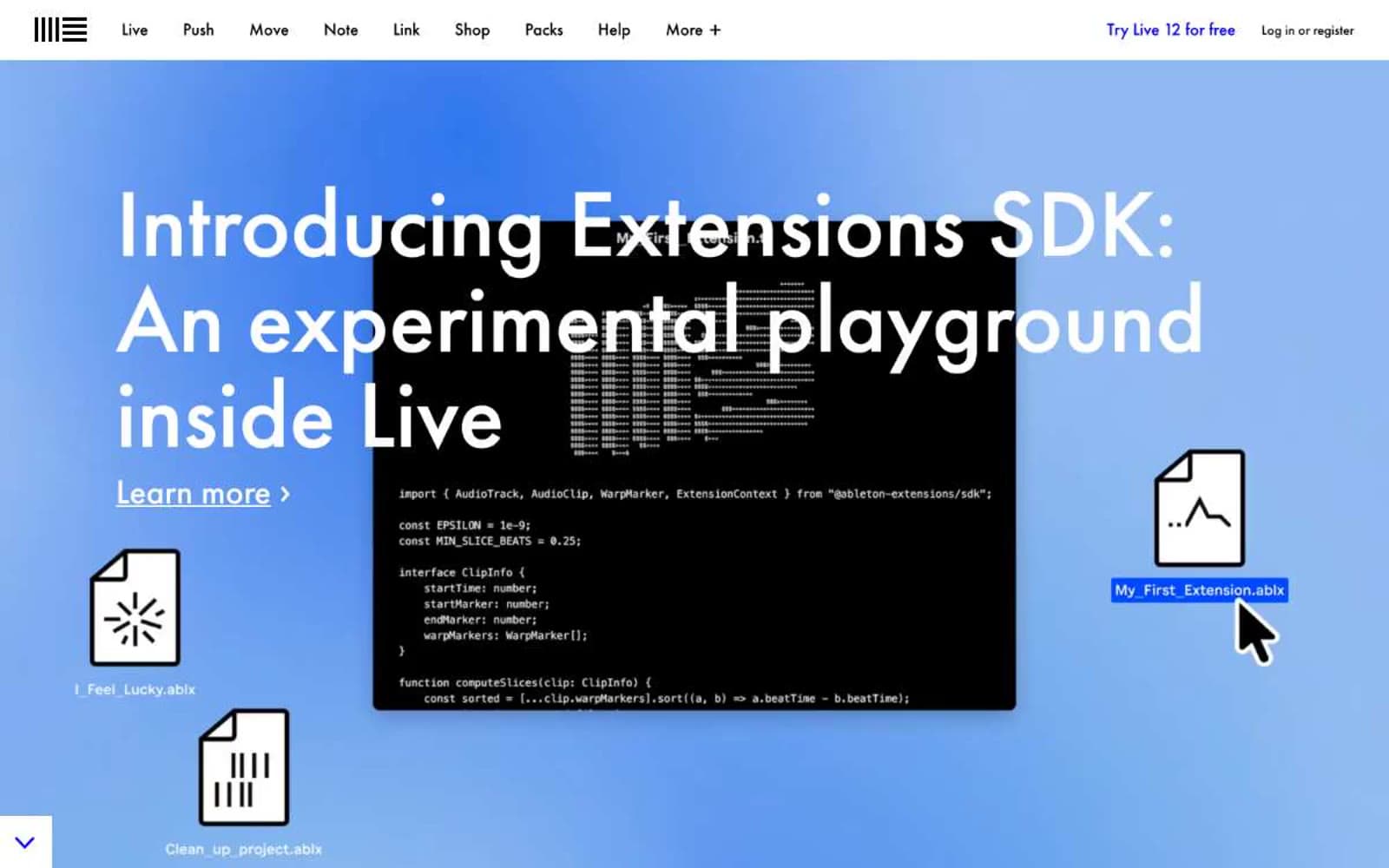
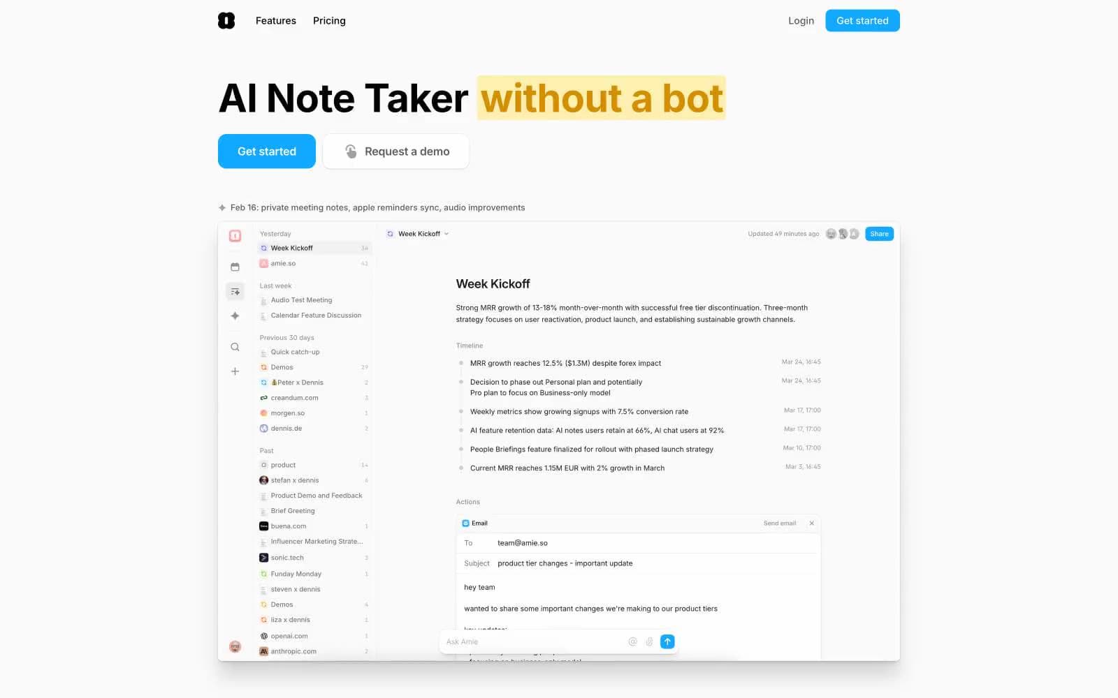
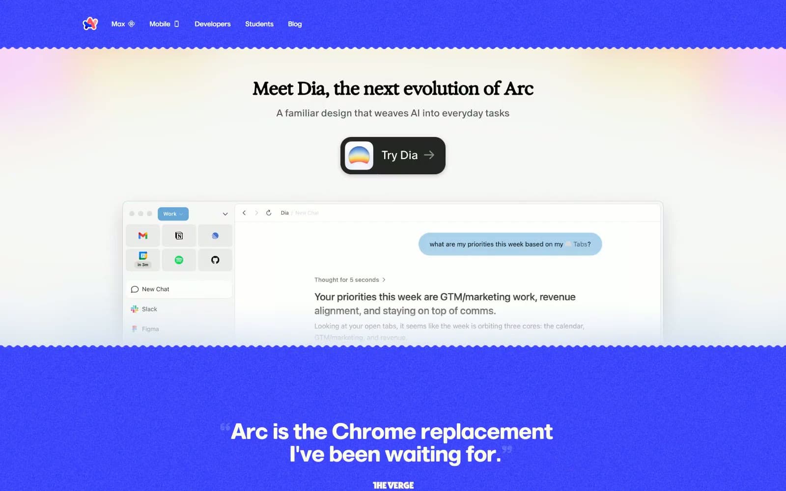
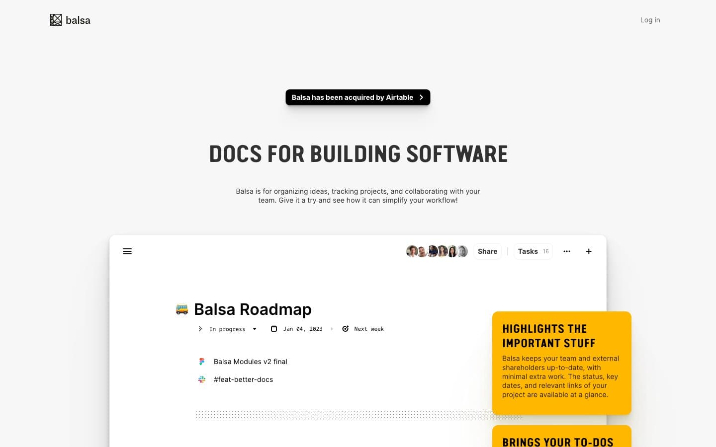
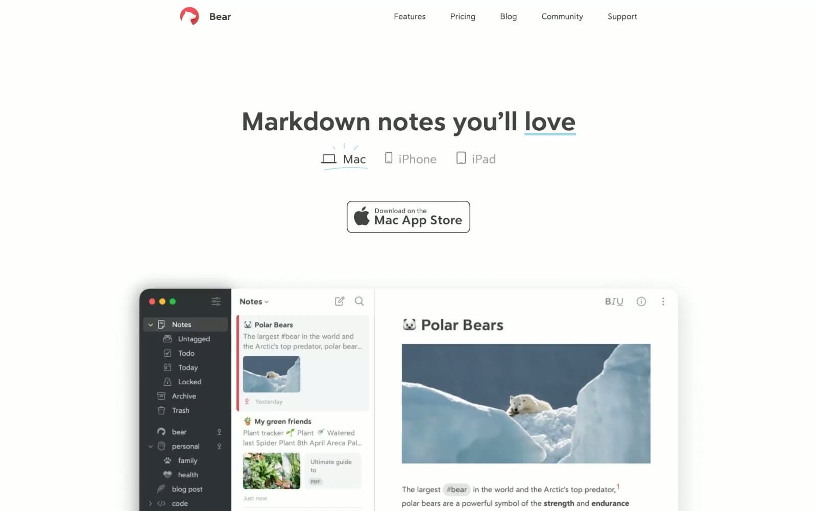
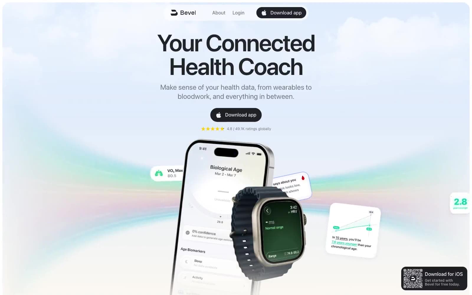
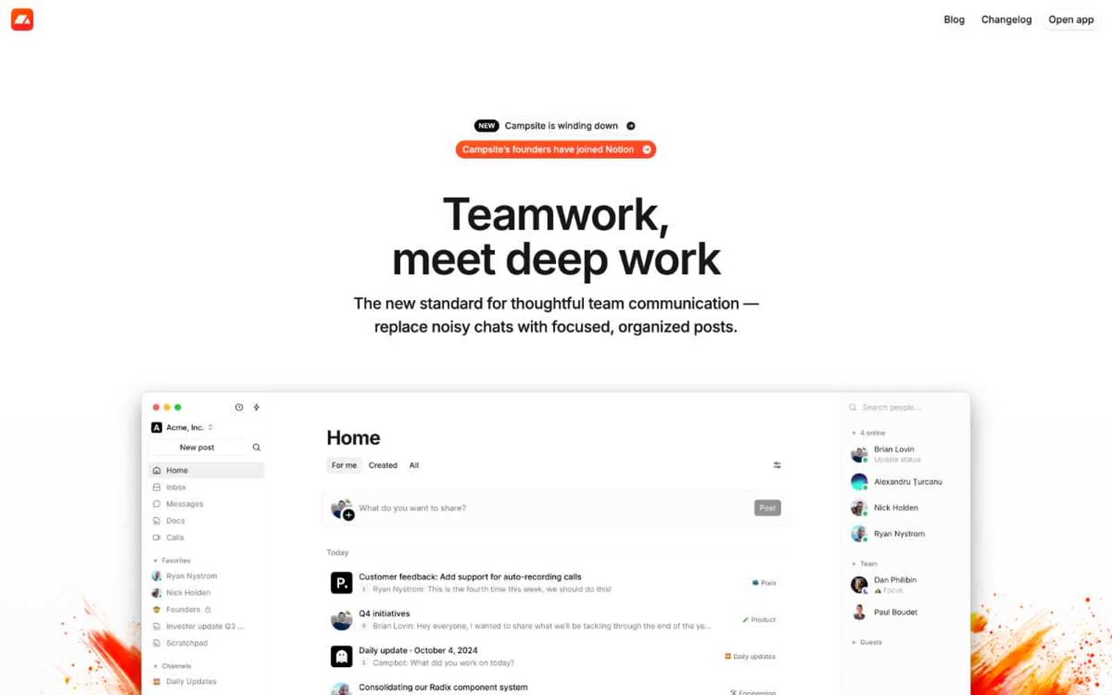
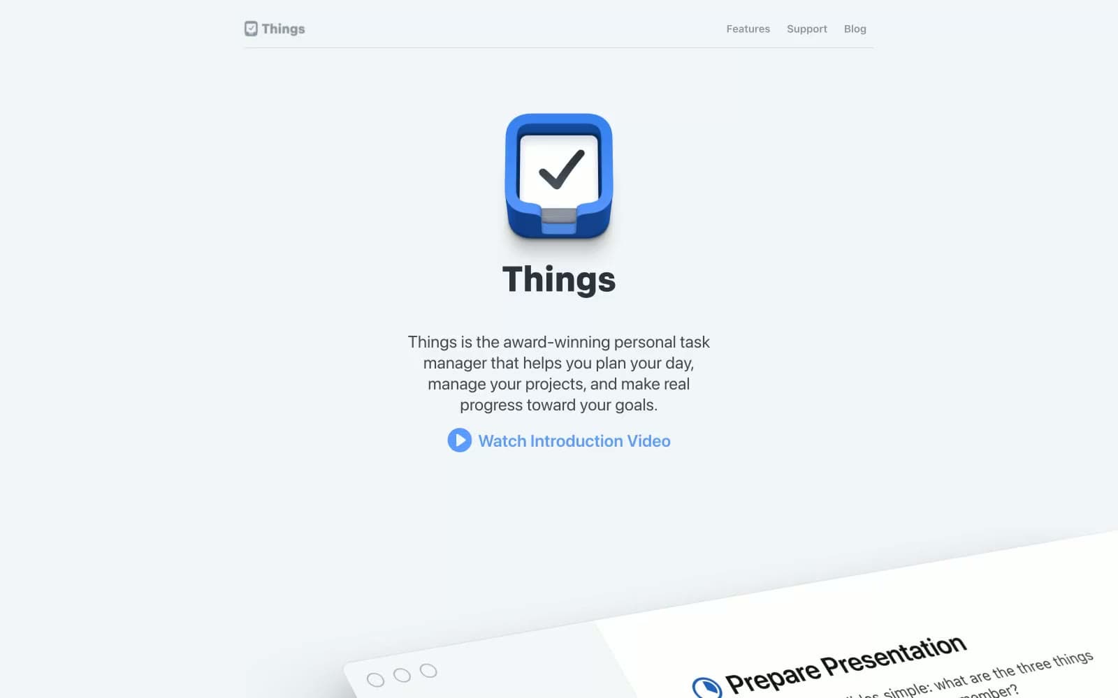
Things. A gallery wall of tilted product frames floating on a quiet cool-gray canvas, with one vivid blue spark pulling the eye to every interactive moment.
- Productivity
- Light theme
- 11 colors
- 1 typeface
Things presents a gallery-like product page where the app speaks through generous white space, tilted product mockups, and a single confident blue accent. The aesthetic borrows from Apple's editorial restraint — system fonts, near-grayscale neutrals, subtle layered elevation, and rounded cards with 18px radii feel premium without ever feeling cold. Color appears sparingly and functionally: a vivid blue for links, icons, and the circular play control; a slightly lighter blue for secondary headings; and a near-black (#303336) for body text against a faintly cool canvas (#f2f5f7). Sections breathe with 40-80px vertical gaps, and hierarchy is carried by type weight (600-800 for headings) and generous line-height rather than decorative flourishes.
Things design system

Brand2
Blue supporting accent for decorative details and low-frequency emphasis. Do not promote it to the primary CTA color
Secondary blue for heading accents, lighter link states, decorative icon highlights — a softer companion to Signal Blue used when the primary blue would feel too loud
Neutrals9
Primary text, body copy, heading text — near-black with a faint cool cast, never pure #000, keeping the page from feeling harsh
Deep body text alternative, emphasized inline text — sits between Ink and Fog for mid-emphasis passages
Tertiary text, icon strokes, decorative dividers — a cool gray that still carries enough chroma to read as designed, not default
Secondary body text, helper copy, muted descriptions — the most-used neutral after Ink, creates the dominant mid-tone of the page
Muted link text, breadcrumb-style secondary navigation
Disabled or de-emphasized text, tertiary metadata
Input borders, subtle dividers, card edges — cool and barely-there, defines boundaries without darkening the surface
Page canvas, full-width background bands — a cool-tinted off-white that feels softer than pure white but still reads as light
Card surfaces, elevated product mockups, input fields — pure white against the cooler canvas reads as lifted, not flat
Try a pairing
Pick any two colors from the palette to check whether text stays readable on top.
Aa
#111111 on Signal Blue
4.38 : 1 contrast
- Body textFails AA 4.5
- Large textPasses AA 3
- StrictFails AAA 7