Sublime. A quiet gallery where one bold black headline holds the room and a single green object is always the only thing worth picking up.
- Productivity
- Light theme
- 11 colors
- 2 typefaces
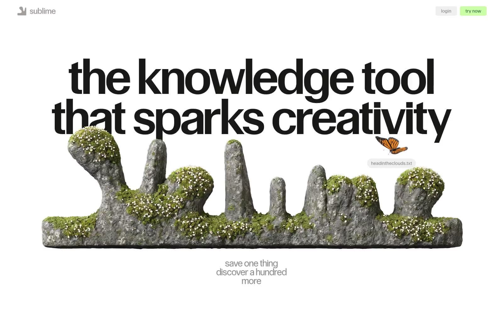
Sublime operates as a digital atelier: vast white walls, a single monumental headline anchoring each view, and collected objects (text snippets, vintage images, 3D renders) that feel curated rather than organized. The palette is 98% achromatic — black on white carries the entire interface, with two whisper-soft washes (pale blue, pale green) and one vivid moss green that punctuates moments of intent. Typography does the structural work: a custom geometric sans at extreme sizes and tight tracking creates headline gravity, while Times New Roman supplies a literary counterpoint for body copy and quotes — the serif/sans collision is deliberate editorial tension, not a system oversight. Layout breathes aggressively — centered compositions, floating collaged elements that overlap and ignore grid lines, generous vertical rhythm. Radii split into two modes: crisp 5px for functional controls, 999px pill for tags and special actions.
Sublime design system

Brand1
Green outline accent for tags, dividers, and focused UI edges. Do not promote it to the primary CTA color
Accent3
Blue outline accent for tags, dividers, and focused UI edges.
Cool surface tint — content card backgrounds, highlight washes; a barely-there blue that hints at a Polaroid shadow without actually adding one
Warm surface tint — secondary highlight washes, soft card fills; a pale chartreuse that pairs with Moss Green as a lighter sibling
Neutrals7
Primary text, structural borders, icon strokes — the dominant workhorse (870 uses); never softened to gray, always full ink
Heading text and icon fills — a near-black with the faintest warm shift, used where Pure Black would feel too clinical (display headings, filled icons)
Heading borders, link text, secondary headings — darker than Fog for moments that need more presence than a border but less than a heading
Button borders, secondary borders — medium gray for outlined controls that need definition without weight
Body borders, nav borders, muted body text — the most-used border gray (275 instances); creates the hairline-grid that organizes the page without drawing attention
Elevated surface, button backgrounds, subtle dividers — the off-white that lets buttons and cards sit forward without using shadow
Page canvas, card surfaces, text on dark fills — the gallery wall itself
Try a pairing
Pick any two colors from the palette to check whether text stays readable on top.
Aa
Paper on Moss Green
5.57 : 1 contrast
- Body textPasses AA 4.5
- Large textPasses AA 3
- StrictFails AAA 7