
Strut. Oversized serif-adjacent display type sitting on a cream paper field, marked only by a single amber highlighter and hairline rules.
- Productivity
- Light theme
- 8 colors
- 2 typefaces
Strut treats its interface as a sheet of warm paper rather than a software screen: a continuous cream canvas carries oversized editorial type, hairline-bordered flat cards, and a single amber accent that punctuates like a highlighter stroke. GT Pressura anchors the voice — its geometric, slightly utilitarian forms at 100–136px turn every headline into a broadsheet masthead, while Inter quietly handles body and UI at 14–16px. Components are deliberately weightless: 1px borders do the work of shadows, 28px corners soften without rounding into pill territory, and vertical rhythm opens up to 80–120px between sections so the page reads like a printed spread. Color is rationed — the amber appears as decorative micro-touches (active icon strokes, brand mark, tag dots) while text and structure stay in warm neutrals from #2e2d2b ink to #ead7b8 paper.
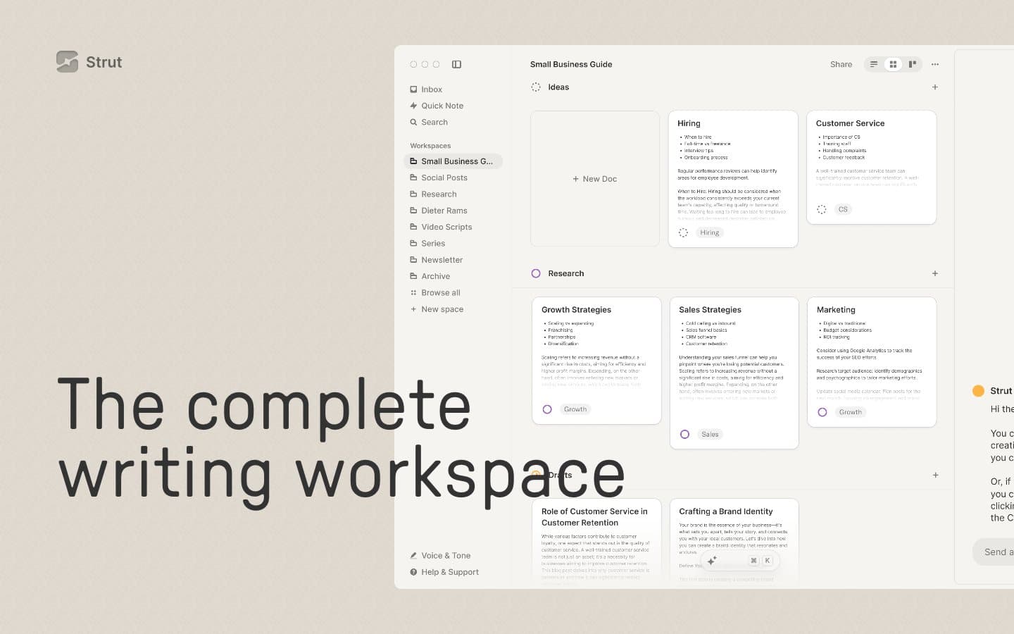
Strut design system

Accent1
Decorative brand accent — brand mark, active workspace icon stroke, highlight tag dots. Rationed: never fills a button, never carries body text
Neutrals7
Primary text, masthead headlines, and the near-black ink that gives the editorial type its printed authority
Body copy, secondary text, and any UI text that needs to stay just slightly softer than pure ink
Pressed/hover states for borders and link underlines — a half-step darker than Slate Border
Dark borders and separators for elevated surfaces and inverted UI. Do not promote it to the primary CTA color
Muted helper text, inactive icons, and the soft gray that recedes behind primary content
Page canvas, the continuous warm background behind every section — the paper the whole product sits on
Hairline borders, soft card surfaces that float just barely above the cream canvas, subtle dividers
Try a pairing
Pick any two colors from the palette to check whether text stays readable on top.
Aa
Ink Black on Amber Honey
7.83 : 1 contrast
- Body textPasses AA 4.5
- Large textPasses AA 3
- StrictPasses AAA 7























