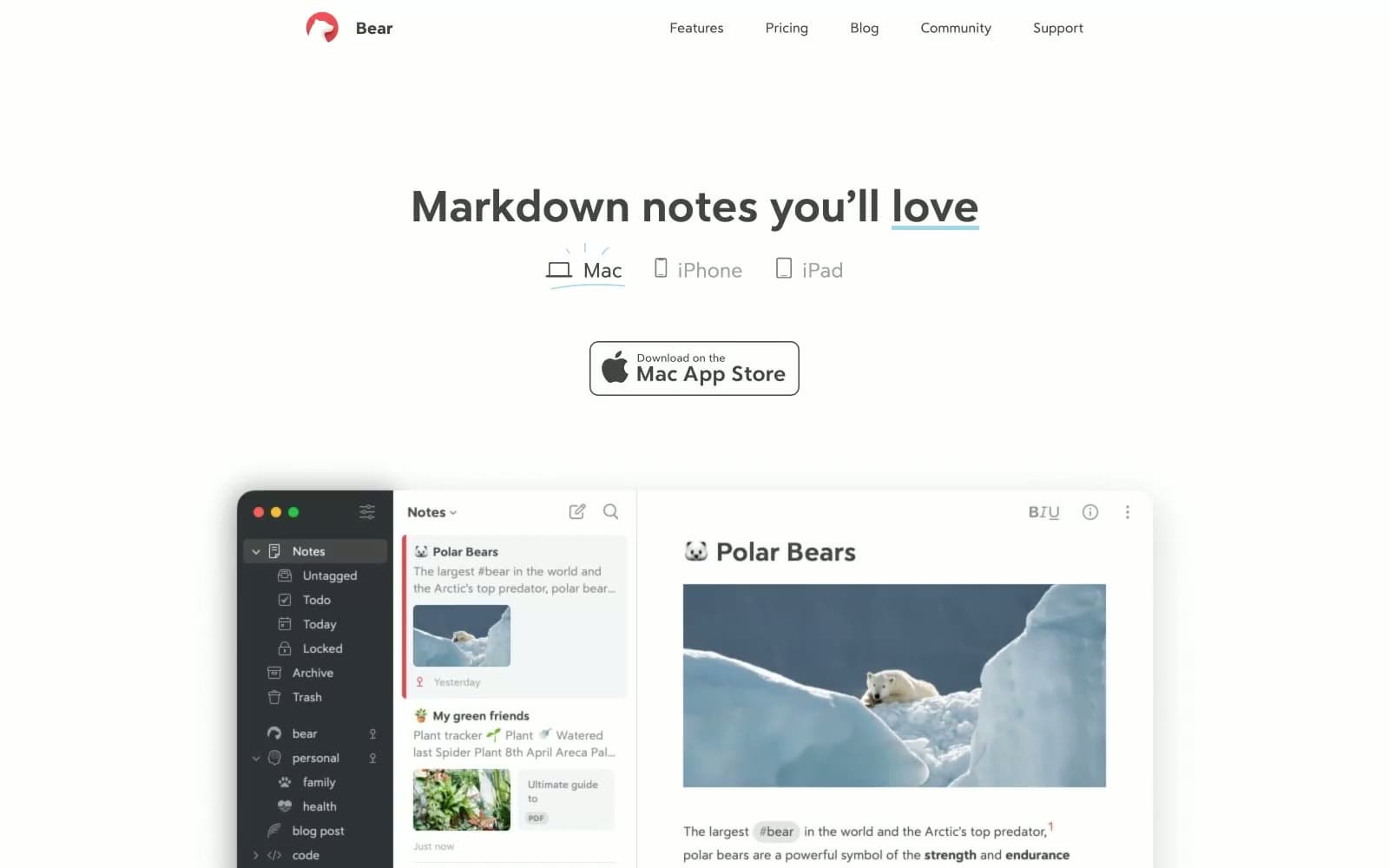
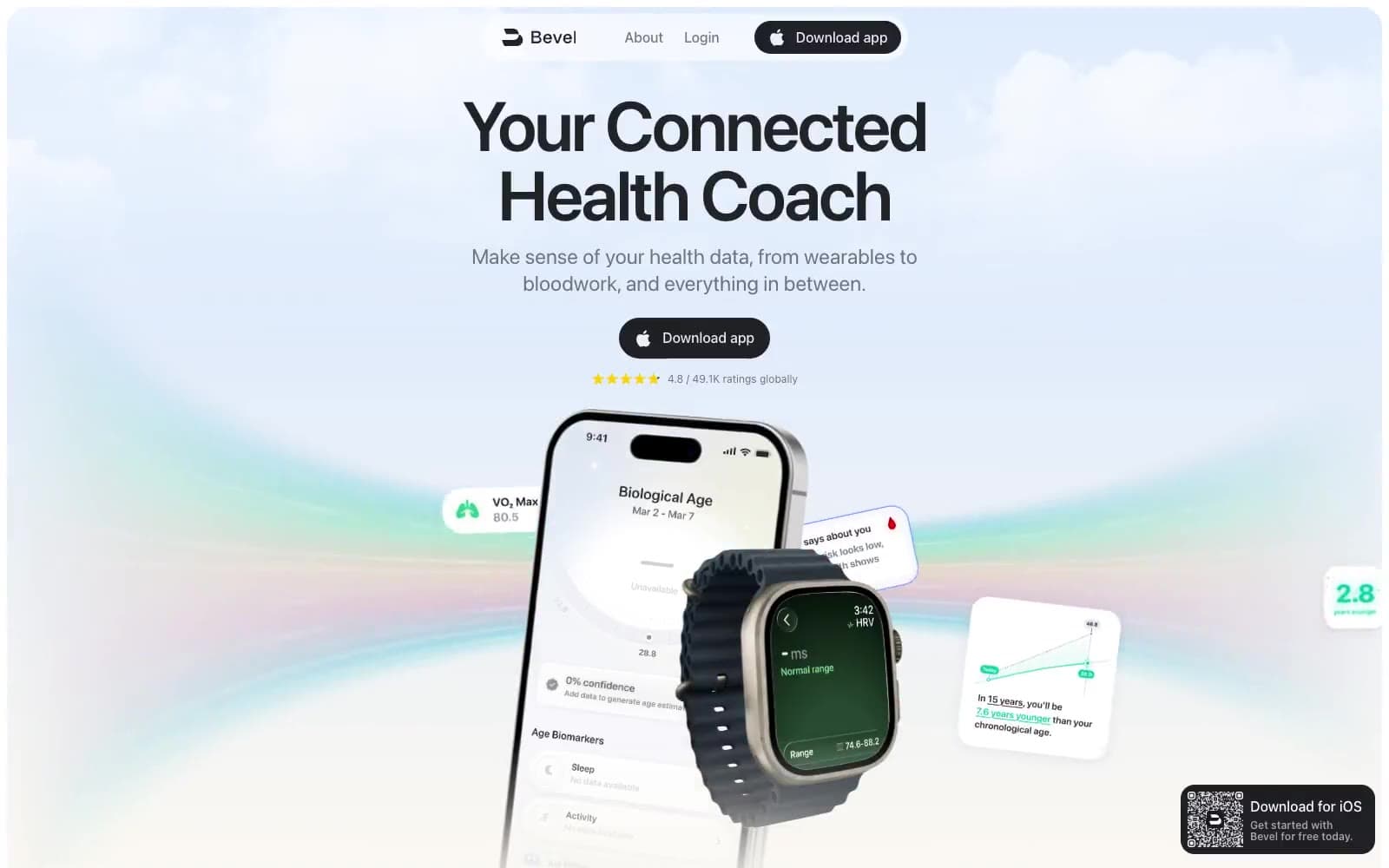
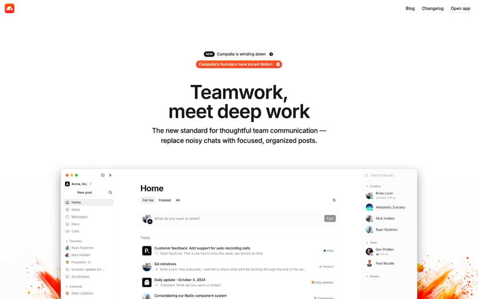
Sleeve. Floating dock on marble.
- Productivity
- Light theme
- 10 colors
- 1 typeface
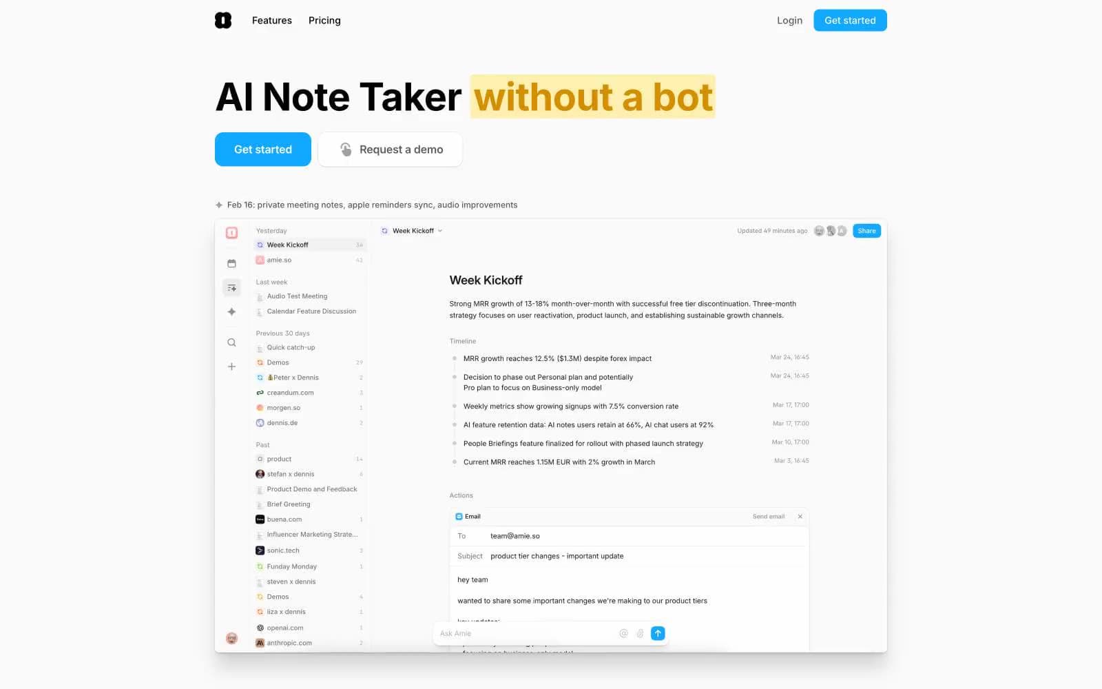
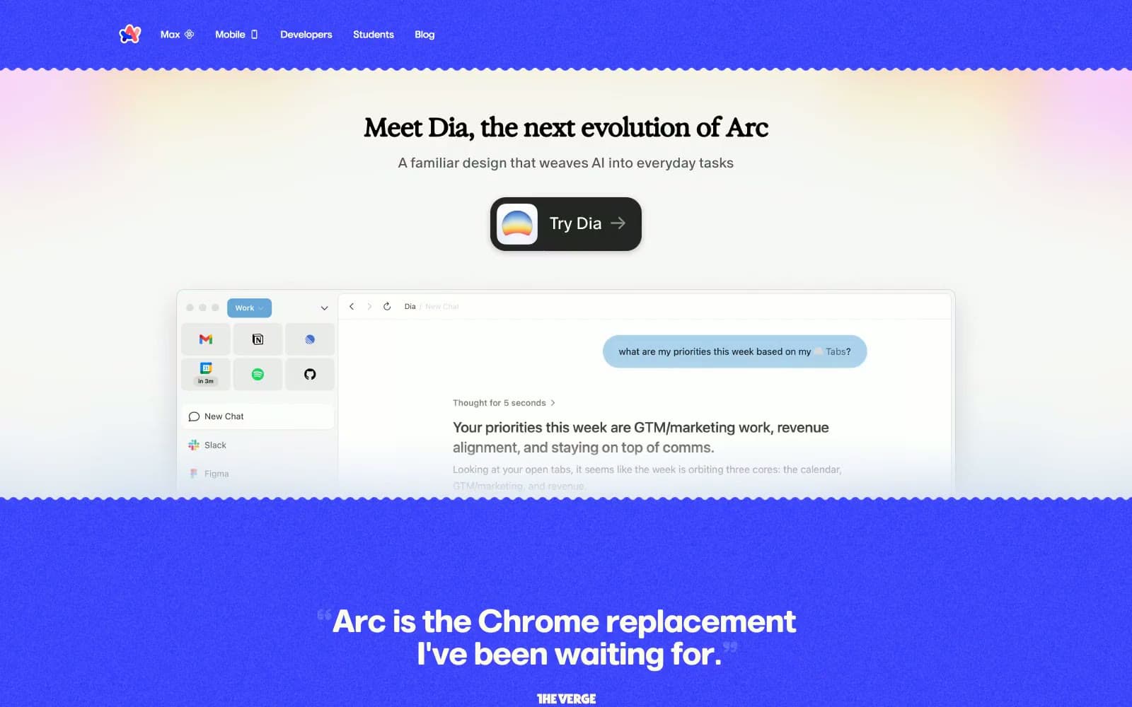
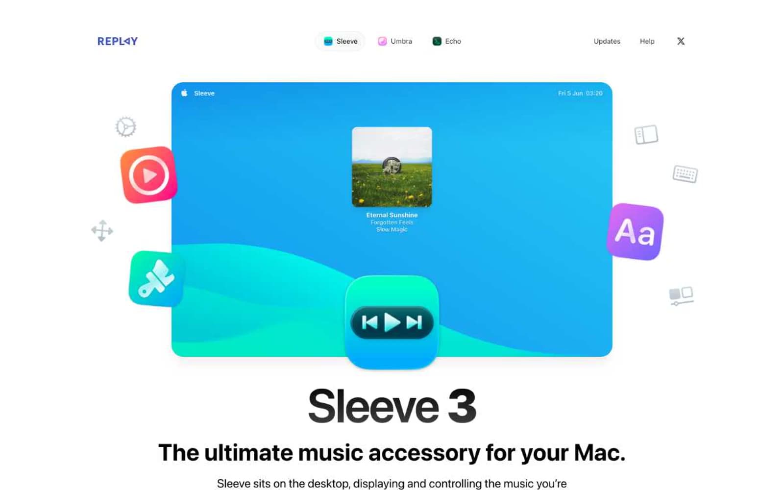
Sleeve's site reads like a macOS product page composed in a gallery: an infinite white canvas, a single hero product shot floating with app-icon satellites orbiting it, and typography that does all the work. The palette is nearly monochrome — black, white, and a hairline gray border are the only structural colors — while the only chromatic energy comes from the app's own blue gradient and a small set of colorful system icons used as decorative punctuation. Headlines are massive and tight-tracked (96px display at -0.025em letter-spacing, 48px section headings), body text is system-sans at 15-18px, and micro-labels like 'THEMING' and 'FEATURE LIST' use 0.05em tracking to whisper rather than shout. Components are soft and chunky: 24px card radii, 9999px pill buttons, inset 1px borders at 0.05 opacity instead of heavy shadows. The design language is confidence through restraint — no gradients on UI, no color on buttons, just typographic weight and generous breathing room carrying every screen.
Sleeve design system

Accent2
Brand accent — section labels (THEMING, FEATURE LIST), gradient anchor for the app showcase gradient; Decorative gradient used in the product showcase and as accent wash — linear-gradient(to right top, #0e95ee, #27c9f5)
Brand accent — gradient terminal for the app showcase gradient, decorative wash; Subtle background gradient wash — linear-gradient(to right bottom, rgba(150,255,238,0.1), rgba(24,192,233,0.1))
Neutrals8
Dark supporting neutral for text, icons, and strong contrast. Do not promote it to the primary CTA color
Secondary text, icon fills, button text — softer than pure black for body emphasis without losing weight
Supporting neutral for secondary UI, dividers, and muted labels. Do not promote it to the primary CTA color
Muted helper text, shadow mid-tones, secondary icon fills — visible but recedes
Shadow base, disabled borders, inset 1px borders on cards — deeper than Silver Mist for visible but quiet structure
Hairline borders, subtle dividers, light surface washes — the most-used color in the system, defines edges at 0.05 opacity equivalent
Subtle surface tier, announcement pill background, secondary card surface — barely warmer than pure white to suggest elevation without shadow
Page canvas, card surfaces, text on dark buttons — the dominant background tone
Try a pairing
Pick any two colors from the palette to check whether text stays readable on top.
Aa
Pure White on Midnight Ink
21.00 : 1 contrast
- Body textPasses AA 4.5
- Large textPasses AA 3
- StrictPasses AAA 7