
Shortcut. A whiteboard surface where one confident violet stroke does all the work.
- Productivity
- Light theme
- 13 colors
- 1 typeface
Shortcut's visual language is an indigo-ink-on-white-paper system: a quiet, high-key canvas interrupted by a single vivid violet that does the talking. The product lives on flat white surfaces with near-invisible hairline borders; depth comes from generous whitespace and the occasional pale lavender card, never from drop shadows. Typography is a single geometric sans (Satoshi) set tight and confident at modest sizes — the interface never shouts, it narrates. Color is rationed like punctuation: deep midnight (#08093f) anchors dark sections and footers, vivid indigo (#494bcb) marks every primary action, and a single warm yellow badge appears as decorative accent. The mood is professional, restrained, and tool-like — a workhorse product UI dressed in just enough brand to feel deliberate without becoming decorative.
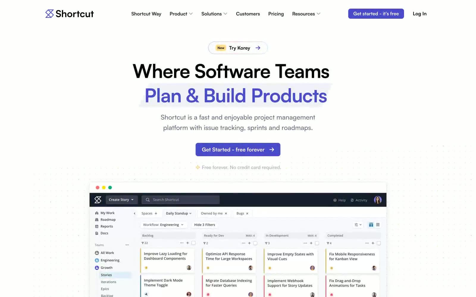
Shortcut design system

Brand2
Primary action background, filled buttons, active nav, brand focal point — the one chromatic color that carries the entire brand
Footer background, dark section canvases, heading accent on dark surfaces — near-black with violet undertone ties it to the brand
Accent4
Icon strokes, decorative SVG borders, illustration outlines — the muted cousin of the brand color, used where saturated indigo would be too loud
Badge accent border, decorative illustration strokes — provides warmth without competing with the primary
Decorative badge fill, section eyebrow pills, highlight wash — a single warm note against the cool indigo system
Subtle button surface, card hover wash, ghost UI background — the lightest tint of the brand violet
Neutrals7
Primary text on light surfaces, nav text, button text — high-contrast reading color
Secondary text, image borders, link text on white
Body text borders, hairline dividers, card outlines — the structural neutral
Muted helper borders, inactive UI outlines
Nav dividers, inactive nav text, subtle UI separators
Alternate section background, subtle surface lift above white, badge surface
Primary page canvas, card surface, button text, image backgrounds
Try a pairing
Pick any two colors from the palette to check whether text stays readable on top.
Aa
Pure White on Vivid Indigo
6.66 : 1 contrast
- Body textPasses AA 4.5
- Large textPasses AA 3
- StrictFails AAA 7























