
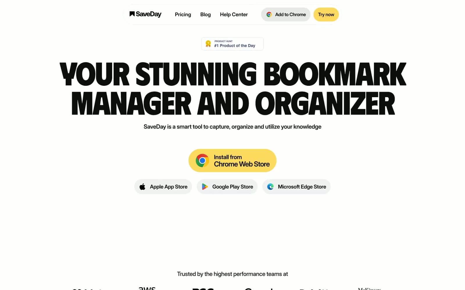
SaveDay. Oversize black uppercase type on cream paper, with one band of yellow dragged across each section.
- Productivity
- Light theme
- 10 colors
- 2 typefaces
SaveDay reads as a sun-bleached editorial spread with a butter-yellow highlighter dragged across it: a near-monochrome paper-white canvas, oversized uppercase display type in Phudu, and one saturated #fbda5f yellow that paints full-width section bands and pill accents. The system is unapologetically poster-like — headlines fill the viewport at 112px, letter-spacing pulls tight to -0.04em, and text alignment is almost always centered, producing a print-poster cadence rather than a dashboard cadence. Information is delivered in horizontal color bands (light gray, yellow, black) that act as section dividers and surface treatments in one move, with no shadows mediating depth. Components are confidently chunky: 24px card radii, 160px pill radii on CTAs and tags, hairline-thick black borders, and flat fills — the geometry does the work that gradients and shadows usually do.
SaveDay design system

Brand1
Yellow accent for outlined action borders, linked labels, and lightweight interactive emphasis. Do not promote it to the primary CTA color
Accent1
Link and icon accent for secondary navigation and store-badge fills — cool counterpoint to the warm yellow, never used for primary CTAs
Neutrals8
Hard-edge borders on feature band cards, icon fills, and the inverted footer band where it provides maximum contrast against yellow text
Body text, heading text, card borders, hairline dividers — the dominant near-black that carries almost all typography and outlines
Deep surface fill used inside the dark footer band and as an elevated neutral surface
Muted helper text, list dividers, and secondary metadata where Ink would carry too much weight
Hairline borders, low-emphasis dividers, and the single drop shadow tint used on elevated cards
Warm-leaning neutral for card surfaces and background variation where Fog feels too cool
Soft feature-band surface (alternates with Butter Highlight and Pure Black), subtle card backgrounds, neutral pill borders and text
Page canvas, card backgrounds, and the negative space inside inverted black bands — the surface everything else sits on
Try a pairing
Pick any two colors from the palette to check whether text stays readable on top.
Aa
Pure Black on Butter Highlight
15.30 : 1 contrast
- Body textPasses AA 4.5
- Large textPasses AA 3
- StrictPasses AAA 7























