
Reclaim. Lavender productivity workshop with violet ink.
- Productivity
- Light theme
- 18 colors
- 2 typefaces
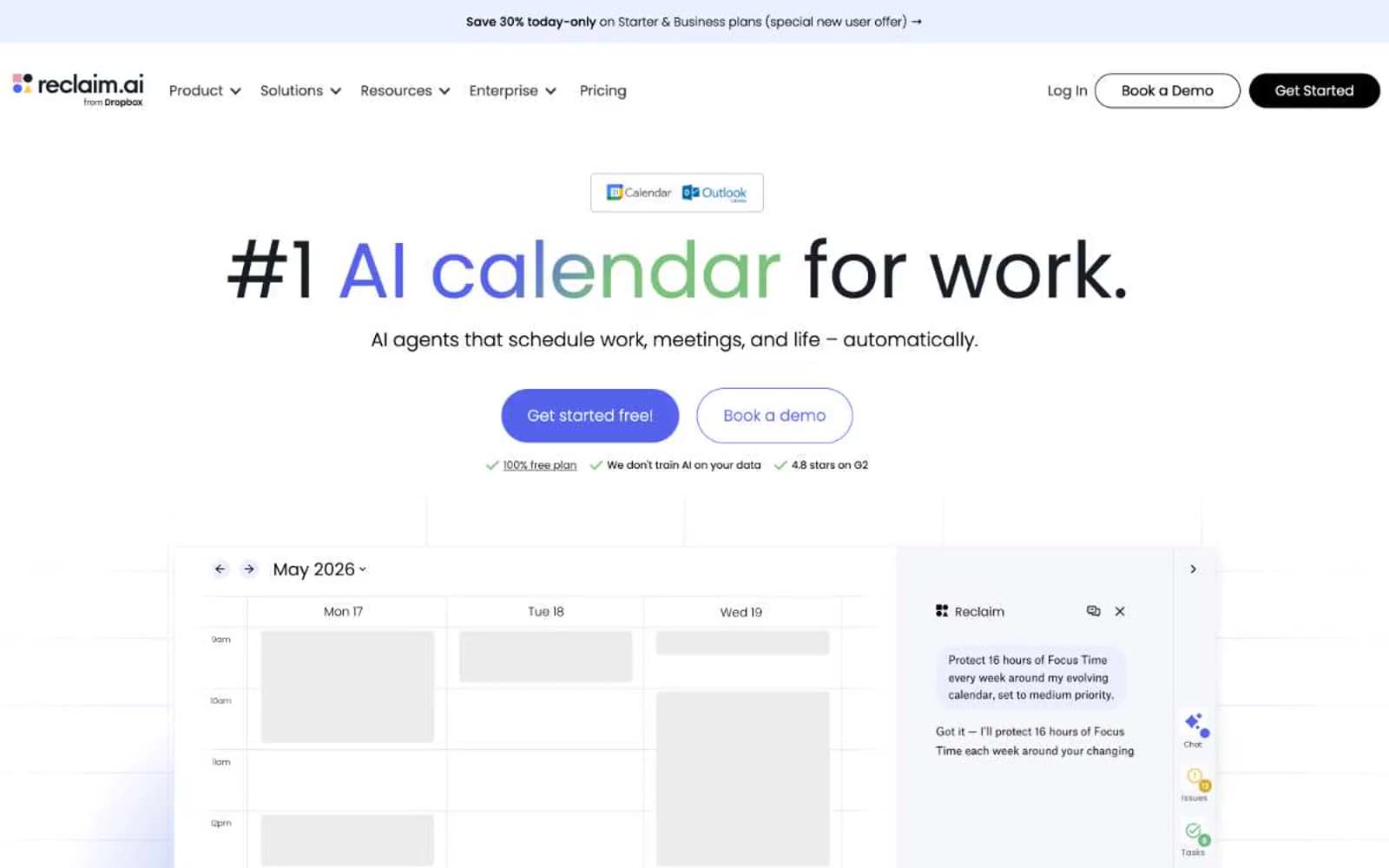
Reclaim reads as a productivity tool that wants to feel friendly, not corporate. The canvas is a very pale lavender (#ebefff) that softens what could otherwise be a stark productivity app, with product surfaces staying pure white for contrast. A single vivid violet (#5562eb) drives every interactive moment — links, primary CTAs, focus states — while a matching vivid green (#7ac17b) appears as functional punctuation on the calendar visualization itself, not on controls. Typography is exclusively Poppins, used at extreme scale: 90px hero headlines with weight 300/400 whisper against the page, and tiny 11-12px body text that never feels utilitarian. Buttons are pill-shaped (100px radius) with stark black or pure violet fills — no gradients on controls. The overall feeling is "calm scheduling app, not enterprise software."
Reclaim design system

Brand5
Violet supporting accent for decorative details and low-frequency emphasis. Do not promote it to the primary CTA color
Violet supporting accent for decorative details and low-frequency emphasis. Do not promote it to the primary CTA color
Soft tints for product card highlights, decorative violet washes, outlined button borders — the muted cousin of Iris Violet
Disabled or secondary violet state, ghost button text on violet themes
Dark mode gradient anchor, deep accent for special promotional sections
Accent4
Green supporting accent for decorative details and low-frequency emphasis
Light supporting surface for subtle backgrounds and section separation
Dark green gradient stop for special promotional banners
Red supporting accent for decorative details and low-frequency emphasis. Use as a supporting accent, not as a status color
Neutrals9
Dark supporting neutral for text, icons, and strong contrast. Do not promote it to the primary CTA color
Body copy and card text on light surfaces — sits just above pure black for slightly softer reading weight
Supporting neutral for secondary UI, dividers, and muted labels. Do not promote it to the primary CTA color
Subheadings and emphasized body — bridges Midnight Ink headings and Slate body text
Tertiary text, breadcrumb-style labels
Muted helper text, secondary descriptions, footer text — the workhorse for non-headline copy
Hairline dividers, decorative strokes, subtle separators
Page background, hero section wash, footer background — the base atmosphere that distinguishes Reclaim from generic white SaaS
Card surfaces, product mockup containers, button text on dark fills — pure white provides the resting layer above the lavender canvas
Try a pairing
Pick any two colors from the palette to check whether text stays readable on top.
Aa
White Surface on Iris Violet
4.85 : 1 contrast
- Body textPasses AA 4.5
- Large textPasses AA 3
- StrictFails AAA 7























