
Readwise. Quiet paper-white, serif headlines, and one blue pen.
- Productivity
- Light theme
- 8 colors
- 2 typefaces
Readwise presents a literary productivity workspace: a near-white canvas with a single editorial blue accent and warm yellow highlighter washes that literally visualize the product's purpose. The type system pairs a transitional serif (Charter) for headlines with a humanist sans (Mulish) for everything else, creating a bookish-but-modern reading-room atmosphere rather than a typical SaaS dashboard feel. Surfaces are flat and quiet — cards float on a cool paper-white (#f1f5f8) with hairline borders, almost no shadows, and rounded corners that feel like printed cards rather than app tiles. Yellow (#fff7ca) functions as a literal highlighter behind in-line emphasized text, not as a decorative accent — the product's identity IS the act of marking what matters. Components stay compact and text-forward, with one filled blue button carrying all the weight and everything else rendered in ghost or text-link form.
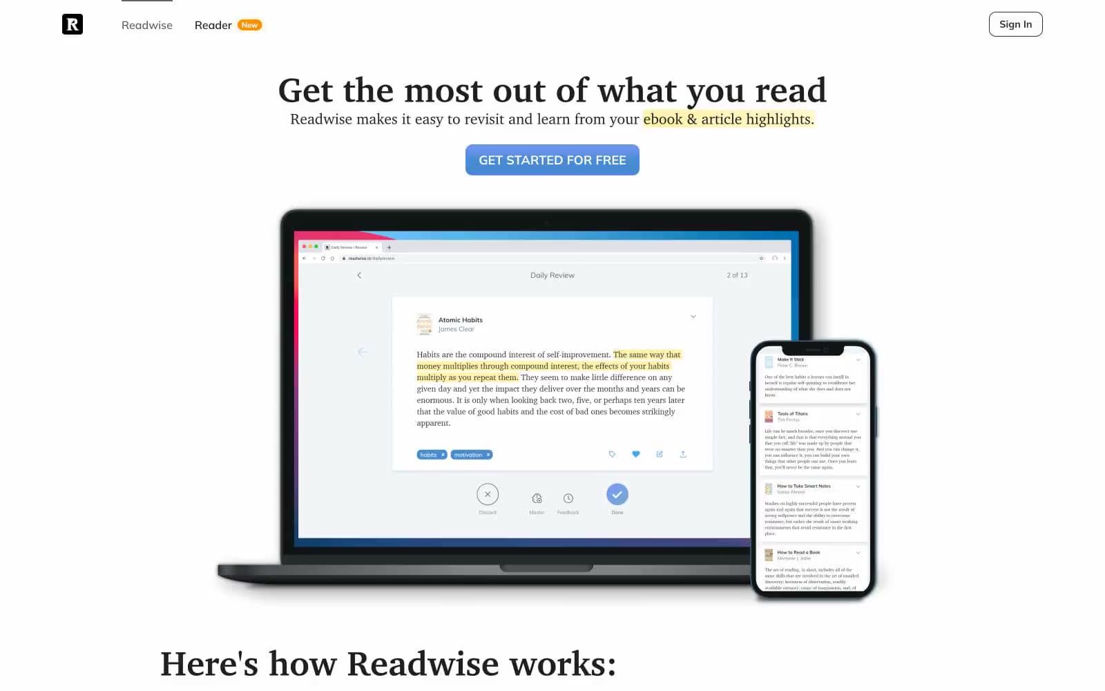
Readwise design system

Brand1
Blue supporting accent for decorative details and low-frequency emphasis. Do not promote it to the primary CTA color
Accent2
Yellow supporting accent for decorative details and low-frequency emphasis.
Orange supporting accent for decorative details and low-frequency emphasis
Neutrals5
Dark supporting neutral for text, icons, and strong contrast.
Primary heading and body text. Near-black rather than pure black — softer on the eye, reads as printed ink rather than digital display
Secondary text and dark surface details. Used in nav and component borders where a slightly different tone from Ink is needed
Page canvas background. A cool, very-light blue-gray that reads as off-white paper rather than a flat gray, giving the entire page a subtle blue cast
Card surfaces, product screenshot backgrounds, button text on filled buttons, and the nav background. The topmost surface tier
Try a pairing
Pick any two colors from the palette to check whether text stays readable on top.
Aa
True Black on Pen Blue
5.93 : 1 contrast
- Body textPasses AA 4.5
- Large textPasses AA 3
- StrictFails AAA 7























