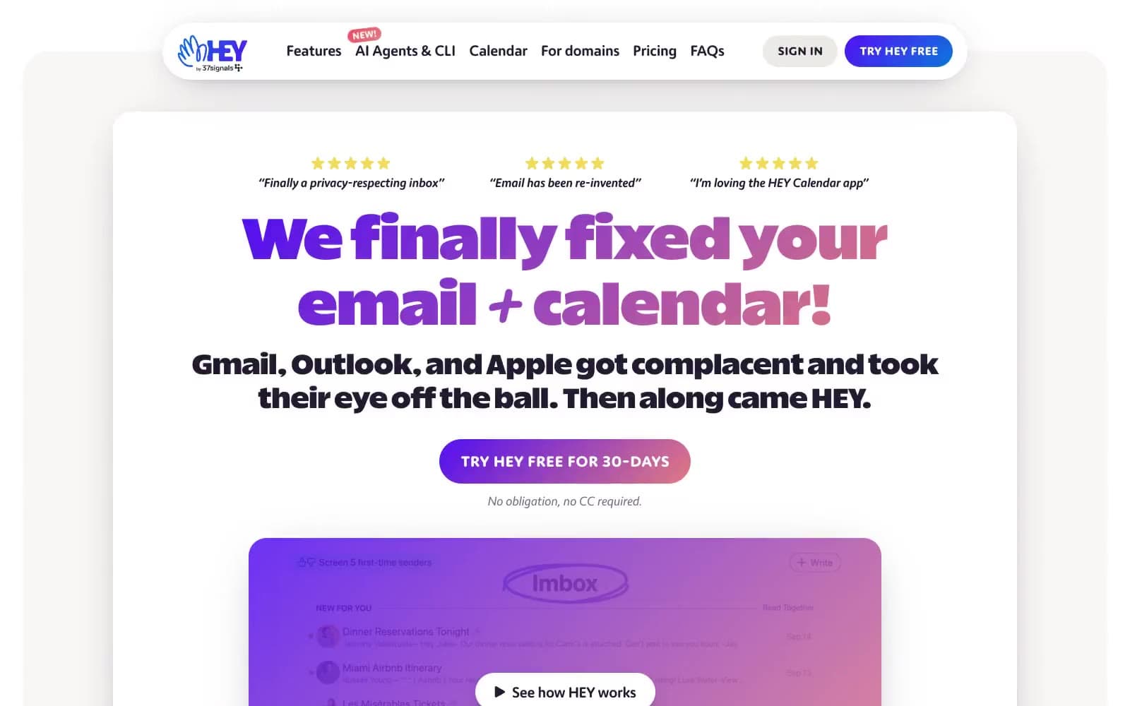
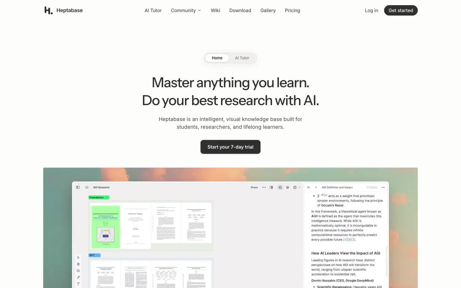
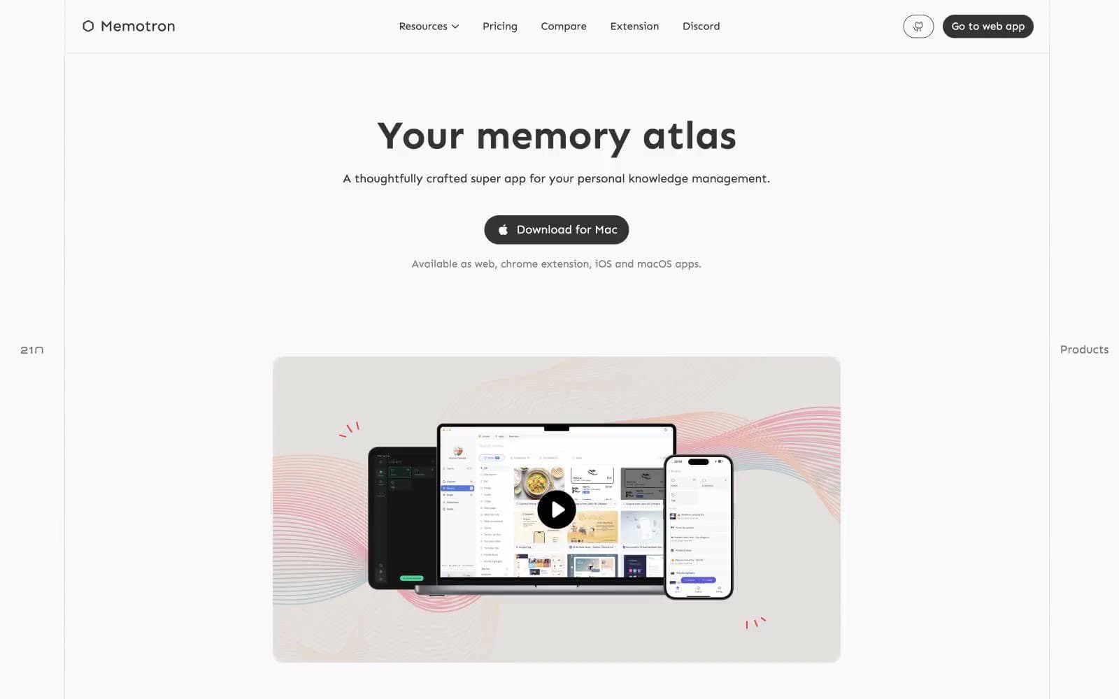
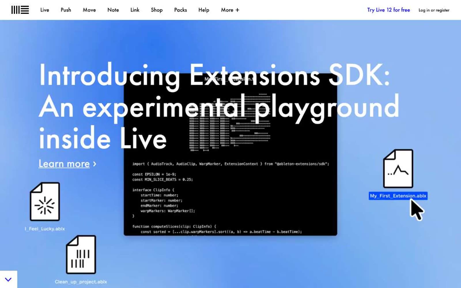
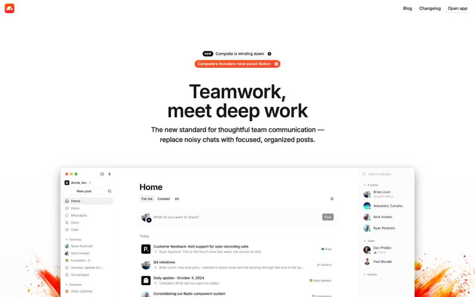
Quo. A single chartreuse stroke against stark black-and-white editorial layout.
- Productivity
- Light theme
- 8 colors
- 2 typefaces
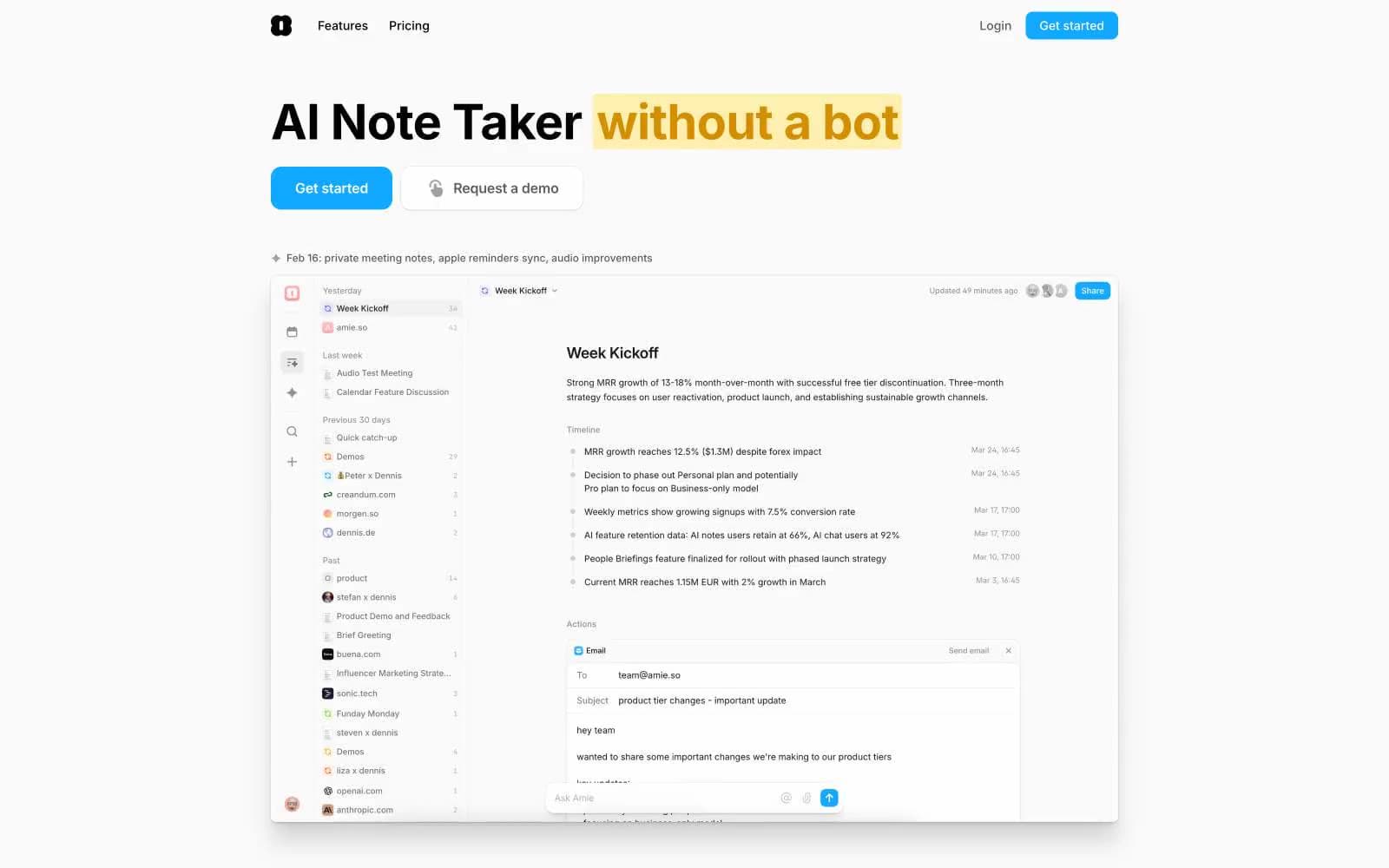
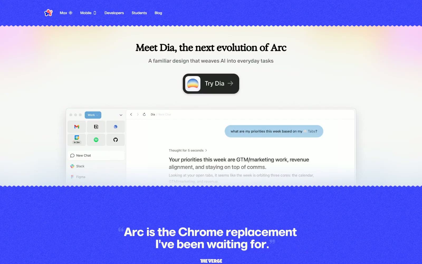
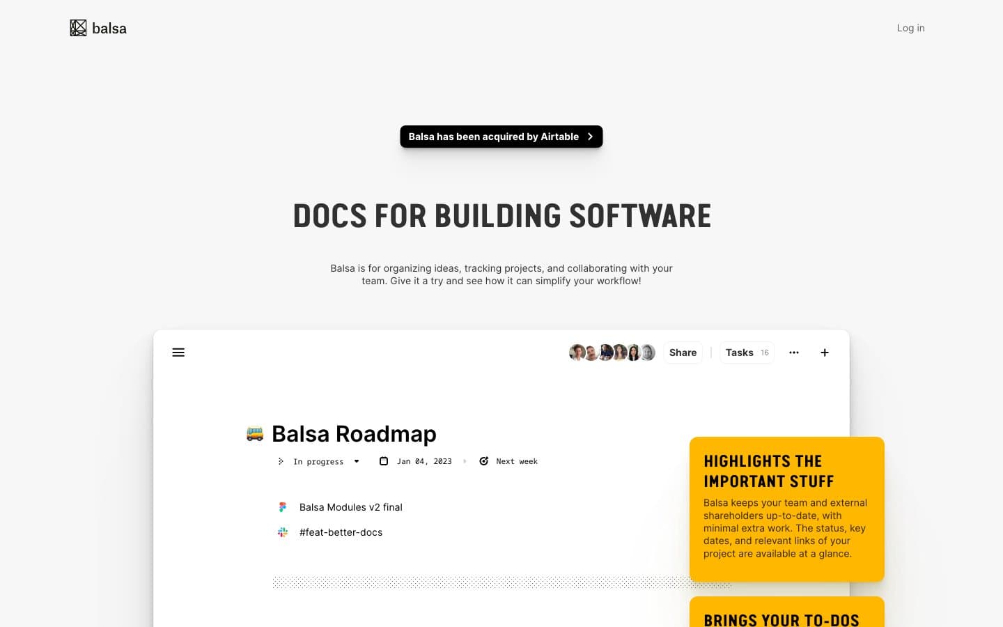
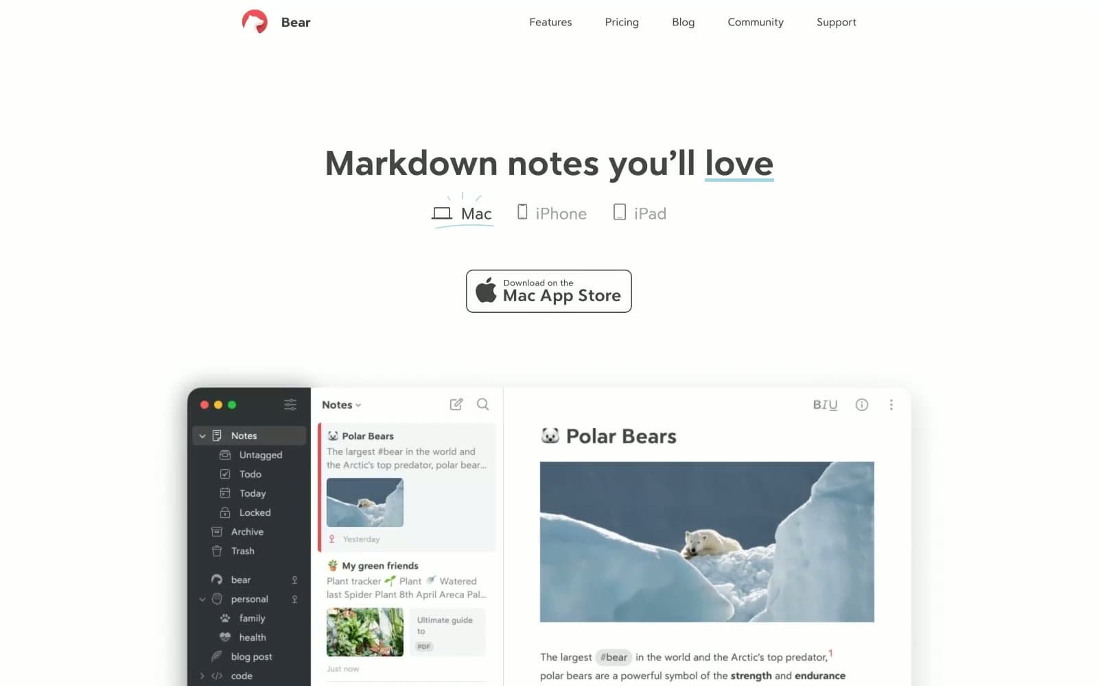
Quo runs on an almost ruthlessly monochromatic system — white and off-white canvases, black ink, hairline borders, near-zero elevation — with a single chartreuse accent that behaves like a highlighter, not a decoration. Headlines are editorial in scale (Roobert at up to 88px, tight -0.02em tracking) while UI stays compact in Inter, producing a newspaper-meets-app rhythm: massive confident display type above dense functional surfaces. Components are flat and rectangular with 10px corners; depth is communicated by product screenshots and one soft shadow rather than stacking. The chartreuse (#edfc47) never fills a button — it highlights words inside headlines, tags icons, and draws the eye to emphasis, making the primary action (a black filled button) feel like the default rather than a colorful exception.
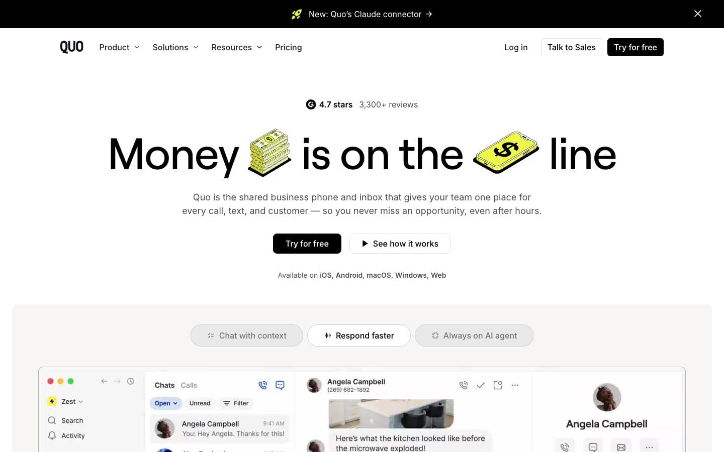
Quo design system

Accent1
Emphasis accent on words inside headlines, icon fills, tag highlights — chartreuse that never fills a button, only marks what matters
Neutrals7
High-contrast neutral action fill for primary buttons on light surfaces.
Announcement bar and dark band backgrounds — near-black for the slim top promo strip
Body text and secondary headings — readable but recedes against Press Black for hierarchy
Muted helper text, icon strokes, tertiary metadata
Hairline borders, dividers, inactive UI edges — the only border color in the system
Page canvas and ambient background — warm off-white that softens the stark black type
Card surfaces, product screenshot frames, nav background — the raised, clean tier above the canvas
Try a pairing
Pick any two colors from the palette to check whether text stays readable on top.
Aa
Press Black on Highlighter
18.62 : 1 contrast
- Body textPasses AA 4.5
- Large textPasses AA 3
- StrictPasses AAA 7