Notion. Warm paper notebook under afternoon sun.
- Productivity
- Light theme
- 17 colors
- 2 typefaces
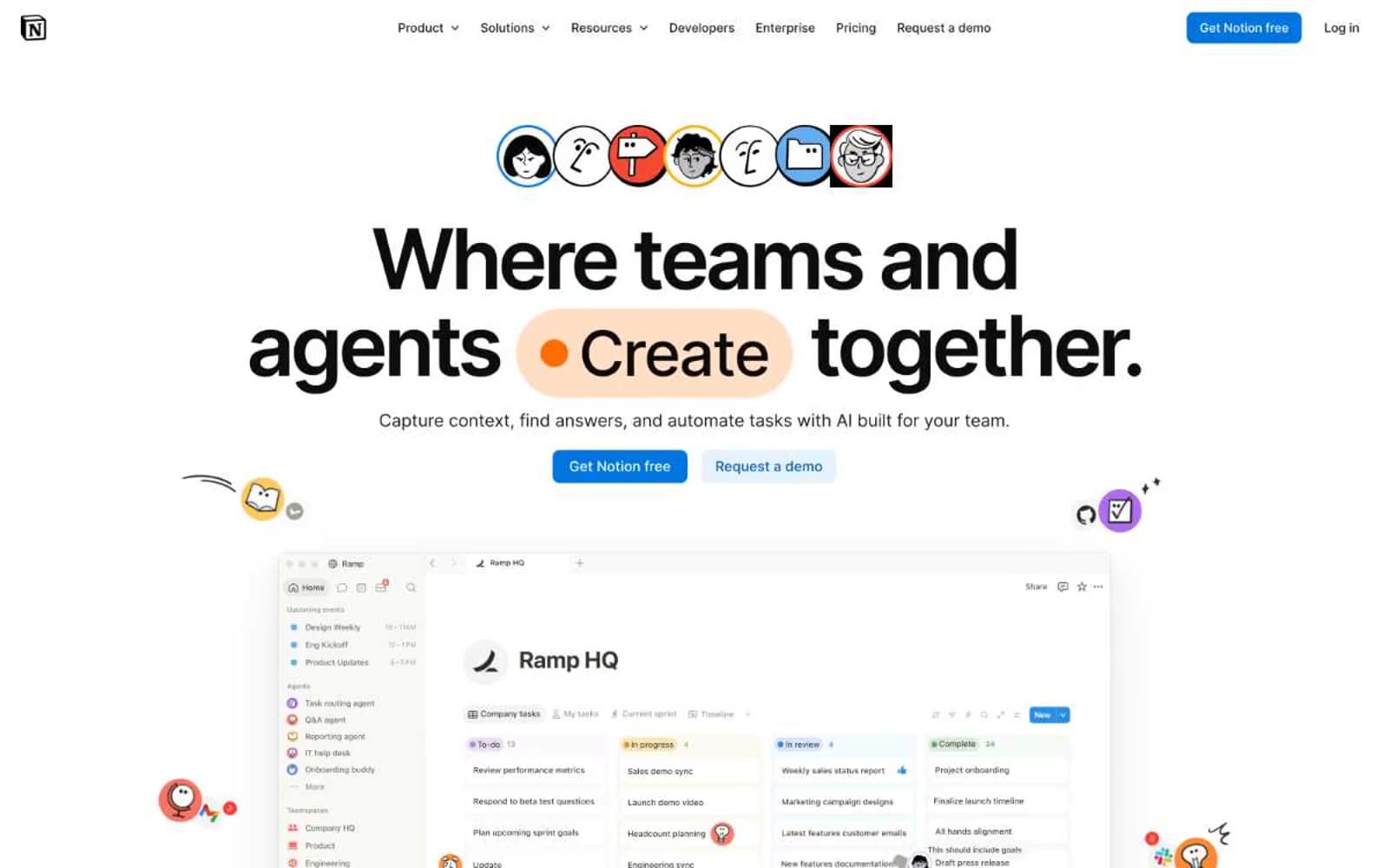
Notion reads like a well-loved paper notebook under afternoon light: a warm off-white canvas (#f6f5f4) that feels tactile rather than clinical, generous sans typography that gives editorial weight to product copy, and color used as sparse punctuation — peachy pills highlight verbs, a single blue anchors the primary action, and a rotating cast of accent hues (coral, amber, sky, midnight) paints the feature card backgrounds like sticky notes. Cards sit on the canvas with 1px hairline borders and 12px corners — no shadows, no chrome — like ruled sections in a Moleskine. Motion is playful and springy, with 200ms ease transitions and bouncy character-mark animations that make the interface feel alive without ever being decorative.
Notion design system

Brand1
Primary CTA fill, active nav accent, filled action buttons — the single chromatic commitment in a near-monochrome system, saturated enough to read as a switch
Accent9
Ghost CTA background, soft blue wash for secondary actions, tinted hover states
Hero pill highlights, Agent feature card background, warm accent for callouts — the first color the eye finds
Decorative card backgrounds, hero pill alternates, warm-to-hot accent in the rotating cast
Body-section accent panels, secondary warm yellow for background washes
Deep coral for saturated body-section backgrounds, signal-warm accent
Warm brown accent for body-section panels — the earthy member of the accent cast
Decorative card backgrounds, hero decorative highlights, secondary blue for visual variety
Lightest blue in the cast — decorative backgrounds, heading accent highlights, airy washes
Violet wash for highlight backgrounds, decorative bands, and soft emphasis behind content.
Neutrals7
Primary text, nav links, headings — deployed at varying alpha (100%, 95%, 90%, 60%, 40%, 20%) to build hierarchy without adding new colors
Dark text variant for specific UI moments where pure black would feel too harsh
Body text with warm cast — the brown-tinted gray that harmonizes with the warm canvas
Card body text, secondary content within cards — slightly lighter than Stone
Secondary nav text, muted helper text, deactivated button labels — the 60% alpha of ink
Page canvas, hero background, section backgrounds — warm off-white gives the system its tactile analog feel
Card surfaces, elevated panels, logo-wall background, contrast text on dark cards
Try a pairing
Pick any two colors from the palette to check whether text stays readable on top.
Aa
Ink Black on Notion Blue
4.60 : 1 contrast
- Body textPasses AA 4.5
- Large textPasses AA 3
- StrictFails AAA 7