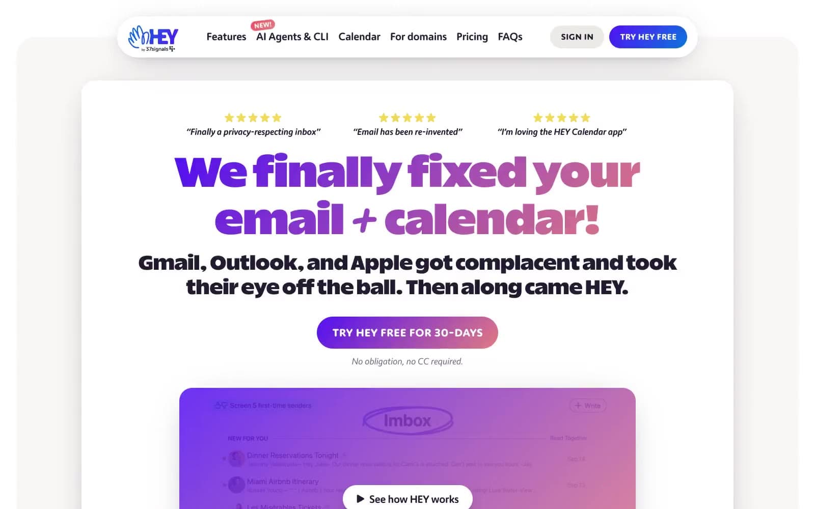
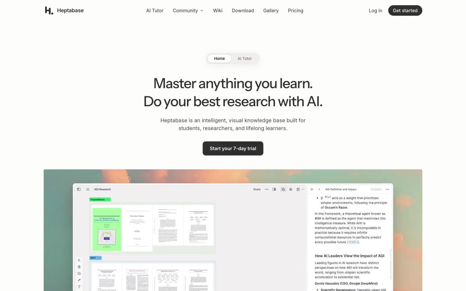
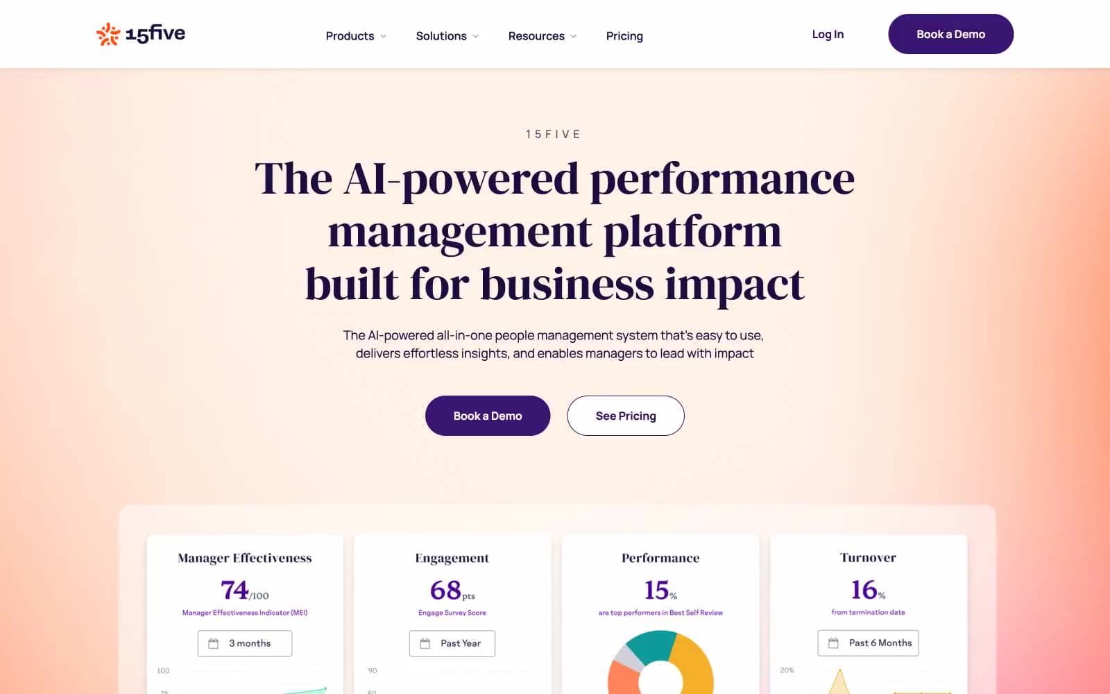
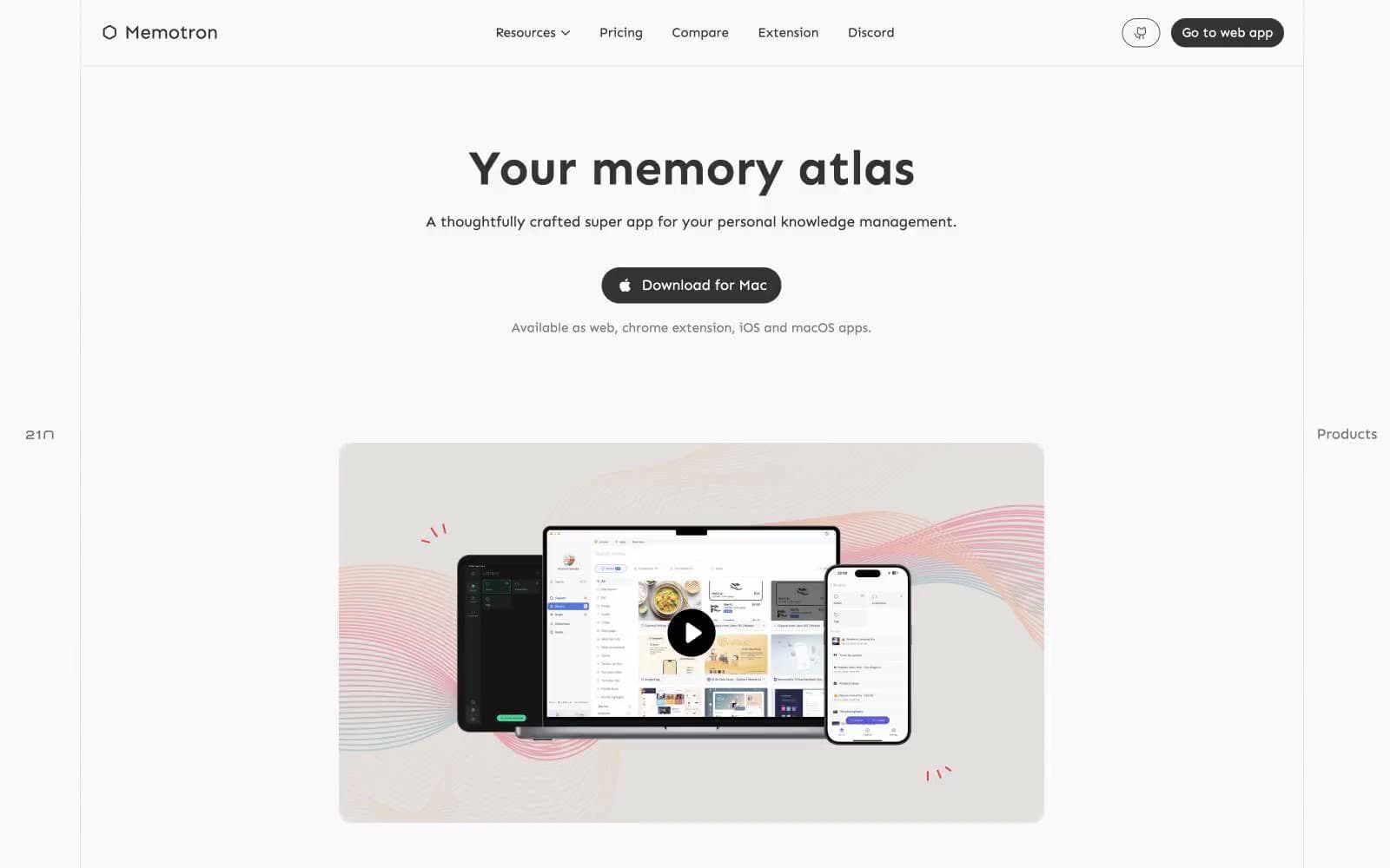
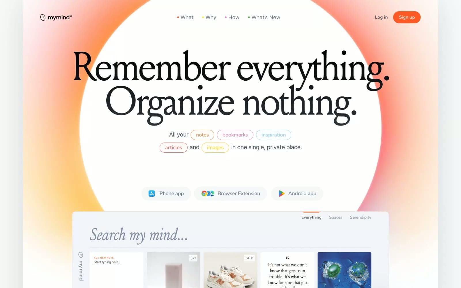
mymind. A warm afternoon light spilling across a private collection of saved thoughts, images, and bookmarks, curated without folders.
- Productivity
- Light theme
- 17 colors
- 10 typefaces
mymind feels like a private journal left open on a warm windowsill — soft, diffuse light bleeding in from orange-to-white gradients that suffuse the entire canvas in ambient warmth. The hero background is a radial bloom of coral-orange fading to white, not a photograph or illustration, just color as atmosphere. Typography does the heavy lifting: Louize serif at 96–140px with aggressive negative tracking (-0.062em) creates editorial weight that editorial magazines would recognize, while Nunito handles micro-UI labels at tracked-out uppercase (0.063em to 0.125em) — the two extremes of the letter-spacing scale are the system's visual signature. Cards sit on tinted pastel surfaces (#e5eaf2, #f3f0e7, #dde9d3) rather than generic white, each hue suggesting a different mood of content. The single chromatic accent — Ember Orange #ff5924 — appears only as an outlined pill button border and brand moment, never as a filled CTA, making it feel like a mark rather than a command.
mymind design system

Brand1
Brand accent — outlined pill buttons, nav bullet markers, section eyebrow text. Never filled. Appears as coral-warm mark, not command.; Decorative gradient on brand moments and section backgrounds — orange to warm amber; Hero section background — radial bloom from intense orange bleeding into white canvas, creating the signature warm ambient atmosphere
Accent1
Inline hyperlinks and underlined interactive text — only chromatic non-orange color in the UI
Neutrals15
Page background (dark sections), primary display text, icon fills
Navigation text items in active/scrolled state
Primary heading text in body sections, secondary display text
Body text, paragraph copy, secondary content text
Tertiary body text, captions, metadata labels
Ghost button text/border (inactive platform buttons: iPhone app, Browser Extension, Android app)
Strikethrough / completed list item text inside product demo cards
Muted nav labels, disabled states, placeholder text
Dividers, subtle borders, structural separators
Green-tinted card backgrounds — third content category surface
Cool-tinted card backgrounds — technology/productivity content cards
Warm off-white card backgrounds — notes, writing content cards
Warm-tinted section backgrounds, alternating with canvas white for rhythm
Primary page canvas — the base surface of all main content sections
Card surfaces, elevated panels, inner containers requiring maximum contrast from canvas
Try a pairing
Pick any two colors from the palette to check whether text stays readable on top.
Aa
Pure White on Cobalt Link
4.64 : 1 contrast
- Body textPasses AA 4.5
- Large textPasses AA 3
- StrictFails AAA 7