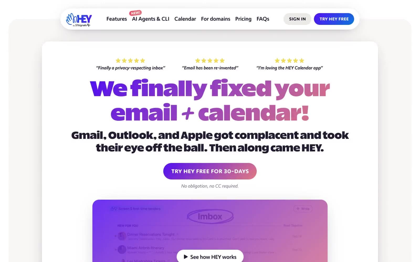
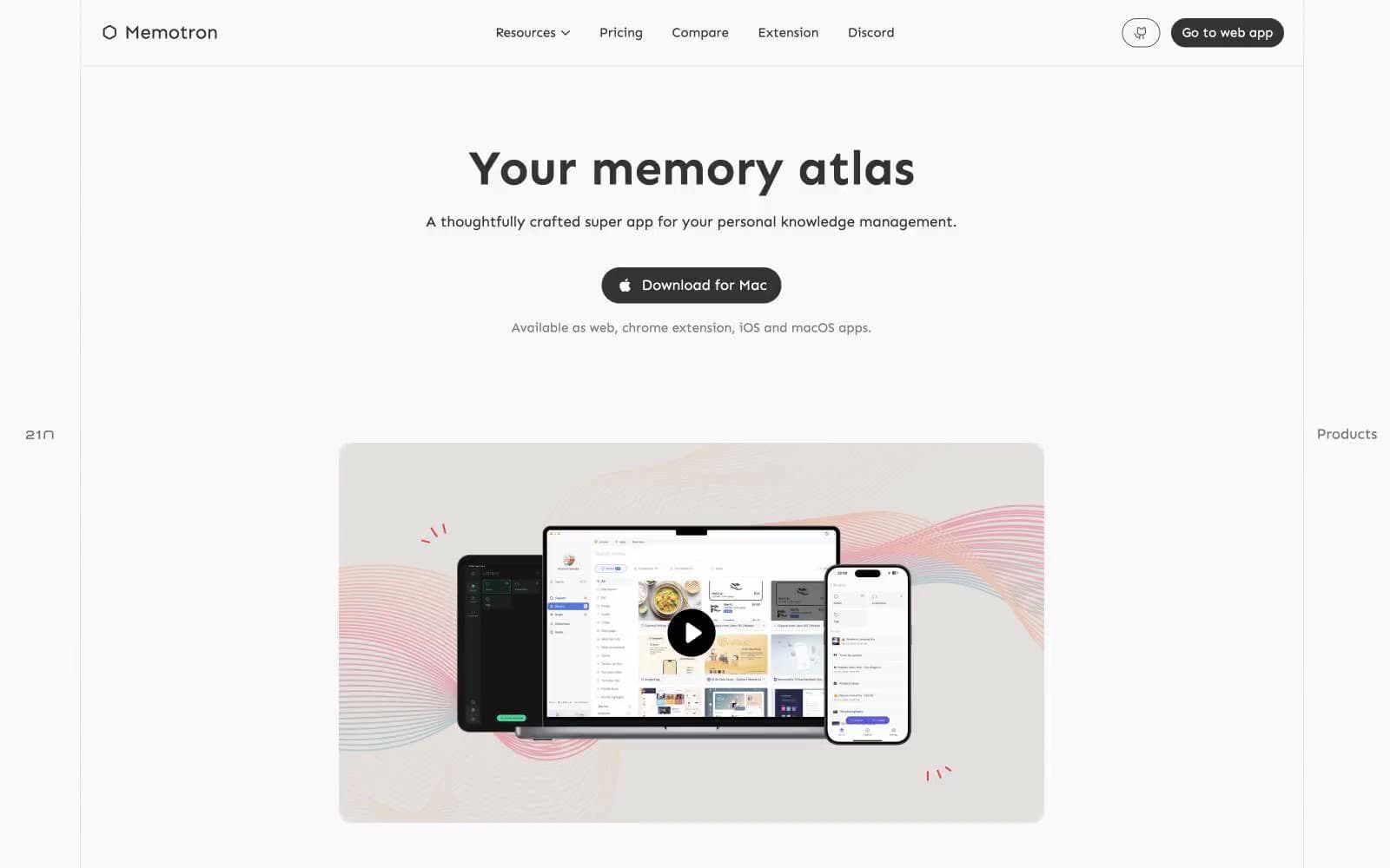
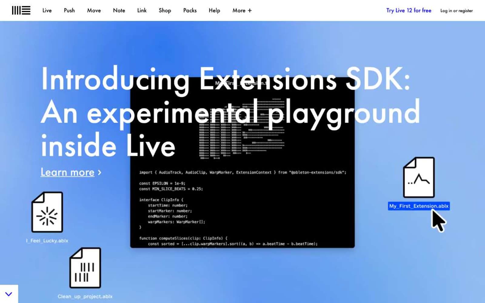
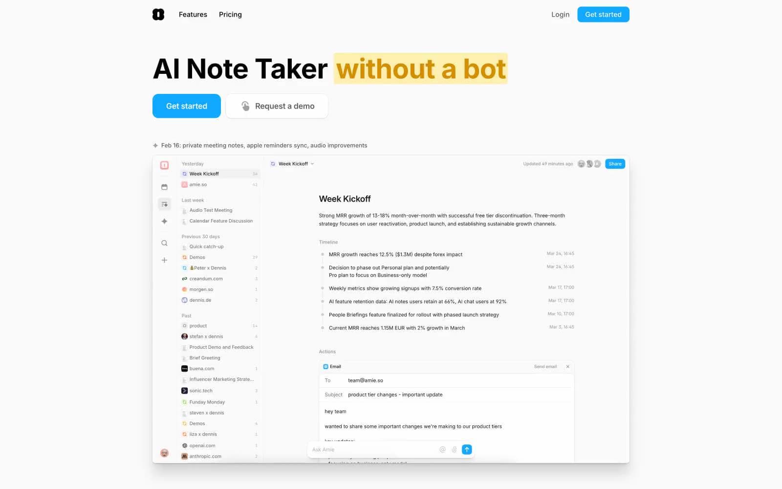
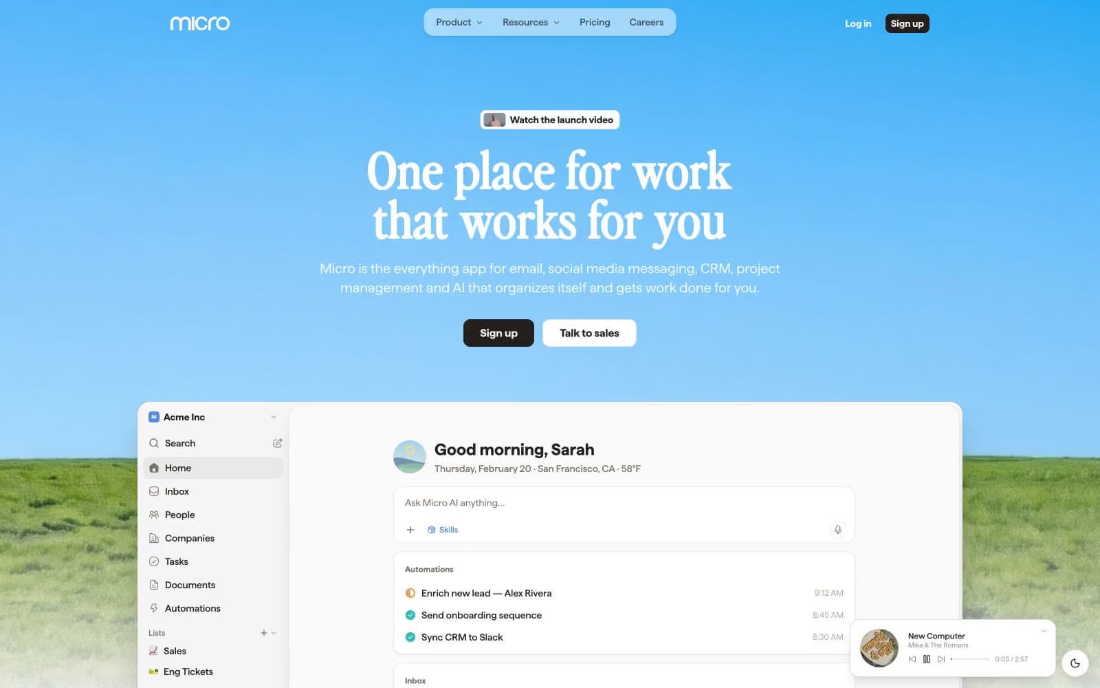
Micro. A calm horizon gradient holding a quiet, ink-on-paper workspace beneath it.
- Productivity
- Light theme
- 18 colors
- 3 typefaces
Micro is a sunrise productivity workspace: a chromatic blue-to-teal gradient sky opens the page, then drops into a quiet, neutral canvas of warm off-white with a near-black ink text color. The signature typographic move pairs a chunky editorial display face (perfectlyNineties) for oversized headlines with a neutral workhorse (haffer) for the dense product UI — giving marketing pages a magazine-cover gravity and product screens a calm, readable density. Color is used as functional punctuation: one azure blue (#518bdb) for actions, plus a pastel accent system (mint, peach, lavender, teal-mist) for soft surface washes and a small multicolor icon palette (teal, pink, red, orange, green) that signals connectivity and categories. Components are flat-first, bordered and gently shadowed rather than heavily elevated; radii cluster at 8px and 14px, with 18px for the larger product cards. The overall feel is a software product that has been allowed to breathe — open, friendly, slightly nostalgic in its display type, but precise in its data-rich product surfaces.
Micro design system

Brand2
Primary action background, focused links, active states, key icon accents — the one chromatic CTA color, vivid enough to register against the warm neutrals; Hero background gradient (Azure Action → Teal Pulse, left to right in oklab) — the signature opening visual
Teal text accent for links, tags, and emphasized short phrases. Do not promote it to the primary CTA color
Accent10
Soft pastel surface tint for feature cards and highlight washes
Soft pastel surface tint, warm counterpart to Mint Wash
Soft pastel surface tint for alternate feature blocks
Subtle teal-tinted surface, bridges brand teal and neutral canvas
Red text accent for links, tags, and emphasized short phrases
Warm icon accent, category color in the multicolor icon palette
Purple-toned icon accent, category color, decorative node edges in the context graph
Dark green border for the live-product mockup's edge treatment, deep botanical accent
Green wash for highlight backgrounds, decorative bands, and soft emphasis behind content. Use as a supporting accent, not as a status color
Green wash for highlight backgrounds, decorative bands, and soft emphasis behind content. Use as a supporting accent, not as a status color
Neutrals6
Primary text, dark CTA backgrounds, dark icon fills — warm near-black rather than neutral black keeps the palette from feeling clinical
Hairline borders on cards and inputs, subtle dividers
Secondary text, icon strokes, muted body copy — warm gray that stays in the same family as Ink Black
Tertiary text, disabled states, low-emphasis icons
Page canvas, card backgrounds, subtle surface fills — the warm off-white that gives the product its paper-like base
Elevated product card surfaces inside the app UI (inbox, context graph nodes) — one level above Paper White
Try a pairing
Pick any two colors from the palette to check whether text stays readable on top.
Aa
Ink Black on Teal Pulse
6.93 : 1 contrast
- Body textPasses AA 4.5
- Large textPasses AA 3
- StrictFails AAA 7