Loom. A bright, pill-shaped communication booth on white marble, lit by one confident blue lamp.
- Productivity
- Light theme
- 15 colors
- 2 typefaces
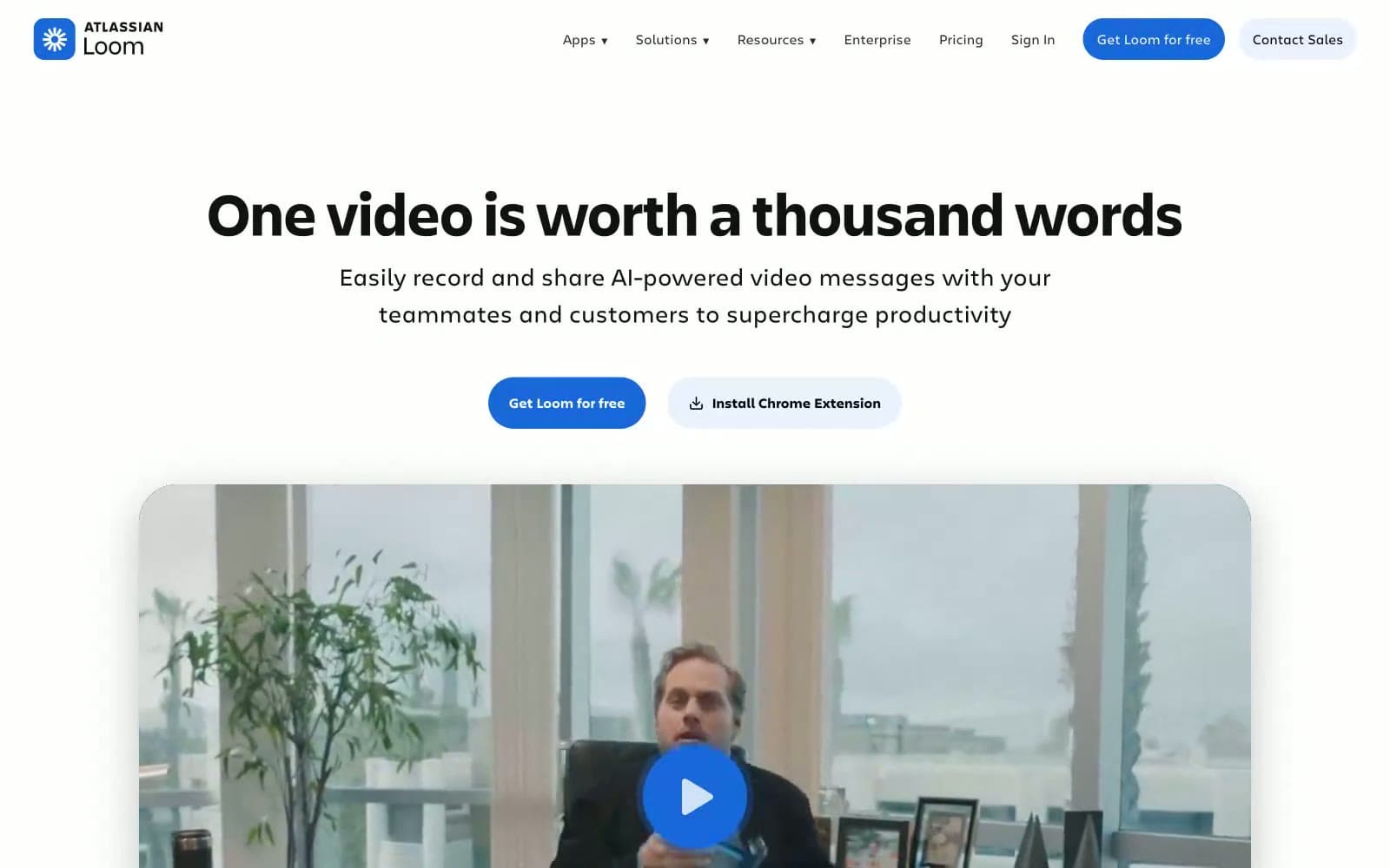
Loom uses a sunlit, airy communication-workspace language — a clean white canvas with generous breathing room, fully pill-shaped controls, and a single saturated blue (#1868db) that threads through navigation, links, and buttons to create one consistent interactive color. The design relies on soft pastel surface tints — pale blue #e9f2fe, buttery cream, mint, and lavender — to differentiate content zones without breaking the bright, welcoming atmosphere. Typography is restrained and editorial: Charlie Display at weight 700 anchors headlines in compact, tight-leading forms while Charlie Text handles body and UI at 15–19px, giving the product a confident voice that never feels heavy. Cards use large rounded corners (~42–69px) and layered ambient shadows to feel like physical surfaces, and the 9999px pill shape carries the entire interactive vocabulary — every clickable element is a capsule.
Loom design system

Brand1
Blue supporting accent for decorative details and low-frequency emphasis. Do not promote it to the primary CTA color
Accent7
Dark accent for content card backgrounds and illustration strokes
Decorative purple accent for icon strokes and illustration fills
Warm orange accent for notification icons, illustration highlights, and callout strokes
Green supporting accent for decorative details and low-frequency emphasis. Use as a supporting accent, not as a status color
Pale cream surface for content card backgrounds and soft highlight washes
Green supporting accent for decorative details and low-frequency emphasis. Use as a supporting accent, not as a status color
Dark blue surface for inverted content cards and feature panels
Neutrals7
Hard text, high-contrast borders, and icon fills
Primary text color for headings and body copy
Secondary text and icon strokes; slightly softer than Ink Black for muted labels
Supporting neutral for secondary UI, dividers, and muted labels. Do not promote it to the primary CTA color
Hairline dividers and subtle card borders
Light blue surface for testimonial cards, banner backgrounds, and soft feature zones
Primary page and card background; the default canvas
Try a pairing
Pick any two colors from the palette to check whether text stays readable on top.
Aa
Paper White on Signal Blue
5.20 : 1 contrast
- Body textPasses AA 4.5
- Large textPasses AA 3
- StrictFails AAA 7