
June. Midnight ink on cream paper.
- Productivity
- Light theme
- 9 colors
- 2 typefaces
June uses a soft editorial language: warm off-white canvas, generous spacing, and SF Pro Rounded giving every line of text a gentle, book-like friendliness. The signature is a deep midnight violet (#2a2a63) that carries headlines, body text, and border accents — never shouting, always present, like ink on cream paper. A single vivid periwinkle (#6868f7) is reserved for the rare accent surface, creating punctuation against the otherwise monochrome body. Components are flat and rounded (12–20px radii), elevated by hairline borders rather than drop shadows, giving the interface a notebook-page weight. Layouts breathe: centered single-column articles, comfortable line-height, and vertical rhythm that treats reading as the primary interaction.
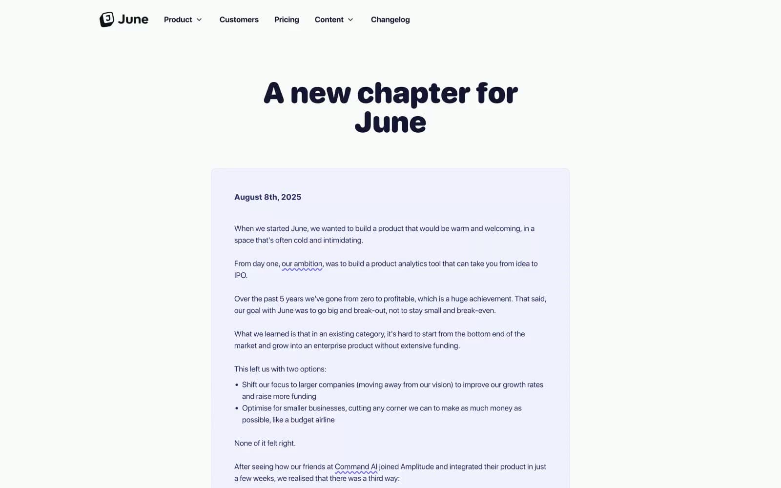
June design system

Brand2
Headings, body text, link text, and border accents — the signature ink color
Primary text, icon strokes, link color, and high-emphasis surface elements
Accent1
Rare vivid accent surface for highlighted cards or callout blocks — a single bright note against the monochrome body
Neutrals6
Secondary text and muted surface details
Tertiary shadow tint for layered elevation
Subtle shadow base and low-contrast surface tone
Hairline borders, dividers, card edges, and structural separators
Soft tinted card surface for content blocks and feature containers
Page background and elevated card surface — the warm white base layer
Try a pairing
Pick any two colors from the palette to check whether text stays readable on top.
Aa
Cream Canvas on Midnight Violet
12.50 : 1 contrast
- Body textPasses AA 4.5
- Large textPasses AA 3
- StrictPasses AAA 7























