
Honk. Cobalt billboard with a yellow highlighter slash.
- Productivity
- Light theme
- 8 colors
- 2 typefaces
Honk operates on a saturated blue-canvas design system built for a messaging product that wants energy, not restraint. The entire viewport is a single electric blue field (#008fff) with white and signal-yellow typography floating on it — no warm grays, no soft cards, no light-mode chrome. Headlines are a custom heavy display face at 52px, tight-tracked, with one or two words flipped to vivid yellow (#ffe400) so key terms punch out of the headline. Surfaces are minimal: everything either sits directly on the blue or uses a hard 16px-radius white panel as a notification/UI element. The phone mockup carries the only secondary color (game-green) and floats with subtle decoration — speech bubbles, emoji-shaped UI nubs. The system reads as playful, confident, and loud on purpose: it is anti-corporate, anti-minimal, and uses color saturation as the primary brand carrier instead of typography or layout sophistication.
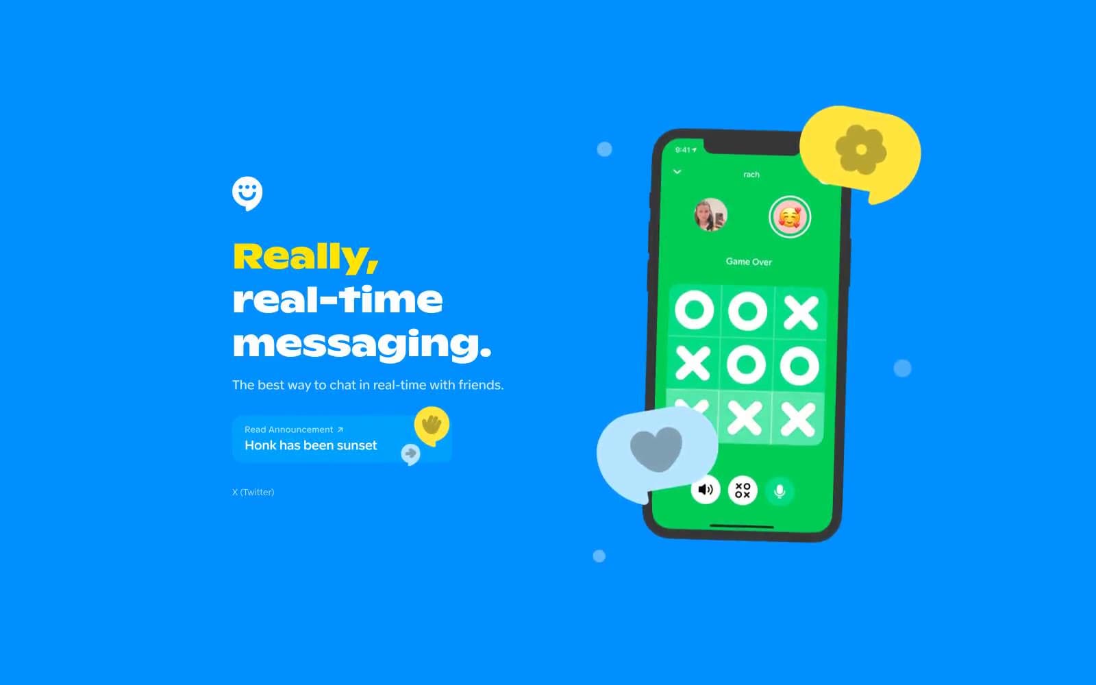
Honk design system

Brand2
Full-viewport page canvas, hero background, all top-level sections — the electric blue IS the brand surface, not a secondary accent
Secondary blue for gradient bands, large decorative shapes, and depth layers behind the primary canvas
Accent2
Accent words inside headlines, heading border underlines, and highlight punctuation — the only chromatic accent on the blue field, used sparingly for emphasis rather than decoration
Phone screen content (in-game UI inside device mockups) — a single-hue secondary color reserved for product-internal screens so the blue/yellow/white trio stays clean on the marketing surface
Neutrals4
SVG fills, graphic detail, maximum-contrast text where the design needs to drop to absolute black
Primary text on light surfaces, dark borders, near-black detail work — used where text leaves the blue field
Secondary graphic fills, dark illustration detail, softer-than-black accents in SVG work
Hairline borders, dividers, input outlines, and card edges on light surfaces. Do not promote it to the primary CTA color
Try a pairing
Pick any two colors from the palette to check whether text stays readable on top.
Aa
True Black on Honk Blue
6.37 : 1 contrast
- Body textPasses AA 4.5
- Large textPasses AA 3
- StrictFails AAA 7























