
Hellotime. Monochrome editorial command center.
- Productivity
- Light theme
- 11 colors
- 2 typefaces
Hellotime is a near-monochrome productivity surface: white canvas, near-black type, and one electric blue accent that appears almost exclusively as a gradient highlight on hero headlines and key words. The visual system relies on typographic weight contrast rather than color variety — massive 700-weight headlines (64–80px) sit beside compact 400–500 body text, creating a clear hierarchy without decorative noise. Surfaces are flat with hairline borders (1px, #c8cad0) and 16px radii; elevation is avoided in favor of crisp edges and generous whitespace. The dark filled button (#25272d) is the only chromatic UI element besides the green logo mark and blue gradient accent, making every action feel deliberate rather than decorative.
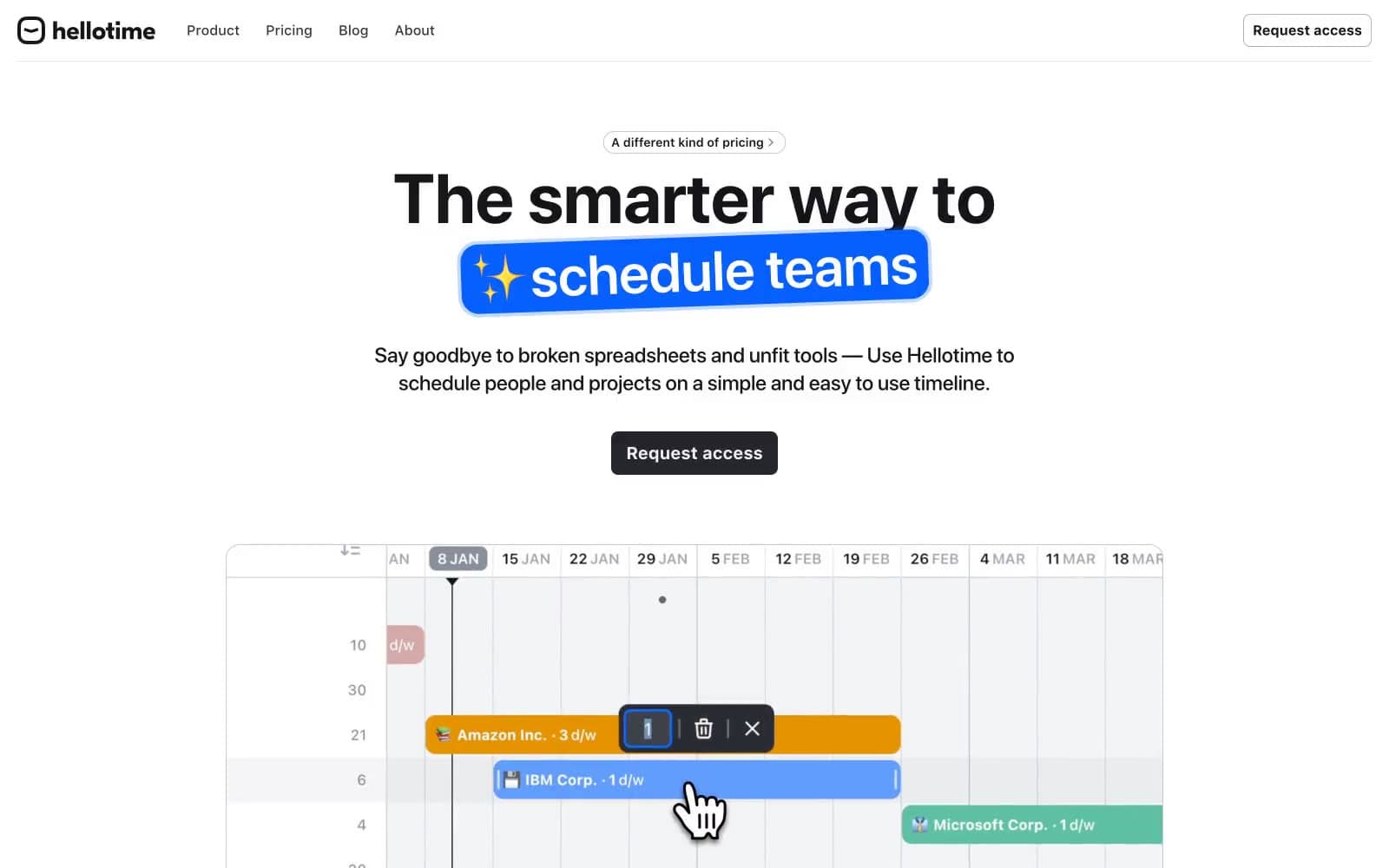
Hellotime design system

Brand2
Brand logo accent stroke, brand identity marker — vivid green checkmark against monochrome
Brand accent — the gradient highlight on hero keywords; also product UI project bars and chart accents
Neutrals9
Primary text, icon strokes, hairline borders, footer text — the dominant non-background color in the system
Primary action button fill and border, nav top-strip emphasis — the only dark surface, reserved for CTAs
Nav link text color, slightly lifted from #151619 for a softer navigation feel
Secondary/muted text, link text, subdued borders, placeholder labels — recedes so body copy reads first
Outlined button border at rest, ghost control stroke
Card and component borders, subtle dividers, icon outlines at rest — the default hairline
Dividers between sections, secondary surface tint, input borders in resting state
Card surfaces, subtle elevated panels, button hover wash, input backgrounds
Page canvas, nav background, inverted button text, heading reverse-color treatments
Try a pairing
Pick any two colors from the palette to check whether text stays readable on top.
Aa
Ink on Signal Green
4.80 : 1 contrast
- Body textPasses AA 4.5
- Large textPasses AA 3
- StrictFails AAA 7























