
Helloivy. Risograph-printed design journal on cream paper.
- Productivity
- Light theme
- 5 colors
- 4 typefaces
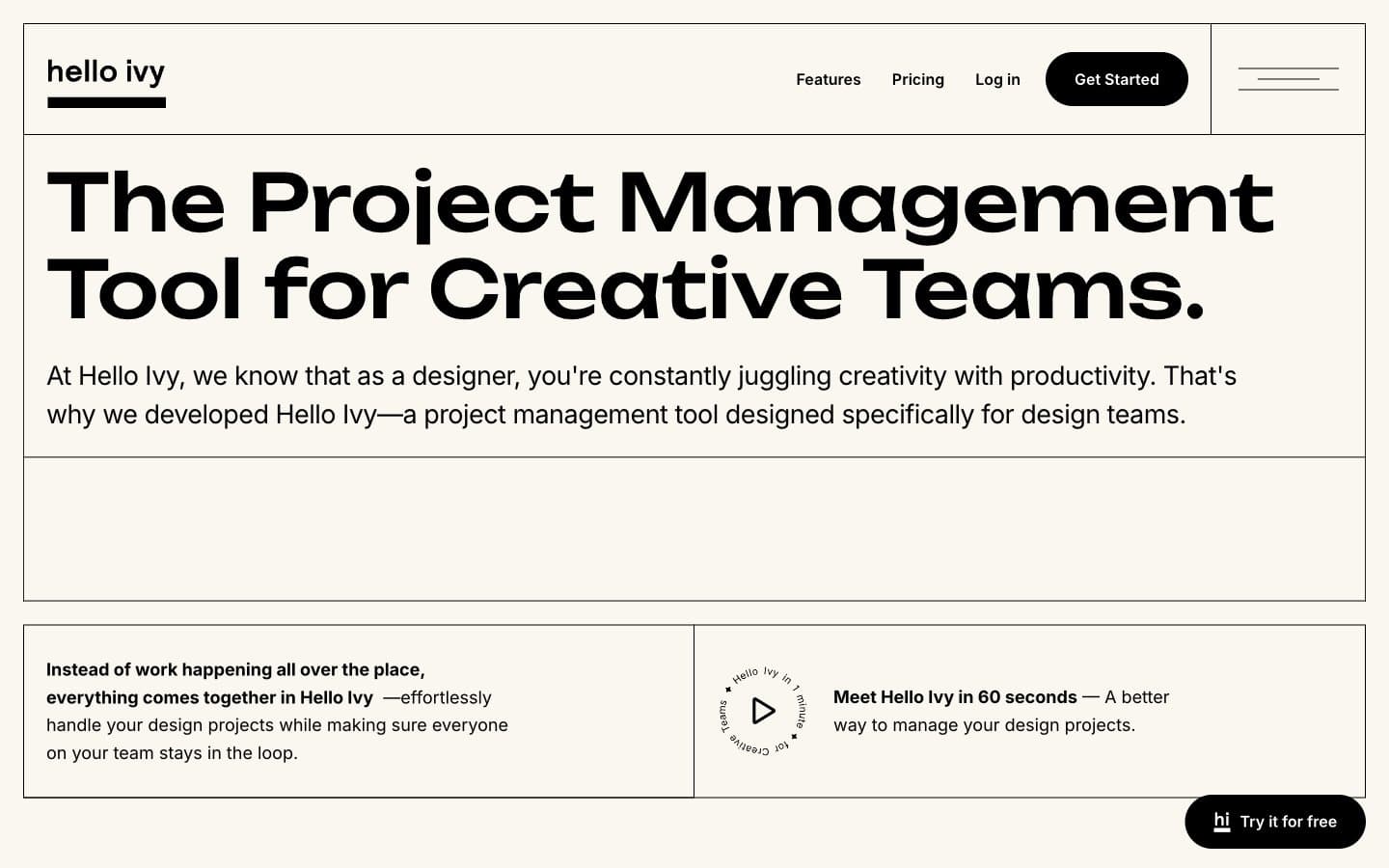
Helloivy uses a warm-cream editorial canvas with near-monochrome ink-black typography, giving the product a print-magazine feel rather than typical SaaS sterility. The display typeface (Unbounded) is geometric and slightly playful, carrying personality that the restrained palette deliberately withholds; Inter does the quiet labor of body, UI, and labels. Surfaces are flat — no shadows, no gradients — and the only elevation comes from filled black pills sitting on cream, or muted gray cards containing product commentary. Color is rationed: the cream canvas (#faf6f0) anchors the page, black owns headlines and primary actions, a single slate gray (#5e697f) handles secondary text, and white is reserved for product mockup surfaces. Everything else is space, type, and the occasional thin hairline border.
Helloivy design system

Neutrals5
Headlines, body text, primary filled buttons, logo mark, dividers, icons — the dominant structural color carrying almost all information
Secondary paragraph text, sub-labels, low-emphasis copy where Slate Whisper isn't deployed — fills the gap between ink-black headlines and whisper-gray annotations
Secondary body text, muted descriptions, helper text, subdued labels — the single desaturated accent that softens body copy without competing with headlines
Page canvas, section backgrounds, card surfaces — the warm off-white ground that makes the whole site read like a print artifact rather than a screen
Product mockup surfaces, card-internal backgrounds, floating badge fills — the crisp inset color that product UI sits on, creating a paper-on-paper layering effect against the cream canvas
Try a pairing
Pick any two colors from the palette to check whether text stays readable on top.
Aa
Pure White on Ink Black
21.00 : 1 contrast
- Body textPasses AA 4.5
- Large textPasses AA 3
- StrictPasses AAA 7























