Headspace. Sunlit wellness retreat on warm paper.
- Productivity
- Light theme
- 18 colors
- 1 typeface
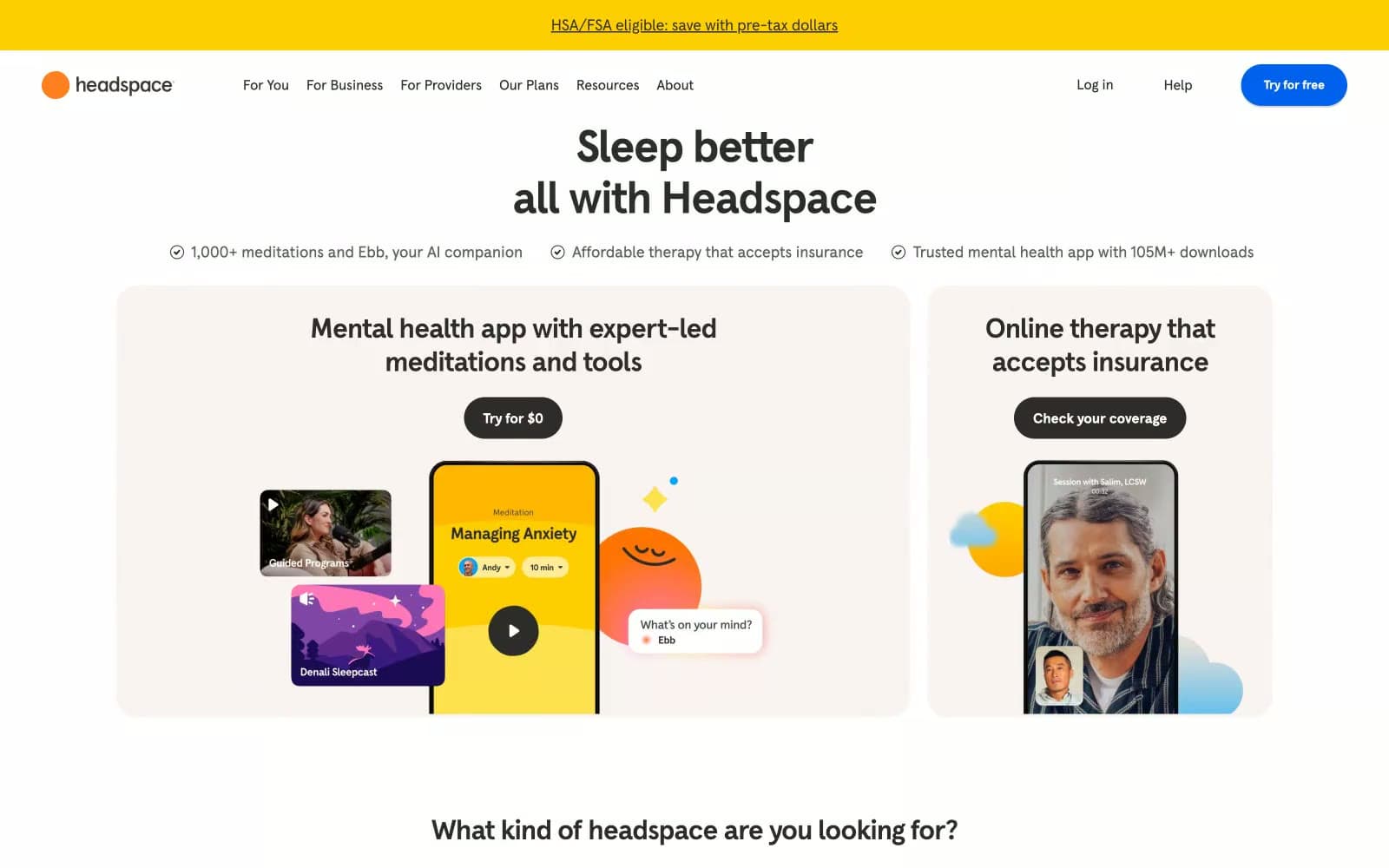
Headspace lives in a sunlit wellness retreat on warm paper: a cream canvas (#f9f4f2) that breathes, bold rounded surfaces, and tightly tracked headlines that feel confident and calm rather than clinical. The palette is predominantly achromatic with a warm dark text scale (#2d2c2b, #44423f) that never goes cold-black on body copy, and color is deployed as deliberate emotional punctuation — Headspace yellow for energy, electric blue for the primary signup, and a deep violet for contemplative moments. Radii are generous: 16-32px on cards and feature blocks, 8px on buttons and inputs, and 9999px (800px in tokens) for pills and circular elements, giving every surface a soft, huggable quality. Typography is a single custom geometric sans (Headspace Apercu) at weights 400/500/700 with negative letter-spacing that tightens as sizes scale up, producing headlines that feel sculpted rather than shouted.
Headspace design system

Brand5
Headspace logo mark — the single warm dot that anchors the brand identity across all surfaces
Violet supporting accent for decorative details and low-frequency emphasis. Do not promote it to the primary CTA color
Headspace signature brand yellow — top banner backgrounds, feature card highlights, optimistic punctuation
Contemplative illustration fills, meditation-related visual moments — the serious counterpart to the cheerful yellow
Deep illustration fills paired with Deep Indigo, gradient companion, night-mode meditation contexts
Accent3
Mid-tone violet for illustration gradients and decorative fills
Lighter violet in illustration gradients — soft, warm purple
Bright sky blue used in category icons and decorative illustration accents
Neutrals10
True black for maximum-contrast dark buttons and bold display text
Supporting neutral for secondary UI, dividers, and muted labels. Do not promote it to the primary CTA color
Secondary text, muted UI labels, icon strokes, nav links
Tertiary text, footer body, helper copy, low-emphasis borders
Disabled states, lowest-emphasis text, decorative dividers
Hairline list dividers, subtle structural separators
Input border, focused field rings, checkbox borders
Card borders, input borders, subtle elevation shadows — the neutral that separates surfaces on cream
Page background, large section surfaces — the warm paper tone that sets the entire mood
Card surfaces, elevated panels, input fills, inverse text on dark buttons
Try a pairing
Pick any two colors from the palette to check whether text stays readable on top.
Aa
Soft Black on Brand Orange
7.82 : 1 contrast
- Body textPasses AA 4.5
- Large textPasses AA 3
- StrictPasses AAA 7