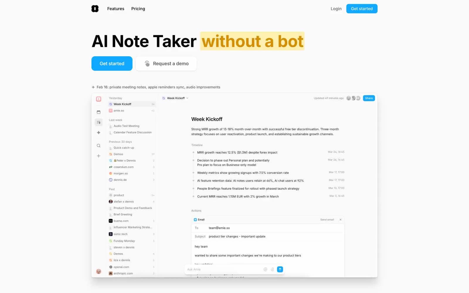
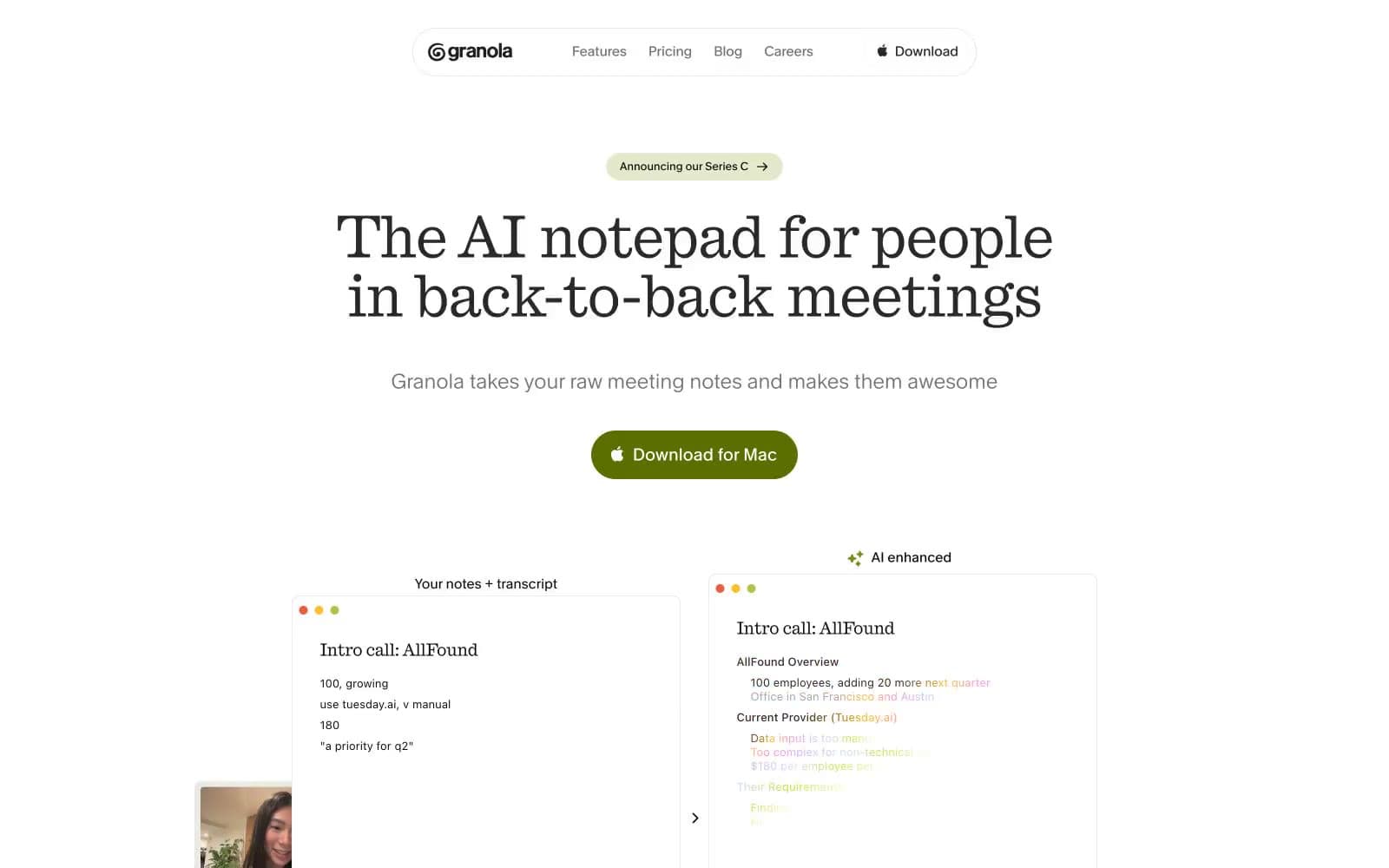
Granola. Granola reads like a well-worn Moleskine open on a sunlit desk: serifed headlines with editorial gravity, organic green accents like ink from a plant-based pen, and hairline-ruled card borders that suggest hand-drawn note margins.
- Productivity
- Light theme
- 18 colors
- 4 typefaces
Granola pairs a serif editorial headline face (Quadrant) with a humanist mono-inflected UI face (Melange) on a near-white canvas — the tension between old-print warmth and digital utility is the defining atmosphere. The chromatic system is almost entirely olive-green: a single muted-yellow-green (#b2c248 surface, #5b6f00 filled CTA, #788c15 border accents) against hairline-bordered white cards and an off-white page. Everything else is achromatic — dark ink, mid-gray text, and 0.5px solid borders that whisper rather than rule. Typography does the heavy lifting: Quadrant at -0.015em tracking for display sizes drops weight at 68px to feel like editorial print, while Melange's 0.01em tracking at UI sizes keeps body text crisp and warm. The result is a notepad-like surface — quiet, high-contrast text on parchment-adjacent white — punctuated by bursts of organic chartreuse green.
Granola design system

Brand4
Large decorative accent surfaces in product UI mockups — the vivid chartreuse that signals AI-enhanced state
Primary download/action button fill — deep olive-green that feels botanical and grounded against white, not techy
Accent borders, focus-adjacent decorative strokes, icon tints in the green family
Secondary pill button backgrounds (announcement badge, iPhone download) — the lightest olive wash
Accent4
Social proof badge icons, X/Twitter brand color used in testimonial cards
Inline text links within body copy and social testimonial cards
Orange wash for highlight backgrounds, decorative bands, and soft emphasis behind content. Use as a supporting accent, not as a status color
Orange outline accent for tags, dividers, and focused UI edges. Use as a supporting accent, not as a status color
Neutrals10
Primary heading and body text — near-black with the faintest warm undertone that keeps it from feeling harsh
Nav text, footer text, secondary headings, filled icon fills; Decorative gradient on AI-enhanced copy indicators — transitions from dark charcoal through amber, pink, lavender, sky, chartreuse, then fades transparent
Medium-emphasis link and body text, supporting secondary labels
Tertiary nav labels, metadata, muted helper text, secondary icon fills
List secondary text, overlay-context captions
Button borders on white-fill controls, card-level contained borders
Hairline dividers, card borders, rule lines across all UI contexts — the dominant structural border color
Soft hover state fills, subtle input surface overlays
Page background and disabled input surfaces — the barely-warm off-white that reads as paper, not screen
Card backgrounds, nav surface, input fills, elevated overlays
Try a pairing
Pick any two colors from the palette to check whether text stays readable on top.
Aa
Midnight Ink on Olive Press
9.80 : 1 contrast
- Body textPasses AA 4.5
- Large textPasses AA 3
- StrictPasses AAA 7