
Goodnotes. A blank notebook page where every tool snap into place without decoration.
- Productivity
- Light theme
- 16 colors
- 2 typefaces
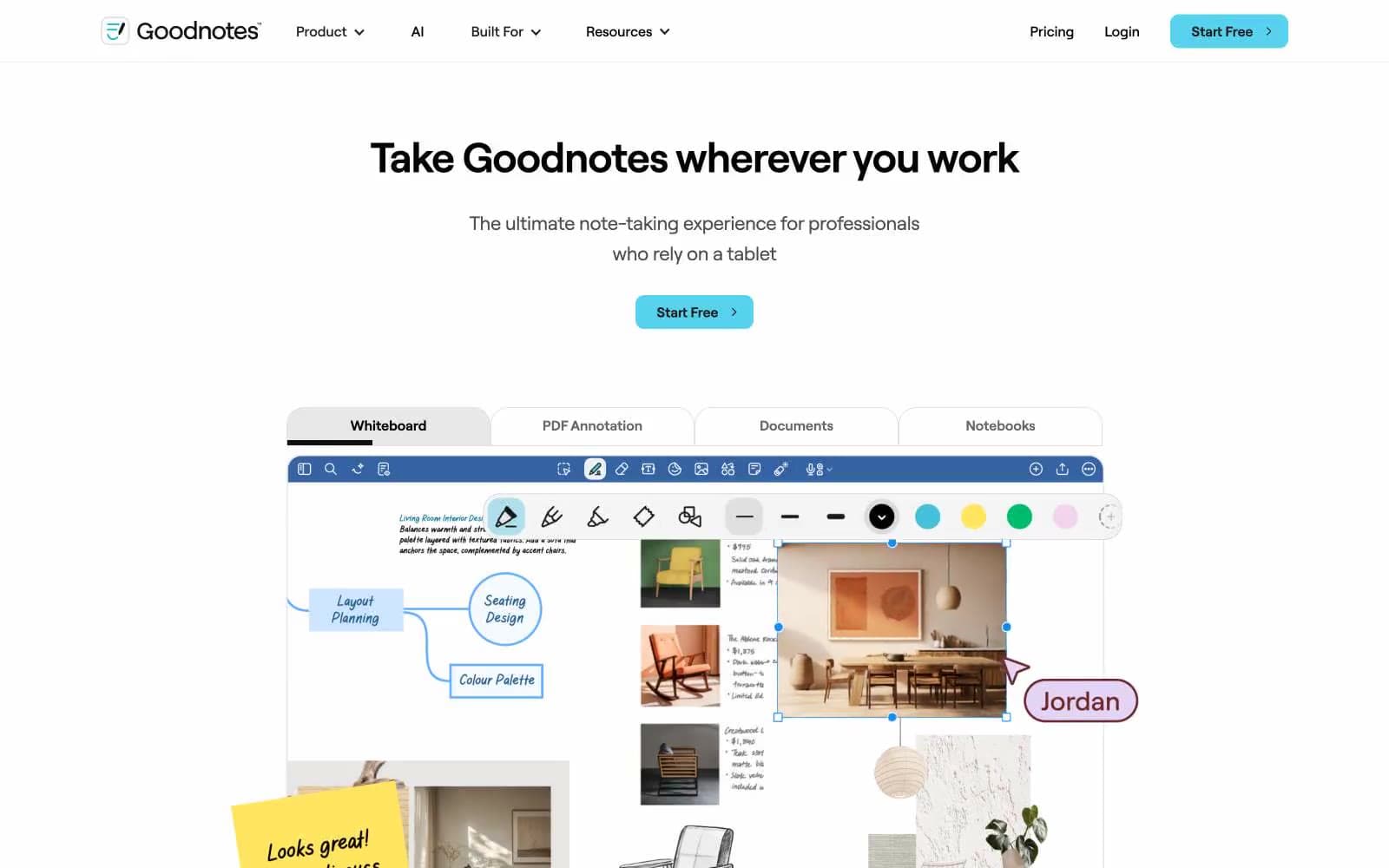
Goodnotes runs on a white canvas with near-zero visual noise: almost no shadow, no gradient, and a deliberately spare chromatic palette. The one saturated color — a cyan/aqua (#57d2ee) — appears exclusively on the primary CTA button, making action feel switched-on against an otherwise monochrome field. Typography is done entirely in Roobert, a custom rounded geometric sans, with pronounced negative tracking at display sizes (−0.05em) that pulls large headlines tight. Product UI screenshots carry the visual weight; the surrounding page chrome stays flat, text-forward, and densely typeset at small sizes. Borders rather than shadows define surfaces, and the single 10px radius applies universally to buttons, cards, and UI chrome.
Goodnotes design system

Brand5
Blue action color for filled buttons, selected navigation states, and focused conversion moments.
Brand surface wash, teal background sections
Outlined button borders, soft teal ring accents
Blue outline accent for tags, dividers, and focused UI edges.
Hyperlinks and underline accents in body copy
Accent1
Text highlight wash — mimics physical highlighter pen on note-taking UI screenshots
Neutrals10
Primary headlines, body text, borders on UI chrome
Dark nav backgrounds, dark section surfaces, link text in dark contexts
Ghost button text and borders, secondary headings, icon strokes
Badge text, mid-weight secondary content
Body copy on cards, secondary descriptive text
Tertiary text, subtle UI labels
Muted helper text, captions, de-emphasised labels
Card outlines, modal borders, container edges
Tab underlines, nav separators, light hairline dividers
Page background, card backgrounds, button text on cyan CTA
Try a pairing
Pick any two colors from the palette to check whether text stays readable on top.
Aa
Midnight Ink on Aqua Spark
11.86 : 1 contrast
- Body textPasses AA 4.5
- Large textPasses AA 3
- StrictPasses AAA 7























