
Getharvest. Warm cream canvas, white floating cards, and one vivid orange flame.
- Productivity
- Light theme
- 14 colors
- 2 typefaces
Harvest uses a sunlit productivity-workspace language: warm cream canvas (#fff8f1) replaces the typical SaaS white, giving every screen a golden-hour warmth, while white cards and panels float above that base for product surfaces. One vivid orange (#fa5d00) carries all the energy — every CTA, link, icon accent, and brand border — making it the only chromatic decision in an otherwise achromatic system of warm grays. Typography is confident and editorial: a geometric sans (MuotoWeb) for everything functional, with a serif display face (Monarch) reserved for hero-grade emotional moments. Components are soft and tactile: 16–20px radii, low warm-tinted shadows, generous breathing room, and decorative orange wash gradients that suggest movement without ever competing with content.
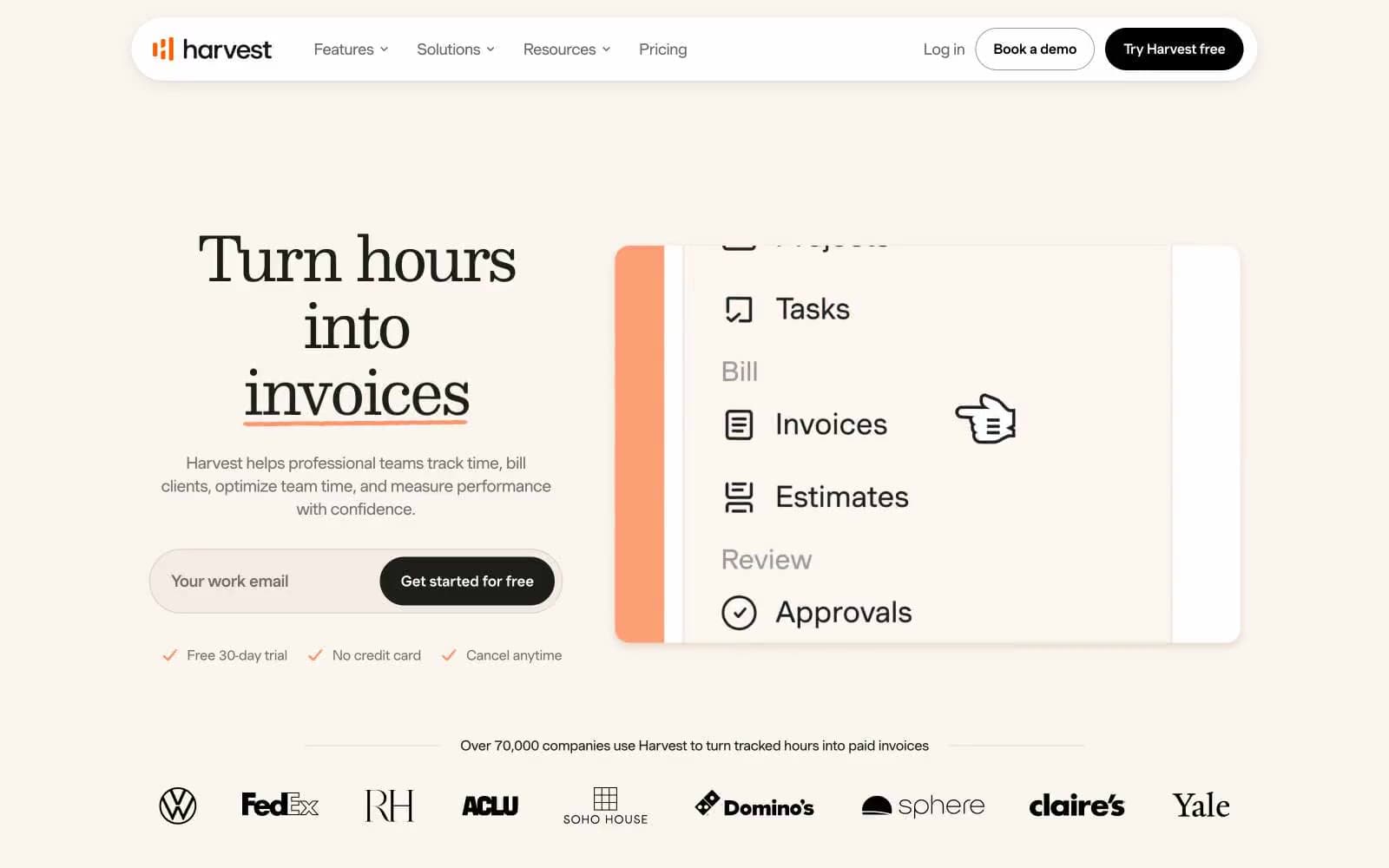
Getharvest design system

Brand1
Primary CTA fill, active nav indicator, brand link color, heading underlines — warm vermilion that reads as energetic but not aggressive, the single chromatic decision in an otherwise achromatic system
Accent2
Soft warm highlight wash on cards, decorative glow tint behind product UI — never functional, only atmospheric
Warm-tinted card shadow color, subtle image shadow — the shadow hue is not neutral gray but matches the cream base
Neutrals11
Primary text, icon strokes, nav borders, card headings — warm near-black rather than pure #000, preserves the system warmth
Strong secondary text, emphasized muted labels
Secondary body text, list items, muted icon strokes
Helper text, placeholder-adjacent copy, low-priority borders
Tertiary body text, decorative strokes, subtle metadata
List borders, tertiary structural lines
Disabled text, decorative borders, very low-priority separators
Input borders, form field outlines at rest
Hairline dividers, subtle borders on neutral surfaces
Page background, hero section base, nav backdrop — the signature warm cream that replaces standard SaaS white
Card surfaces, input fields, elevated panels, button text on orange fill
Try a pairing
Pick any two colors from the palette to check whether text stays readable on top.
Aa
Ink Black on Harvest Flame
5.28 : 1 contrast
- Body textPasses AA 4.5
- Large textPasses AA 3
- StrictFails AAA 7























