Getclockwise. A warm, editorial announcement, not a product page.
- Productivity
- Light theme
- 8 colors
- 2 typefaces
Clockwise speaks in a warm, paper-like voice: cream canvas, deep forest-green ink, and generous white space that lets short paragraphs breathe. The design is editorial rather than product-UI — think a well-typeset letter rather than a dashboard. A single custom display face (PP Mori) carries every heading at 52–66px with tight line-heights, while Inter handles body text with a subtle -0.03em tracking. The palette is ruthlessly restrained: nearly every visual element is either warm off-white, deep green ink, or a hairline border. Pill-shaped radii (800px) wrap around tags, buttons, and logo containers, giving every rounded element the same soft capsule form. Interactivity is whisper-quiet — no filled CTA buttons, no heavy shadows, no gradients — just a vivid emerald accent (#039861) that appears on ghost-style links and section rules.
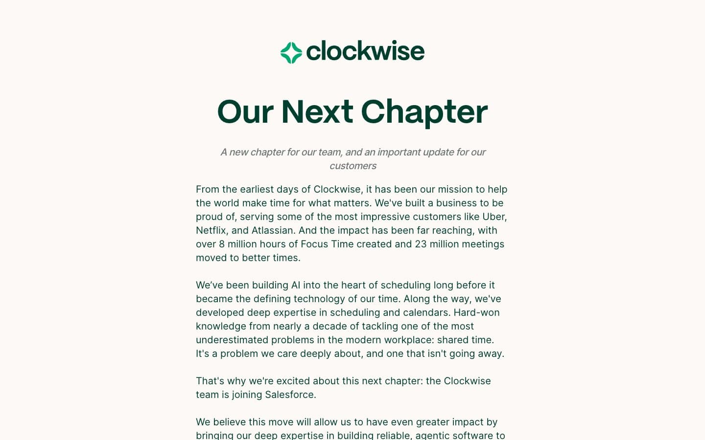
Getclockwise design system
Brand1
Primary brand color, headlines, logo mark, body emphasis, heavy borders, dark surface blocks — deep emerald reads as ink-stamp rather than digital green, anchoring every page with editorial weight
Accent1
Outlined/ghost link borders, thin section rules, and occasional icon accents — the only chromatic accent in the system, used sparingly so it reads as a signal rather than decoration
Neutrals6
Primary body and link text on light surfaces — softened pure black to feel printed rather than digital
Muted body text, secondary metadata, helper copy
Medium-weight borders, icon strokes, secondary dividers
Light borders, dividers, accordion separators, subtle structural rules
Page background, document body — warm off-white gives the entire site a paper-like, non-screen feel
Card and elevated surfaces layered above the cream canvas
Try a pairing
Pick any two colors from the palette to check whether text stays readable on top.
Aa
Pure Paper on Forest Ink
12.00 : 1 contrast
- Body textPasses AA 4.5
- Large textPasses AA 3
- StrictPasses AAA 7























