
Free Resume Builder. Fresh worksheet with blue ballpoint.
- Productivity
- Light theme
- 17 colors
- 1 typeface
Resume.io is a confident, document-first utility: a near-pure white canvas where a single vivid blue is the only voice allowed to interrupt the page. The system is built on a restricted chromatic diet — one near-black ink, one primary blue, one violet — with every other surface expressed as the faintest wash of color (mint, peach, lavender) to separate content blocks without adding noise. Typography is geometric and tightly set: a custom sans (TT Commons) carries the entire hierarchy from 14px helper text to a 67px display, and the lack of drop shadows or gradients keeps everything feeling like a productivity tool rather than a marketing site. The result reads like a fresh worksheet — clean paper, blue ballpoint annotations, the occasional green check.
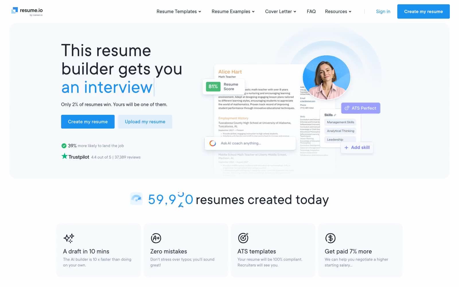
Free Resume Builder design system

Brand2
Blue supporting accent for decorative details and low-frequency emphasis. Do not promote it to the primary CTA color
Hover/pressed state of Signal Blue, darker link color for visited emphasis
Accent4
Decorative icon accent, step indicator strokes, secondary highlight on cards
Dark template preview surface, deep contrast callout — the only near-black accent beyond Ink
Light supporting surface for subtle backgrounds and section separation. Use as a supporting accent, not as a status color
Supporting neutral for secondary UI, dividers, and muted labels. Use as a supporting accent, not as a status color
Neutrals11
Headlines, headings, footer brand mark — darker than Ink for emphasis lift on large type
Body text, primary copy, icon strokes, footer text — the default ink across all running content
Secondary body text, descriptions, helper copy — sits between Ink and Fog
Muted metadata, captions, inactive nav items, subtle icon tint
List dividers, lightest neutral text, disabled borders
Hairline borders, nav separators, card outlines on tinted backgrounds
Subtle button borders, ghost-control outlines, secondary surface
Light supporting surface for subtle backgrounds and section separation. Use as a supporting accent, not as a status color
Tinted section background for tool/feature blocks — barely-there violet breath
Hero section wash, feature row background, subtle surface lift below cards
Page background, card surfaces, button text on colored fills — the base canvas
Try a pairing
Pick any two colors from the palette to check whether text stays readable on top.
Aa
Carbon on Signal Blue
5.58 : 1 contrast
- Body textPasses AA 4.5
- Large textPasses AA 3
- StrictFails AAA 7























