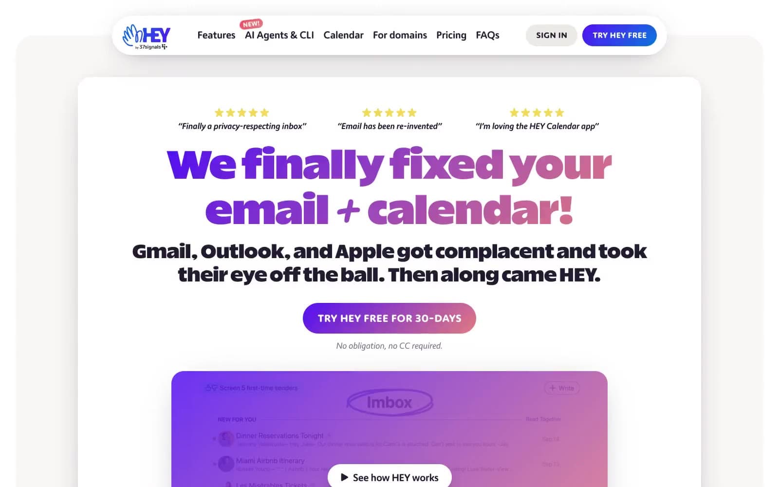
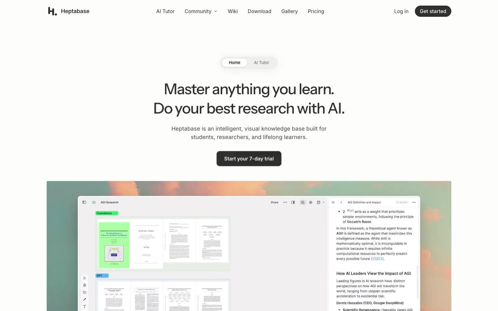
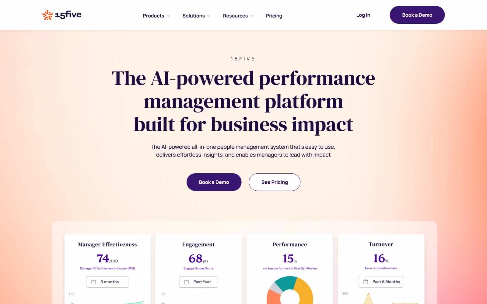
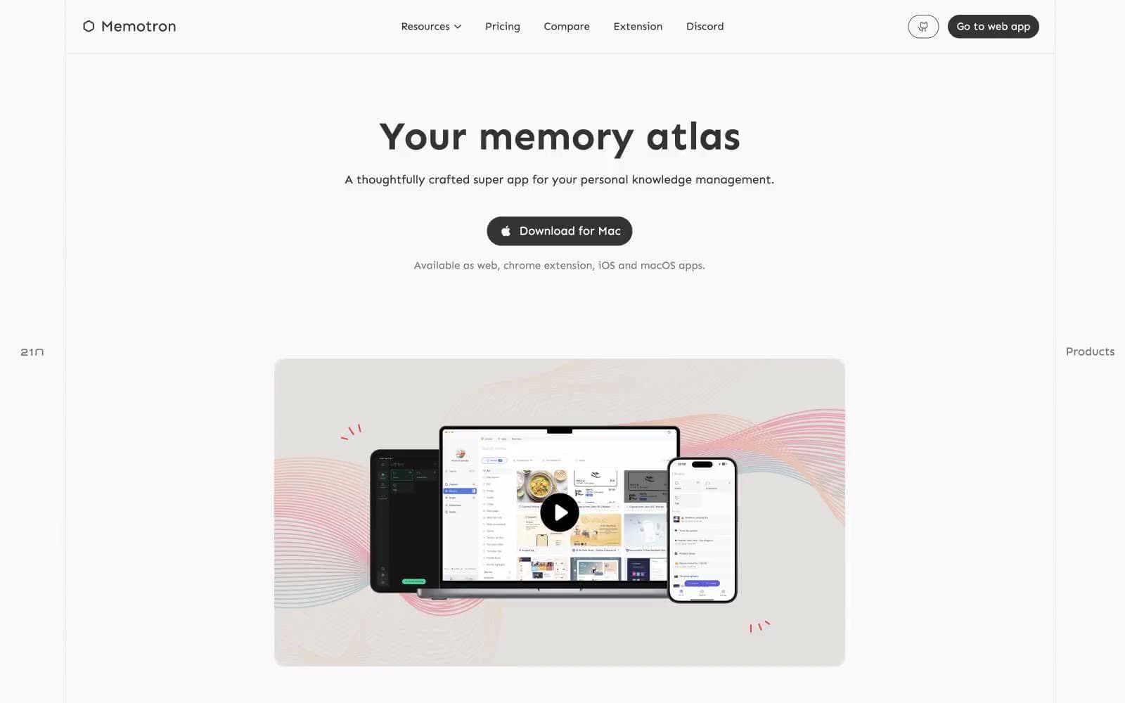
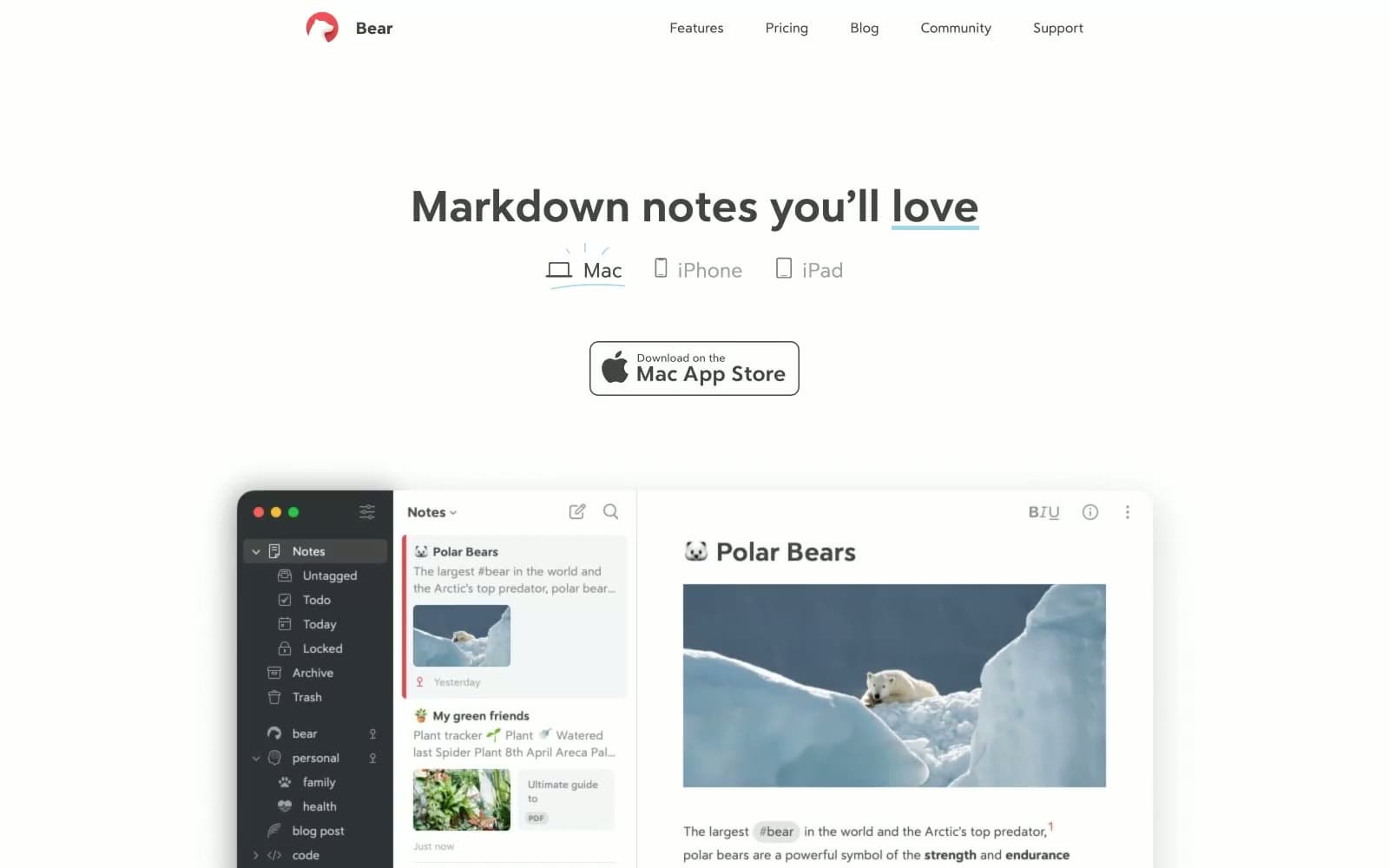
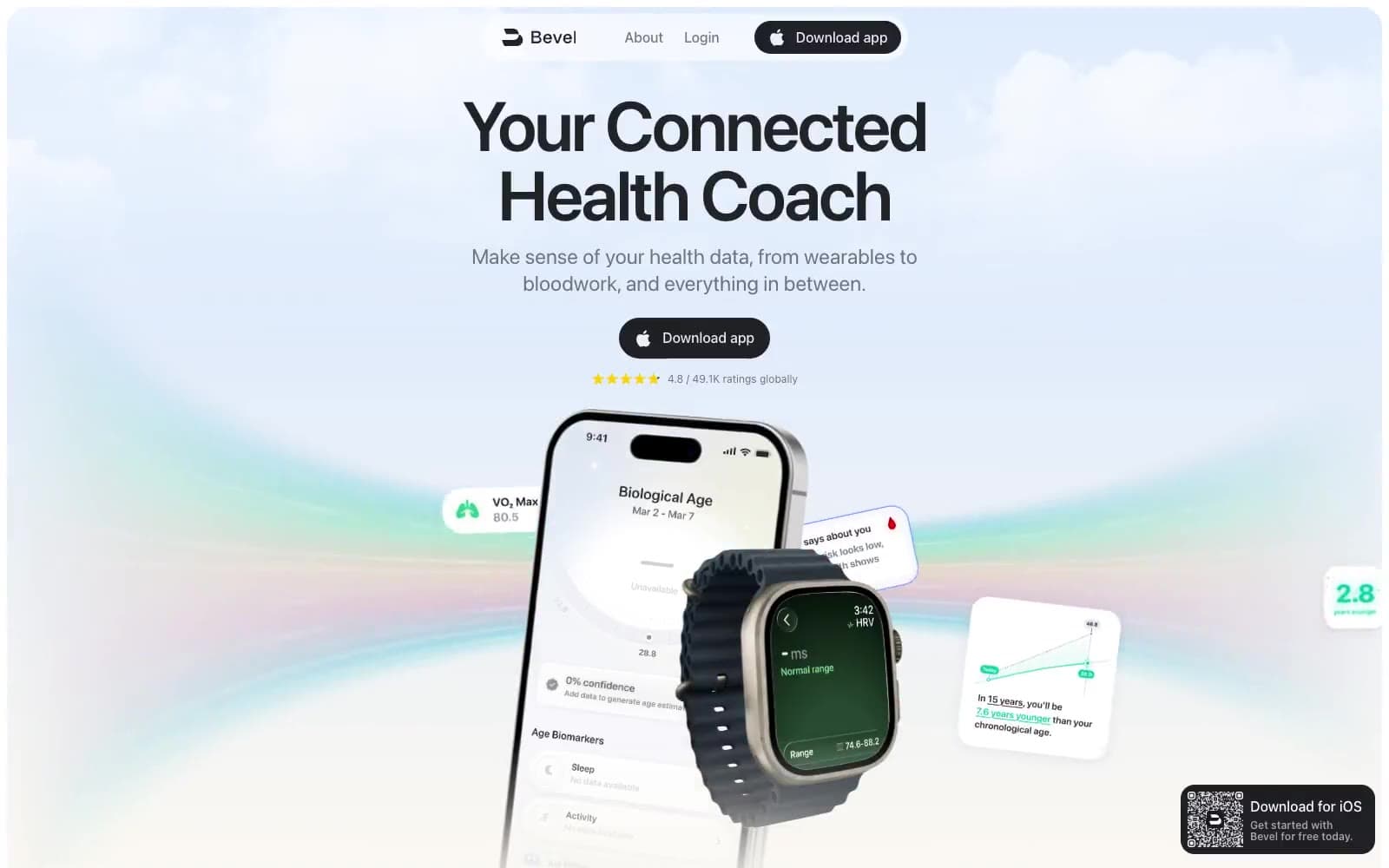
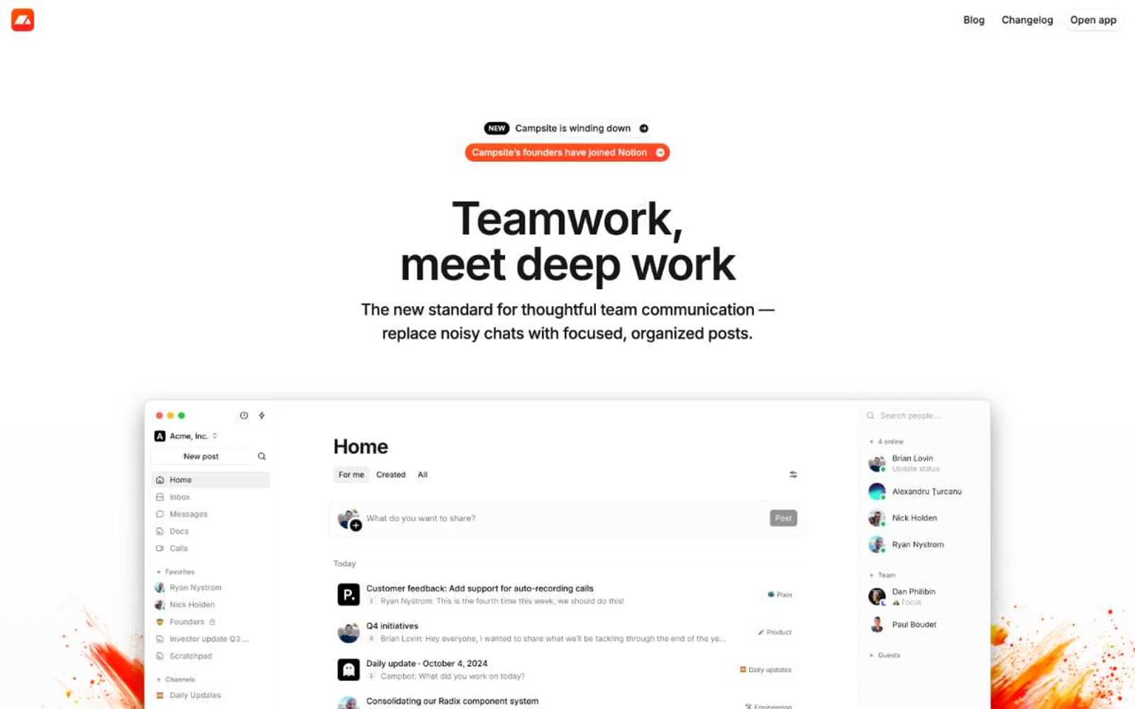
Foodnoms. Warm orange, fresh green, and generous rounded forms.
- Productivity
- Light theme
- 15 colors
- 4 typefaces
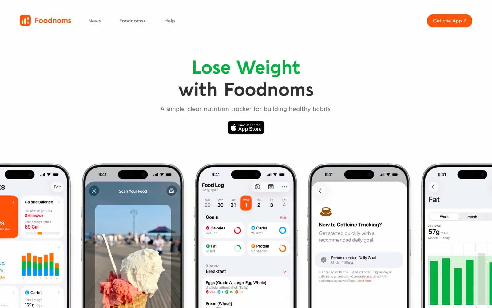
Foodnoms presents a sunlit nutrition-tracker marketing language: pure white canvas, oversized phone mockups as the visual anchor, and a playful chromatic vocabulary where color codes nutrients and progress. The two-tone headline convention (one color for the win word, dark graphite for the rest) makes the value proposition scannable in a glance. The system leans on a single custom display face (Aquawax Pro) with a distinctly rounded, geometric character that softens the dense data-heavy app screens. Most surfaces are flat and shadowless; a uniform 26px corner radius gives buttons, cards, and tags a friendly, pillow-like feel that makes health tracking feel approachable rather than clinical.
Foodnoms design system

Brand1
Orange supporting accent for decorative details and low-frequency emphasis. Do not promote it to the primary CTA color
Accent10
Green supporting accent for decorative details and low-frequency emphasis
Secondary warm accent visible in app screen UI elements and supporting brand moments. Sits one step hotter than Ember Orange for emphasis on selected or active app states
Cool counter-accent for app-internal data categories (carbs/protein/other nutrient groupings). Balances the warm-dominant palette inside phone mockups
Muted cool accent — softens Sky Blue for secondary data labels and chart backgrounds inside the app surfaces
Warm accent for secondary headings and emphasis text within the marketing pages
Deep warm accent for data-heavy text and chart labels in the app's nutrition displays
Red supporting accent for decorative details and low-frequency emphasis
Accent for the carbs/protein/fat macro rings and category tags inside the app interface
Accent for headings and emphasis text on supporting pages, and for specific data categories inside the app
Accent for bold headings and highlighted text on supporting pages
Neutrals4
Maximum-emphasis text and icon fills. Used sparingly — reserved for the darkest typographic moments and SVG icon details
Primary text, dark buttons (App Store badge), and icon strokes. The dominant non-white color in headings and body copy
Alternate canvas for cards, feature sections, and soft UI containers. Distinguishes elevated content blocks from the white page
Dominant page background, button text, and card surfaces. The base layer of the entire visual system
Try a pairing
Pick any two colors from the palette to check whether text stays readable on top.
Aa
Charcoal on Ember Orange
6.52 : 1 contrast
- Body textPasses AA 4.5
- Large textPasses AA 3
- StrictFails AAA 7