
Fabric. Editorial manuscript on a drafting table.
- Productivity
- Light theme
- 11 colors
- 4 typefaces
Fabric uses an editorial-document language: white canvas, near-monochrome surfaces, and a single editorial serif headline that gives the workspace a literary, almost manuscript-like gravity. The product lives in a tight grayscale world — black text, white surfaces, hairline borders, and almost no color — punctuated by a single vivid electric-violet glow that appears as soft shadows, focus halos, and accent washes rather than fills. Inter handles all UI and body text at compact, confident sizes, while GT Alpina Light whispers the brand promise in weight-300 serif at 80px. Components are paper-thin: cards with 16px radii, dark filled CTAs (#0a0a0a) with 8px radii, ghost links drawn in deep indigo with a 1px underline, and shadows so subtle they register as paper grain rather than elevation. The system feels like a writer's drafting table — calm, restrained, deeply considered, with one bright violet mark on the page.
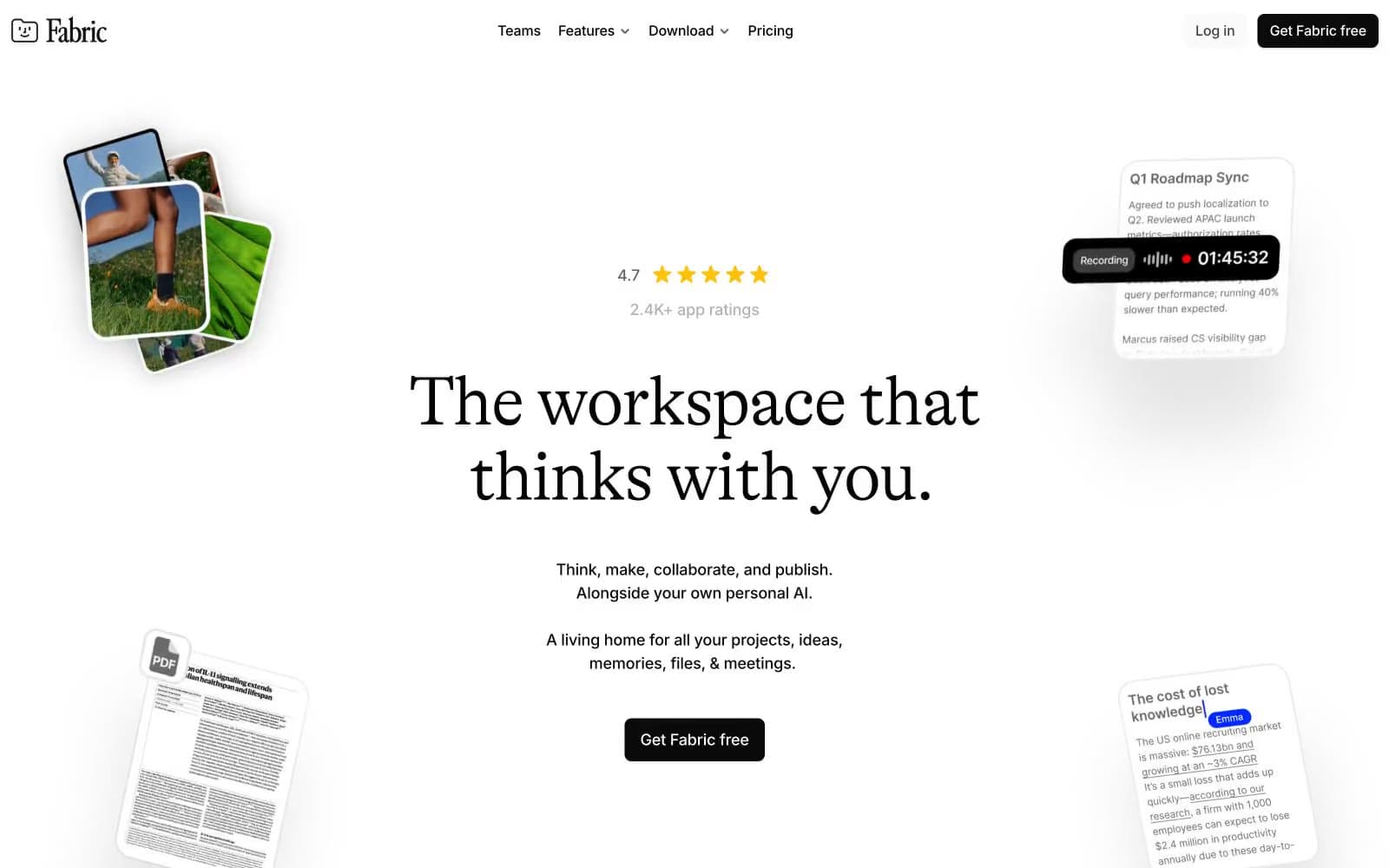
Fabric design system

Brand2
Brand accent — vivid glow halos behind product cards, focus ring washes, decorative shadow tint. Appears sparingly as a soft aura, never as a filled surface or text color
Link color and ghost-action border — underlined hyperlinks, outlined action borders, link text. The only chromatic text color in the system
Neutrals9
Universal border color and high-emphasis text. The system draws most structural borders in pure black at hairline weights
Primary action background, heading text, nav backgrounds. Used for filled CTA buttons and the heaviest typographic weight in the system
Secondary heading text, emphasized body copy, card titles. One step lighter than Press Black for sub-headlines
Tertiary text, nav secondary items, metadata. Between Graphite and Slate in the gray scale
Muted body text, helper text, secondary labels, nav inactive items. The workhorse gray for de-emphasized content
Subtle borders, icon stroke at reduced weight, tertiary metadata text
Medium-contrast borders, control outlines, and structural separators. Do not promote it to the primary CTA color
Subtle surface lift — secondary card backgrounds, hover fills, input resting states. One step off white for quiet differentiation
Page canvas, card surfaces, button text on dark fills, inverse text. The dominant background throughout
Try a pairing
Pick any two colors from the palette to check whether text stays readable on top.
Aa
Paper White on Electric Violet
8.51 : 1 contrast
- Body textPasses AA 4.5
- Large textPasses AA 3
- StrictPasses AAA 7























