
Evernote. A warm, lived-in notebook where white cards float on beige, dark text breathes, and one lime-green highlighter marks the important things.
- Productivity
- Light theme
- 11 colors
- 2 typefaces
Evernote is a warm-paper productivity workspace: a cream canvas (#f9f6f2) replaces the typical white SaaS background, giving every screen the feel of a sunlit notebook page. The interface stays nearly monochrome — charcoal text, white elevated cards, hairline gray borders — with one vivid lime green (#94e130) acting as the singular energy accent for CTAs, icons, and highlights. Display headlines use Figtree at 300 weight with tight tracking, reading as editorial and airy rather than corporate. The visual rhythm is calm: centered hero stacks, generous section gaps, card carousels with small colored category squares, and a single dark contrast band (black with organic gradient blobs) that breaks the cream monotony for high-energy moments.
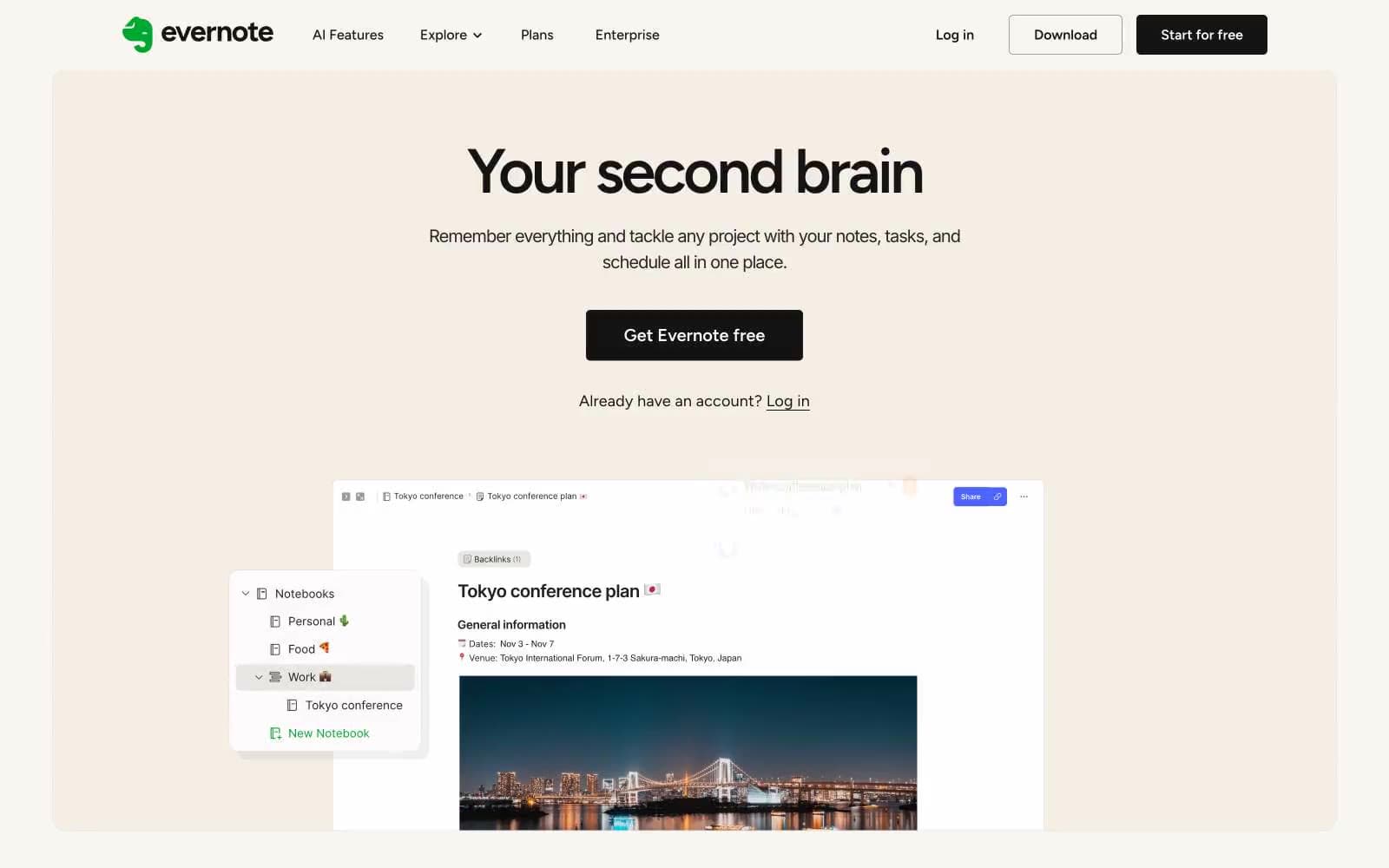
Evernote design system

Brand1
Primary action button, icon highlights, accent tags — the singular chromatic punctuation that makes actions feel switched on against the cream canvas
Neutrals10
Maximum-contrast borders, footer rules, SVG fills where absolute black is needed
Primary text, dark filled buttons, heading color — the near-black that carries all weight in the type system
Dark surface elements, body borders on inverted sections
Secondary text, icon strokes, subdued UI labels
Helper text, tertiary body content, subdued annotations
Muted link borders, nav underlines, subtle structural dividers
Card borders, hairline dividers between content sections and list items
Alternate card surface, warm-toned elevated panels that sit one step deeper than the cream canvas
Page canvas, hero background, section backgrounds — warm off-white that replaces standard white with a paper-like quality
Elevated card surfaces, product screenshot containers, button text on dark fills
Try a pairing
Pick any two colors from the palette to check whether text stays readable on top.
Aa
Onyx on Lime Sprout
13.07 : 1 contrast
- Body textPasses AA 4.5
- Large textPasses AA 3
- StrictPasses AAA 7























