
Dropmark. Warm paper atelier with cubist murals.
- Productivity
- Light theme
- 15 colors
- 2 typefaces
Dropmark lives on a warm cream paper canvas (#f7f7f1) with almost no chrome, letting a vivid cubist illustration system carry the brand's voice while the interface stays nearly monochrome. The type system pairs DropmarkRealHead (weight 500, used sparingly for display and section titles) with DropmarkRealText (400/600/700) for everything else, creating a calm editorial cadence where headings whisper at medium weight rather than shout bold. A single cyan (#00affa) is the only chromatic UI accent, reserved for the outlined action border language and the filled primary button — every other surface and border is warm gray. Radii are near-zero (3px) and shadows are essentially absent, producing a flat, paper-like feel that contrasts deliberately with the bold geometric illustration murals acting as section art.
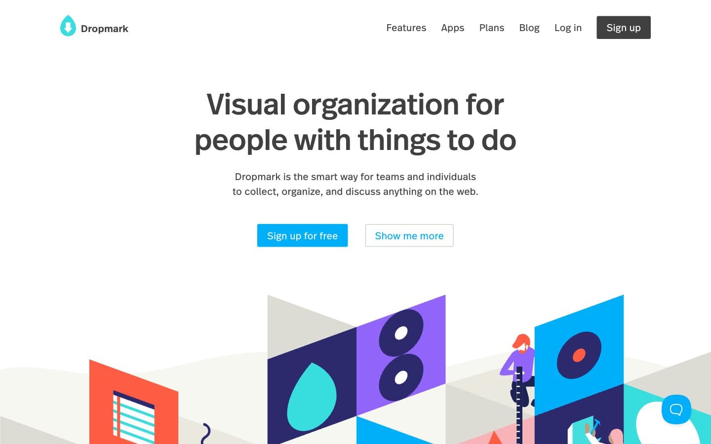
Dropmark design system

Brand1
Blue accent for outlined action borders, linked labels, and lightweight interactive emphasis. Do not promote it to the primary CTA color
Accent6
Illustration primary — the dominant dark shape color in cubist murals
Illustration mid-tone — secondary dark purple in mural compositions
Illustration warm accent — orange-red shape fills in murals
Illustration cool accent and icon highlight — teal punctuation in murals
Illustration bright accent — saturated purple shape fills
Illustration soft accent — pink shape fills for warmth in murals
Neutrals8
SVG illustration linework, deepest icon fills
Headline text alternative, deep emphasis borders
Button text and border on dark surfaces, icon stroke
Dark borders and separators for elevated surfaces and inverted UI. Do not promote it to the primary CTA color
Secondary body text, muted helper text, inactive state text
Subtle accent surfaces, inset focus rings, warm shadow tints
Page canvas, section backgrounds, soft card surfaces — the warm off-white ground everything sits on
Inset cards, modal surfaces, inverse button text, nav background
Try a pairing
Pick any two colors from the palette to check whether text stays readable on top.
Aa
Ink Black on Cyan Signal
8.51 : 1 contrast
- Body textPasses AA 4.5
- Large textPasses AA 3
- StrictPasses AAA 7























