Dot Inc.. White laboratory with a single orange spark.
- Productivity
- Light theme
- 14 colors
- 1 typeface
Dot Inc. operates a precise, near-monochrome visual system anchored by pure white surfaces and a single high-saturation orange accent that acts as functional punctuation. The interface is spacious, typographically confident, and relies on Plus Jakarta Sans at varying weights to create hierarchy without color noise. Every container, image, and card carries a generous 20-30px radius — the softness is the brand's tactile signature, echoing the braille dot product itself. Components are flat, borders are hairline, and the single shadow token is reserved for the primary action button. Color appears only when the system needs you to do something.
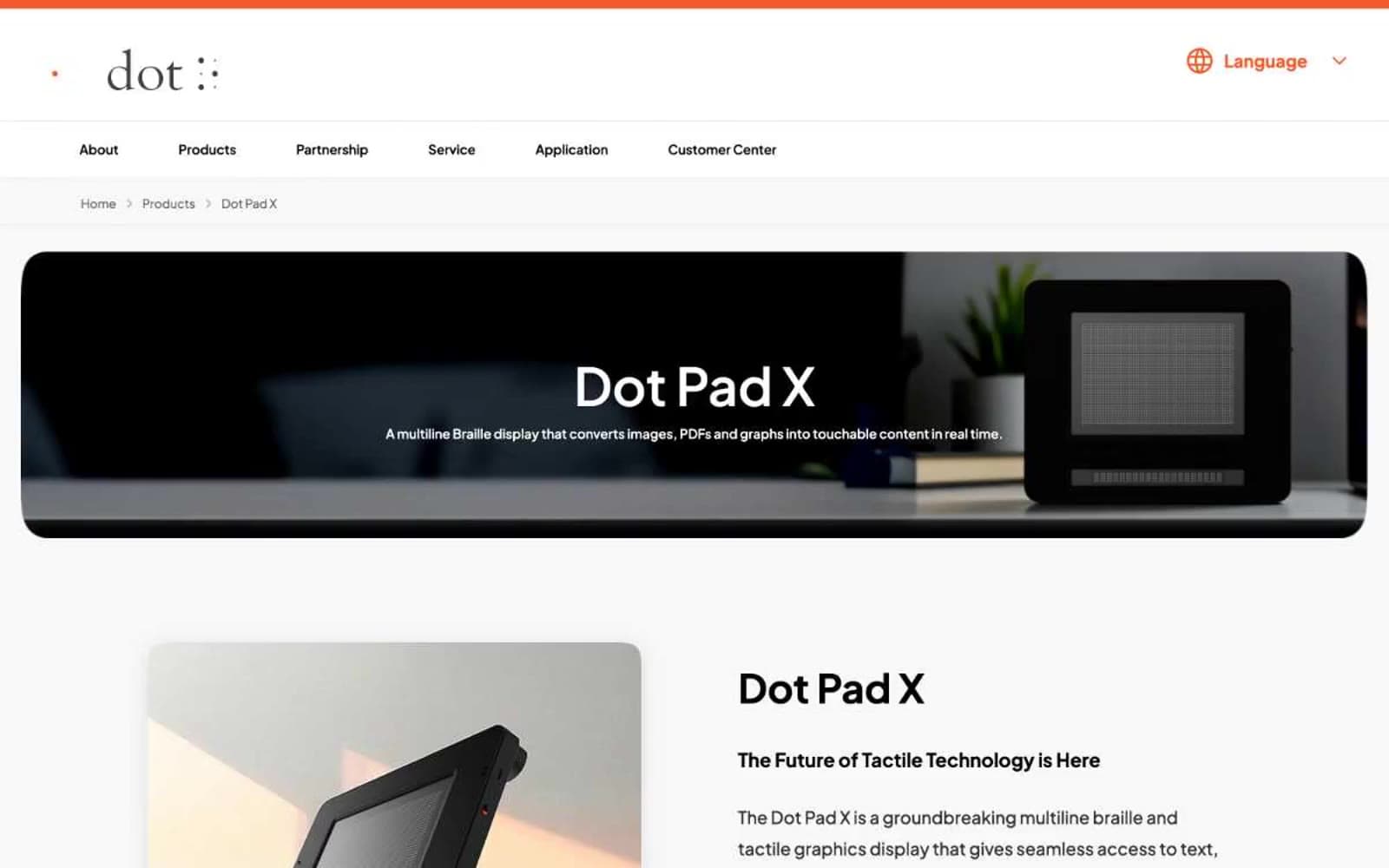
Dot Inc. design system

Brand2
Primary action buttons, active badges, accent borders — the system's only chromatic voice, used to signal interactivity and emphasis
Orange text accent for links, tags, and emphasized short phrases. Do not promote it to the primary CTA color
Neutrals12
Primary text, icons, image overlays, card headings — maximum contrast against white canvas
Headings, body emphasis, dark surface alternative — slightly softened black for large display text
List items, secondary body text, card content
Navigation labels, subdued body text
Muted descriptions, inactive list items, heading borders
Disabled or decorative text
Card borders, subtle button shadows — cool-tinted gray that defines container edges
Alternate card backgrounds, disabled surfaces
Neutral secondary button fill, placeholder surfaces
Hairline dividers, borders across all contexts — the structural neutral that separates sections
Card surfaces, subtle backgrounds, alternate section bands
Page background, nav surface, card fill, button text — the dominant canvas
Try a pairing
Pick any two colors from the palette to check whether text stays readable on top.
Aa
Carbon Black on Ember Orange
6.76 : 1 contrast
- Body textPasses AA 4.5
- Large textPasses AA 3
- StrictFails AAA 7