Doo. Pastel sticky notes drifting on white linen.
- Productivity
- Light theme
- 9 colors
- 1 typeface
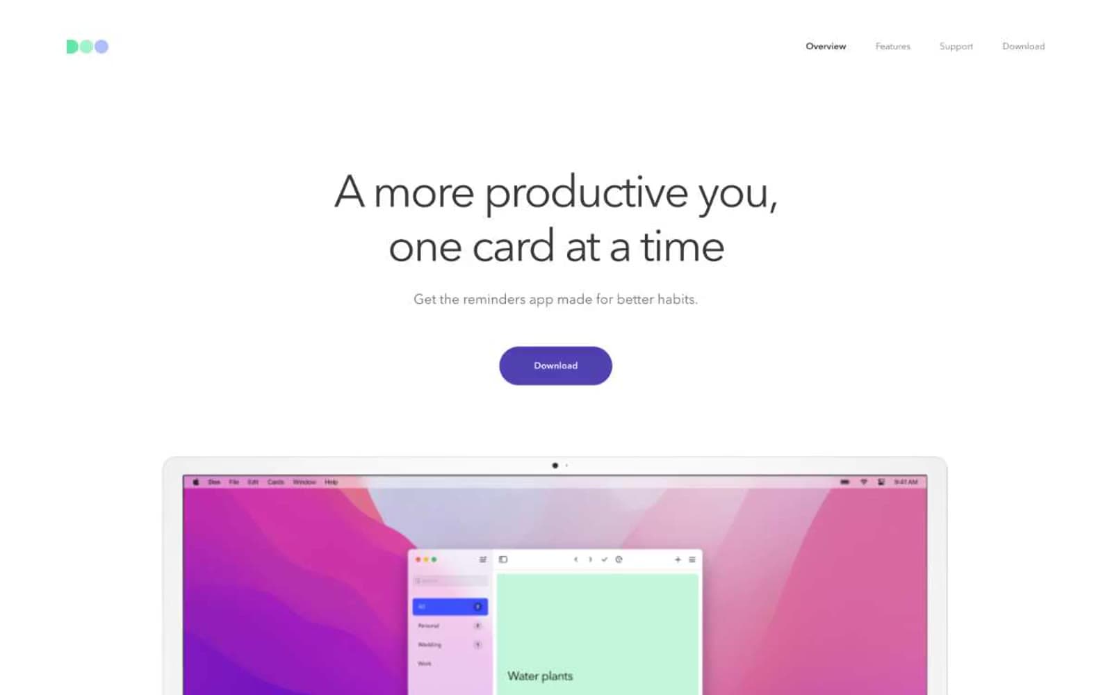
Doo reads as an empty notebook waiting to be filled: nearly all-white canvas, cool-gray hairline borders, charcoal type, and a single deep-indigo CTA acting as the page's only saturated punctuation. The visual system is deliberately monochrome on the surface while the product itself is colorful — colored category tags, pastel task cards, and a tri-color logo carry the warmth. Layout is centered, symmetrical, and Apple-like in its discipline: a single headline, one button, then product imagery doing all the visual work. Components are pill-shaped controls with generous radius, text-first hierarchy, and almost no decoration — no shadows, no gradients, no background tints behind content. The mood is calm, organized, and unhurried.
Doo design system
Brand1
Supporting palette color for small decorative accents when the core palette needs contrast. Do not promote it to the primary CTA color
Accent2
Task category tag accent (product UI), logo green dot — pastel annotation, not interface chrome
Task category tag accent (product UI), logo blue dot — pastel annotation
Neutrals6
Headline color, strongest body emphasis, near-black for maximum contrast on light surfaces
Navigation text, heading text, dark UI elements — the primary readable dark on white
Hairline borders, dividers, secondary text, list separators — the structural gray that quietly defines the page grid
Elevated panels, subtle background washes, light borders — the cool-tinted off-white that lifts content above the page
Secondary card surfaces, quiet content panels
Page background, card surfaces, text on dark/indigo fills — the dominant canvas
Try a pairing
Pick any two colors from the palette to check whether text stays readable on top.
Aa
Paper on Indigo Pulse
9.50 : 1 contrast
- Body textPasses AA 4.5
- Large textPasses AA 3
- StrictPasses AAA 7























