
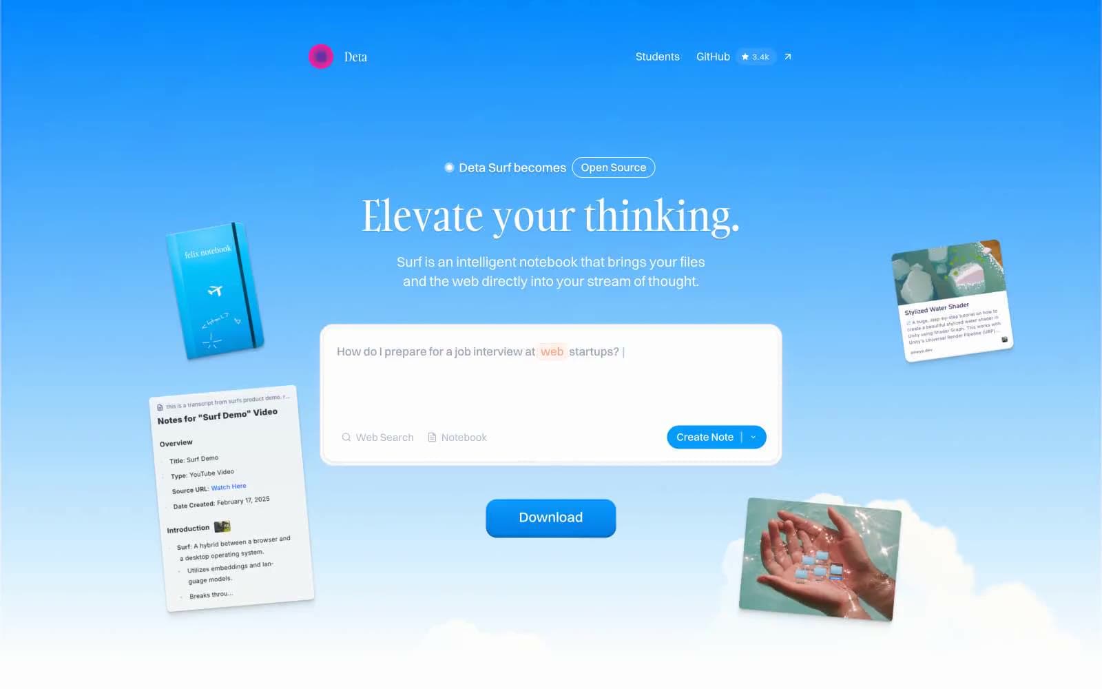
Deta Surf. Open notebook floating in a clear blue sky.
- Productivity
- Light theme
- 11 colors
- 4 typefaces
Deta Surf treats the web like a cumulus notebook — a pale blue sky gradient carries the hero, content cards tilt and float at the edges, and the interface itself feels weightless. The signature typographic tension sits between Gambarino serif headlines and Switzer geometric sans: the words feel handwritten, the UI feels engineered. Tanker appears sparingly as an all-caps accent (16-19px, +0.05em tracking) on tags and small display elements, breaking the otherwise clean system with a crafted, editorial touch. Components hover rather than sit: cards carry a single hairline shadow at 5% opacity, filled buttons gain depth from a #006dc8 inset highlight, and the single brand blue (#009afc) appears only where the user must act. The whole system breathes — 8px base, generous 32px section gaps, 30px rounded hero search bar, and pill-shaped controls everywhere signal a contemplative, low-friction product.
Deta Surf design system

Brand4
Primary CTA fill, focused interactive state — the only vivid color in the system, reserved for actions that complete a task
Inset button highlight, pressed state, button shadow tint — creates the lifted feel under filled CTAs
Pill badges (Open Source tag), outlined action borders, soft highlight washes — the cool whisper of brand blue on neutral surfaces
Hero background gradient bottom stop — fades the sky into white at the page floor
Neutrals7
Headlines, primary body text, icon strokes — the typographic anchor of every screen
Secondary text, metadata, icon strokes, muted labels — the only chromatic neutral, gives UI text a cool undertone that matches the sky
Tertiary helper text, disabled links — the quietest voice in the system
Subtle outer shadows on elevated cards — softer than Hairline, only for depth
Borders, dividers, input outlines — the structural skeleton holding the airy layout together
Page canvas, recessed card backgrounds — the air that everything floats on
Card surfaces, search bar, button text, inverted surfaces — the floating layer above Mist Gray
Try a pairing
Pick any two colors from the palette to check whether text stays readable on top.
Aa
Ink on Surf Blue
7.03 : 1 contrast
- Body textPasses AA 4.5
- Large textPasses AA 3
- StrictPasses AAA 7























