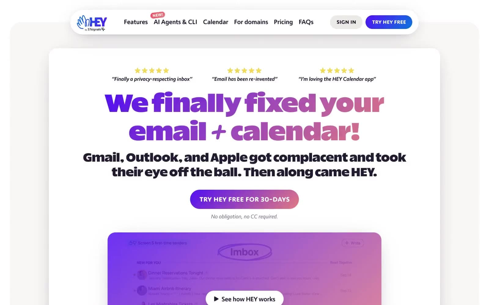
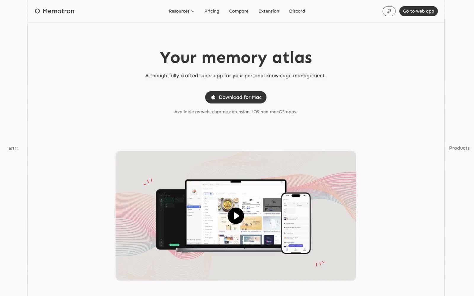
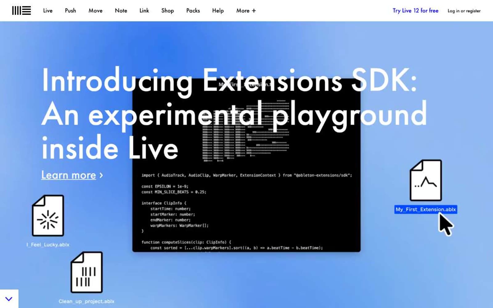
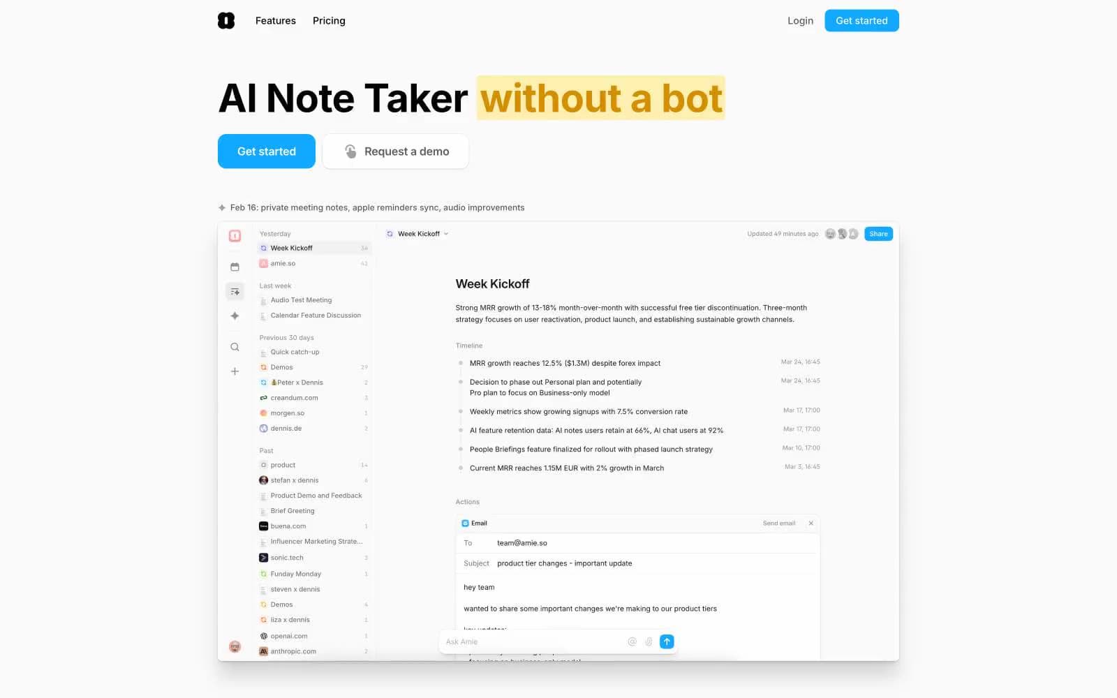
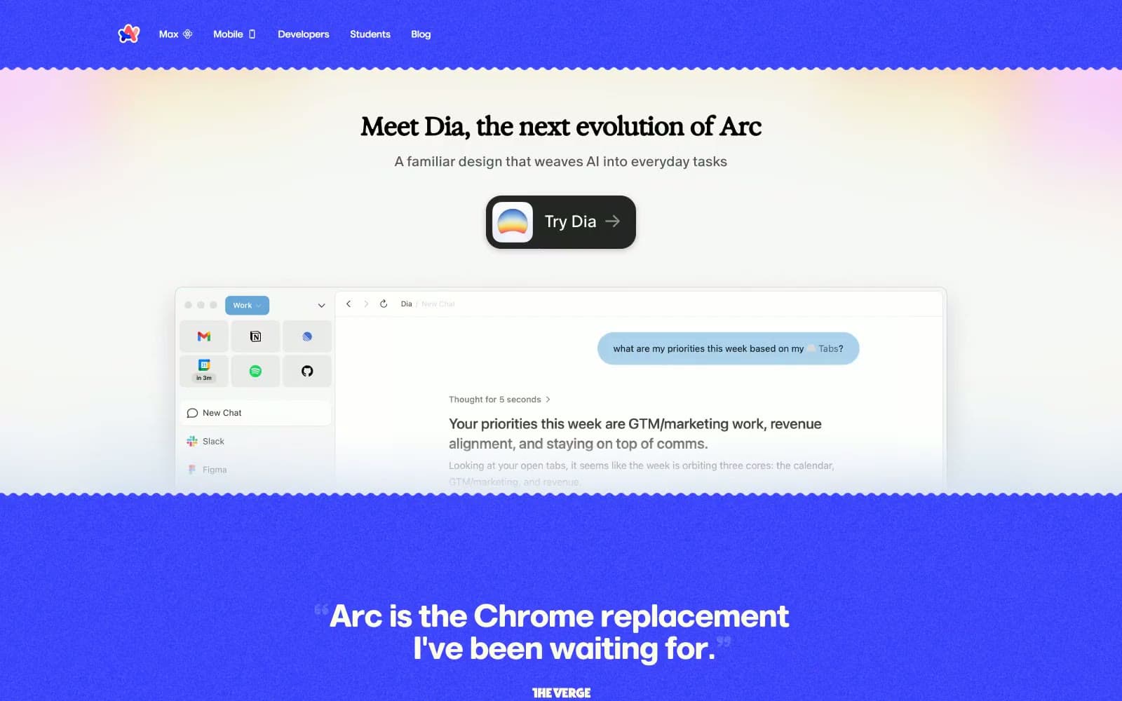
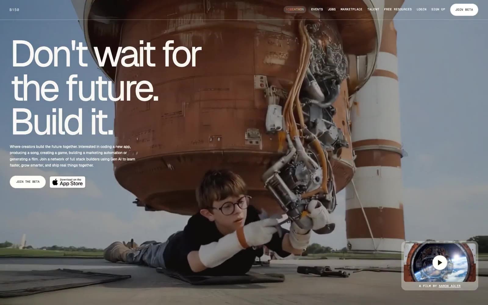
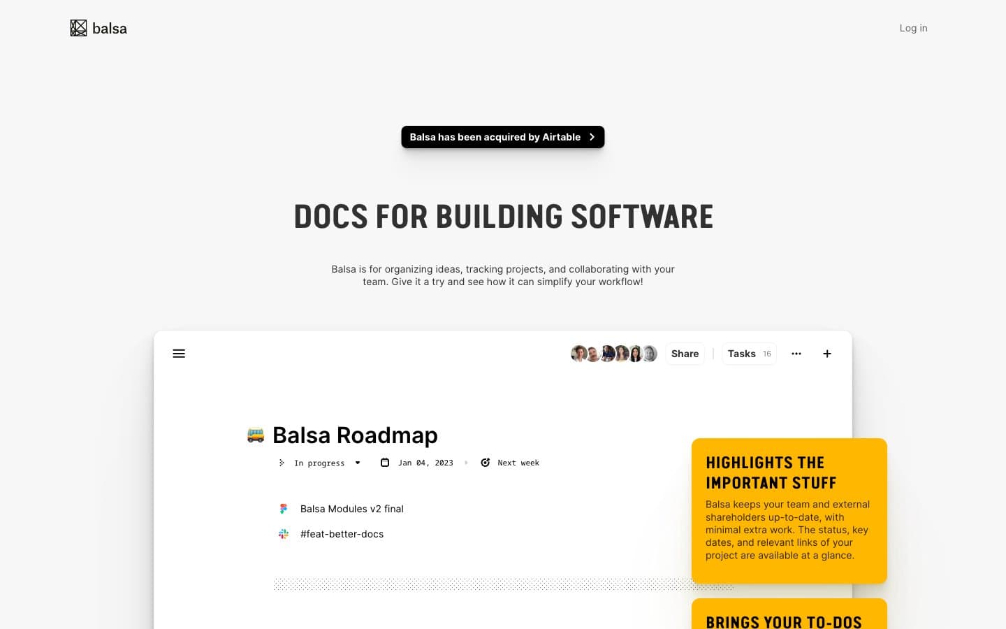
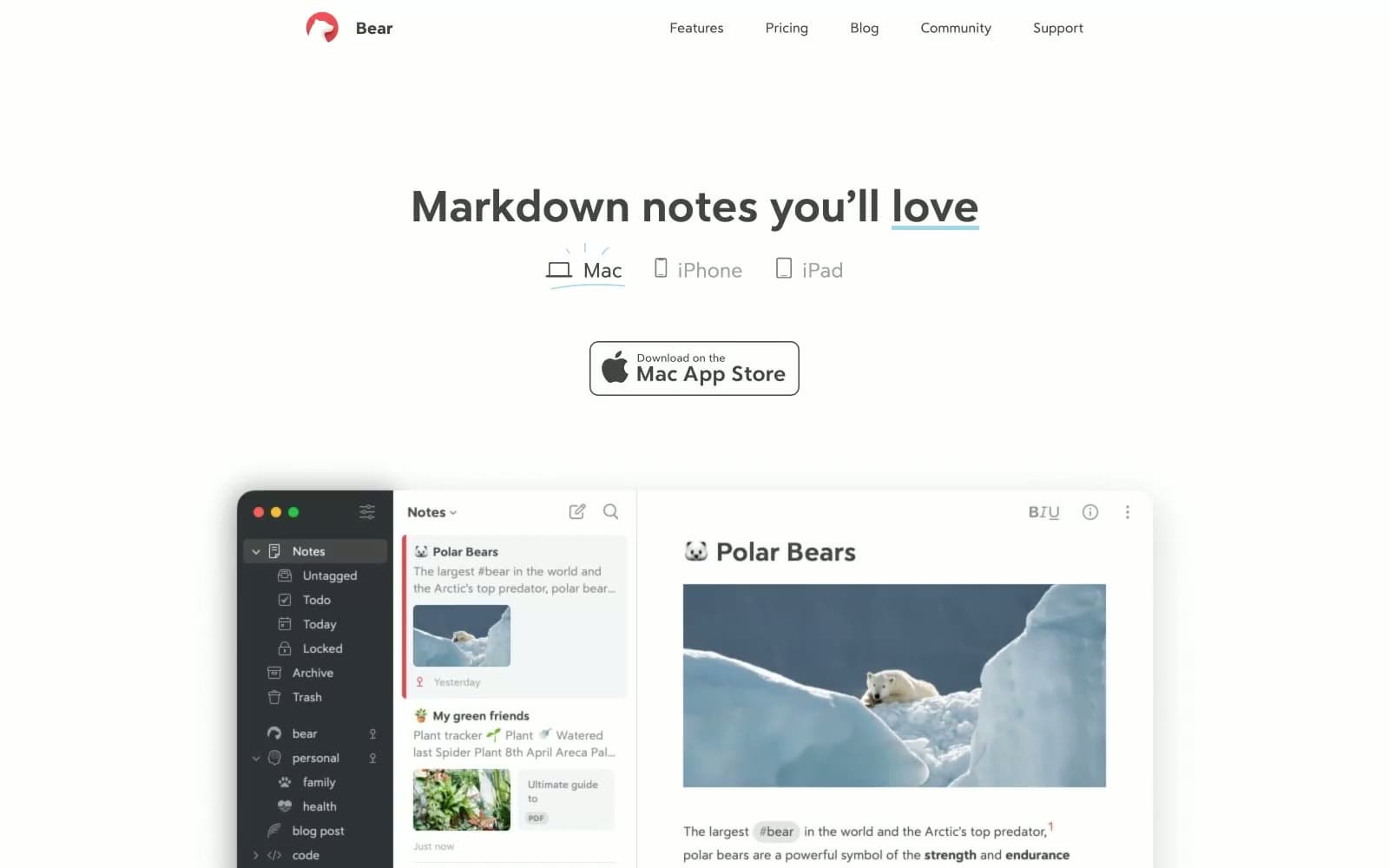
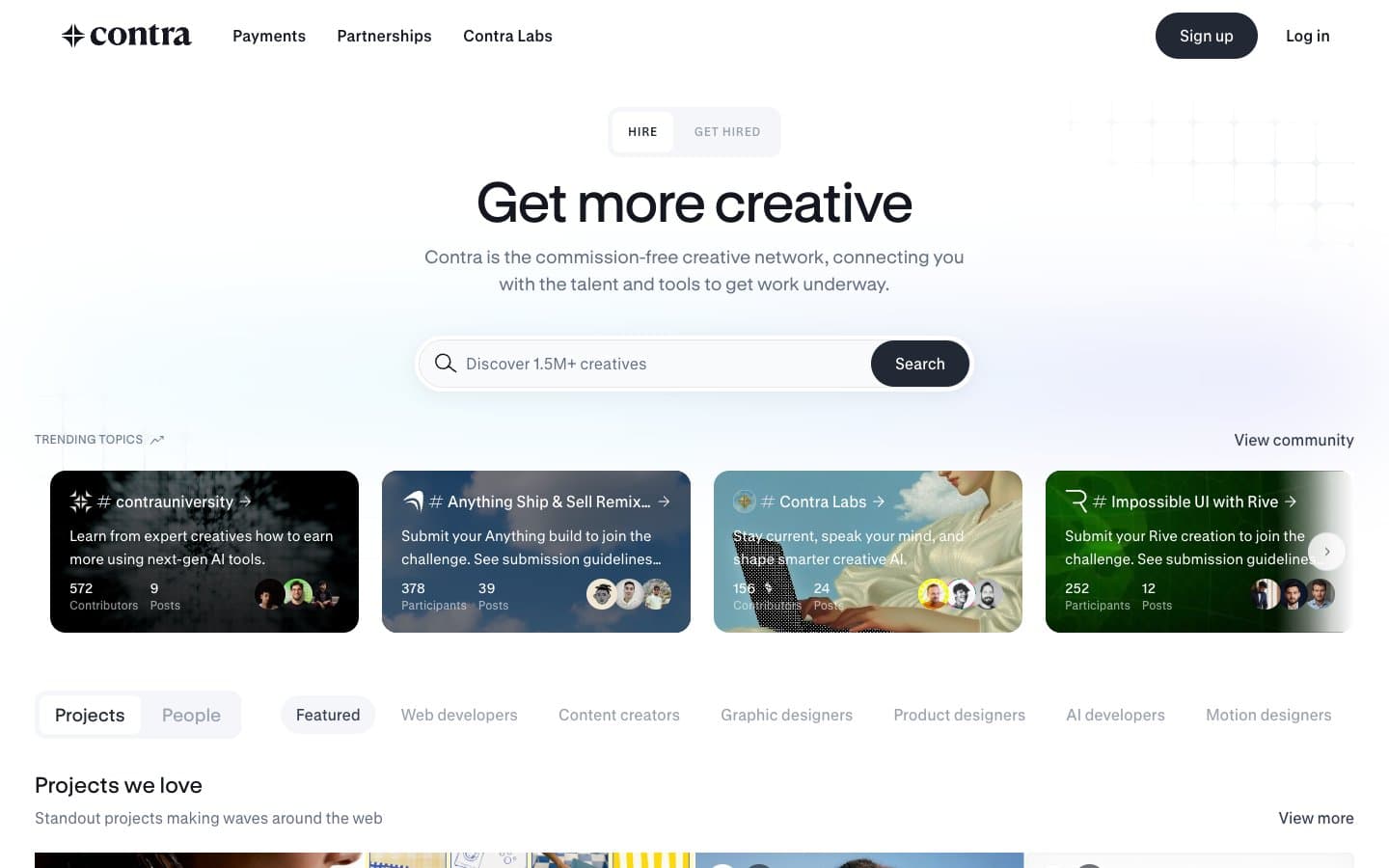
Contra. Editorial portfolio wall on white marble.
- Productivity
- Light theme
- 17 colors
- 2 typefaces
Contra operates as a curated creative-marketplace gallery: a bright white editorial canvas where almost every element is either deep ink or hairline gray, and chromatic color only erupts inside challenge/category cards and the hero gradient wash. The system reads like a print portfolio — flat, photo-forward, grid-disciplined — with one near-black action color (Charcoal #222834) carrying all primary interactivity. Typography is a custom GT Standard family whose large display sizes (up to 58px) with tight -0.01em tracking give the hero a magazine-cover gravity, while compact 14–16px body text keeps the dense directory rows legible. Components favor pill shapes (24px buttons, 16–40px tags) and razor-thin 4px card corners, with elevation achieved through a soft two-layer charcoal shadow rather than heavy borders.
Contra design system

Brand1
Primary filled button background, elevated card surface, and tag pill fill — the single non-neutral action color
Accent7
Category/challenge card background — vivid violet used as one of the rotating card-fill colors
Soft violet wash for decorative surfaces and pale category cards
Vivid pink-purple card fill in the category carousel
Deep muted plum card fill in the category carousel
Warm red card fill in the category carousel and highlight badges
Vivid green-yellow card fill and decorative wash — the brightest accent in the palette
Hero background gradient running from icy cyan through sky blue into soft violet — the only multi-color wash on the page
Neutrals9
Heaviest text weight and maximum-contrast border accents on dark cards
Primary text, headings, icon strokes, hairline borders, deep surfaces — the near-black backbone that makes white space read as gallery rather than form
Dark borders and separators for elevated surfaces and inverted UI.
Secondary body text and muted nav labels — never used as a primary heading color
Tertiary text, placeholder text, disabled labels
Icon strokes on white surfaces and faint structural outlines
Borders, dividers, and outlined-button strokes — the thinnest visible structural line
Secondary surface for subtle bands, input fills, and tag/chip backgrounds that need to sit just behind Paper
Primary canvas and card surface — the default ground for the entire directory
Try a pairing
Pick any two colors from the palette to check whether text stays readable on top.
Aa
Paper on Charcoal
14.78 : 1 contrast
- Body textPasses AA 4.5
- Large textPasses AA 3
- StrictPasses AAA 7