
Coda. Warm editor's desk where bold black type and a single orange accent do all the work.
- Productivity
- Light theme
- 9 colors
- 3 typefaces
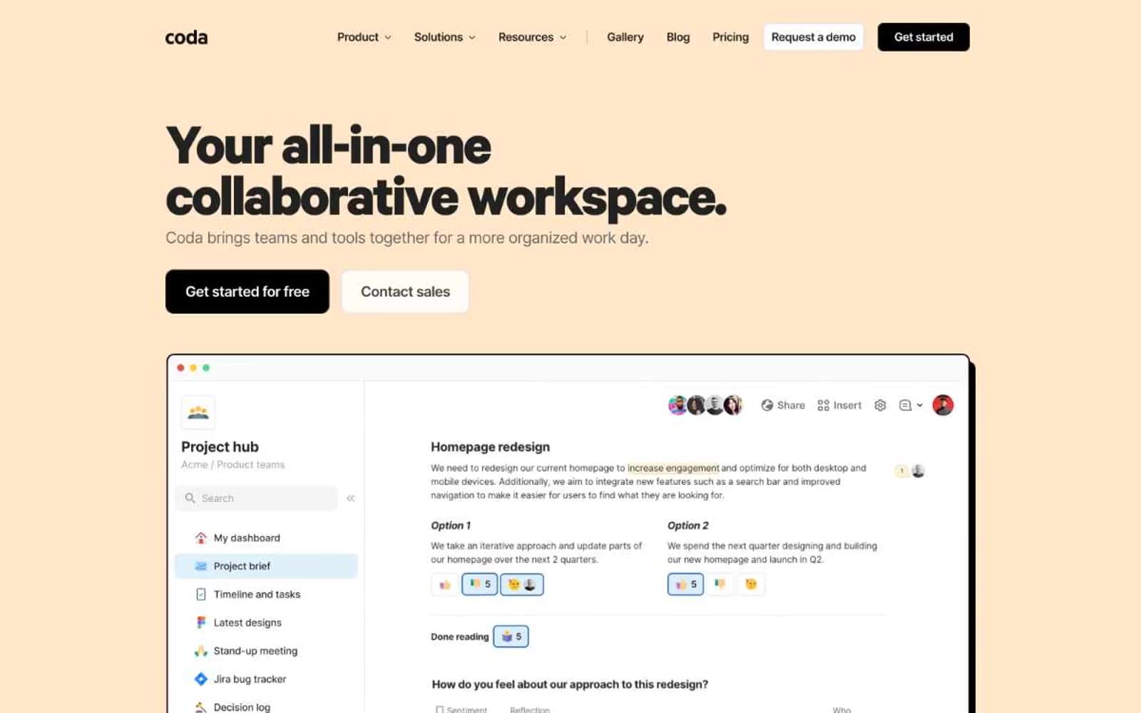
Coda reads as a warm editorial workspace printed on cream paper: a nearly monochrome system anchored by heavy black sans-serif headlines that sit on a buttery #fff6ec canvas, with one vivid orange accent used as high-signal punctuation. The product itself is shown the way a magazine would show a well-designed tool — inside browser-chrome mockups with hard offset shadows, not soft Material-style elevation. Surfaces are mostly white; warm cream appears as the emotional entry band and as a footer anchor. Typography does almost all of the brand work: a custom 700-weight display face (Calibre-R) screams in tight tracking while Inter handles everything else at near-default weight. The result is confident and blunt — black buttons, hard shadows, and zero chromatic noise outside the single orange.
Coda design system

Brand1
Sole chromatic accent — heading highlights, section eyebrow text, decorative underlines, and brand-mark punctuation. The single warm note against an otherwise black-and-cream system
Neutrals8
Filled primary action background, hard offset shadow color, and high-contrast icon fills
Primary text, heading fills, primary borders, and the structural ink color across all UI surfaces
Secondary button borders and mid-weight icon strokes
Secondary body text, muted helper text, and low-emphasis metadata
Tertiary text, placeholder text, disabled labels, and nav item resting state
Hairline borders, card edges, and subtle dividers separating surfaces from canvas
Warm hero band, footer surface, and the signature alternate canvas that gives Coda its editorial mood
Default page canvas, card surfaces, button text on dark fills, and outlined-button fills
Try a pairing
Pick any two colors from the palette to check whether text stays readable on top.
Aa
Carbon on Ember Orange
6.13 : 1 contrast
- Body textPasses AA 4.5
- Large textPasses AA 3
- StrictFails AAA 7























