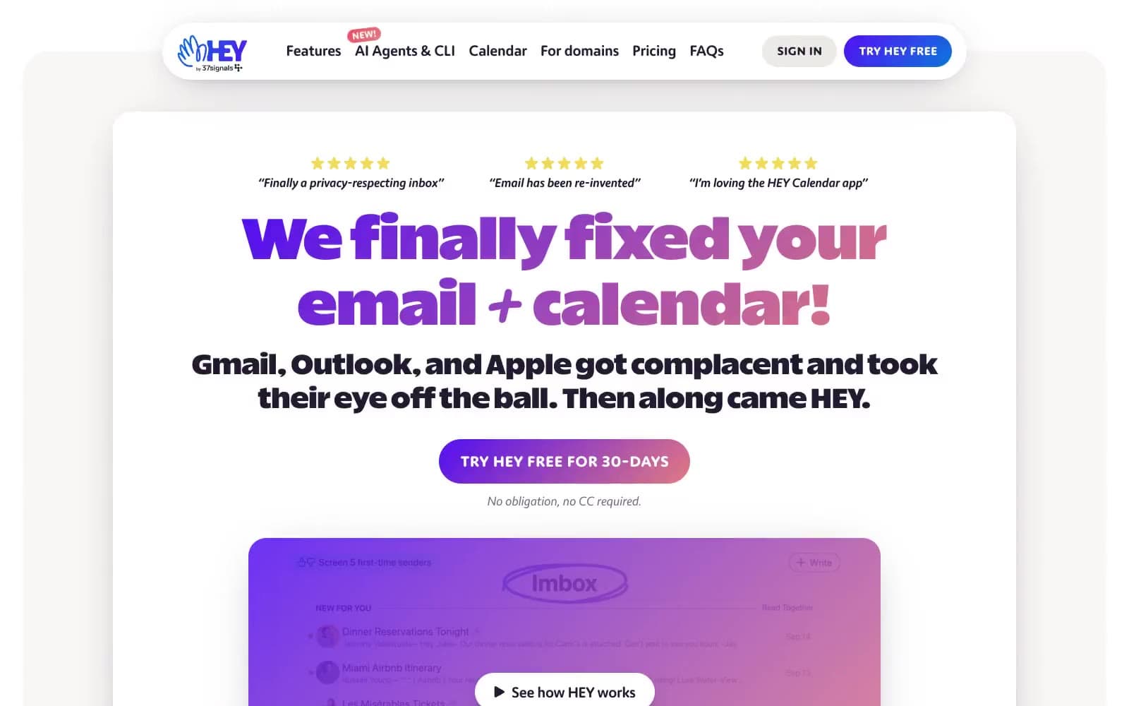
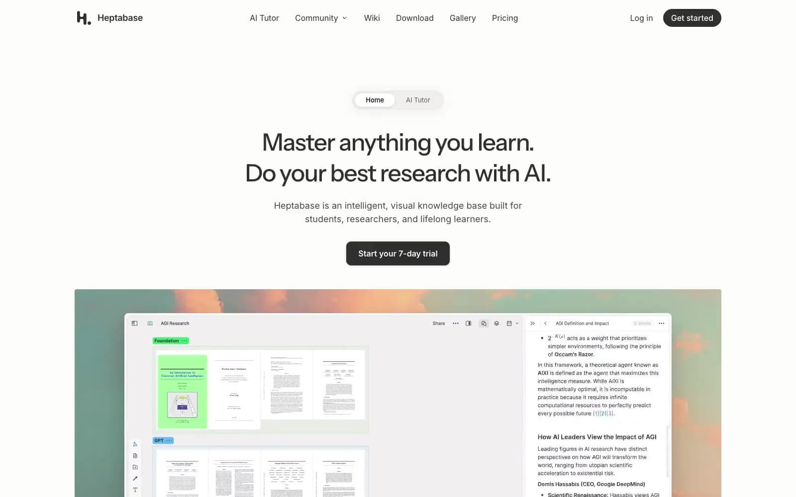
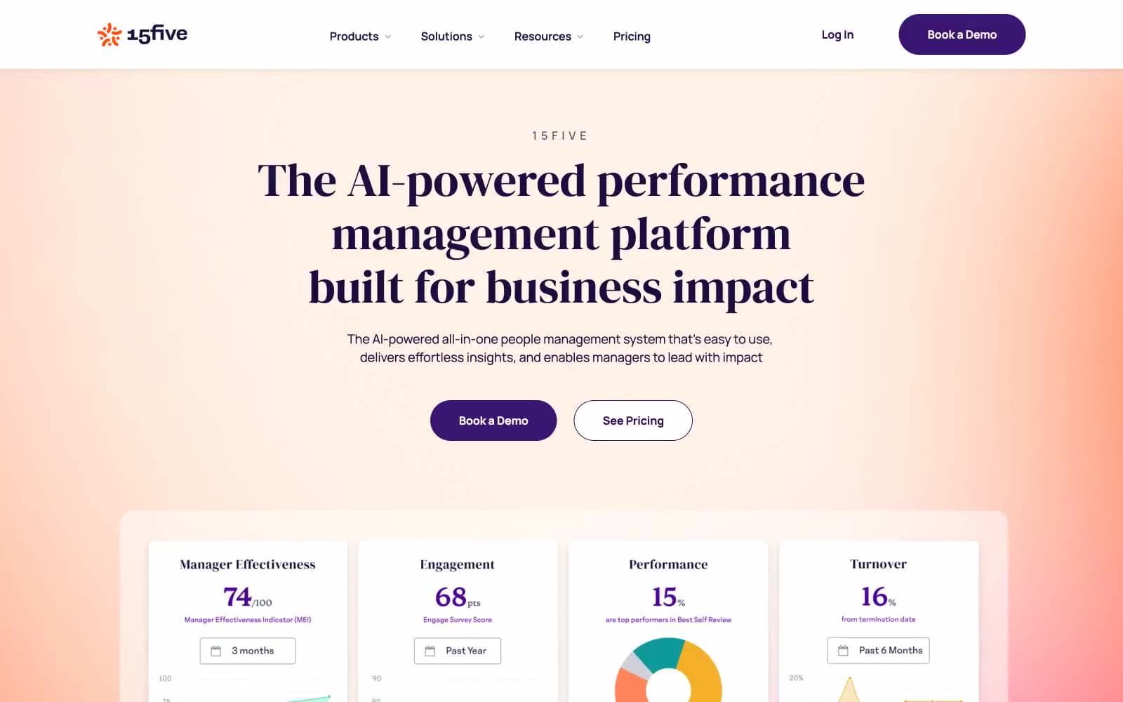
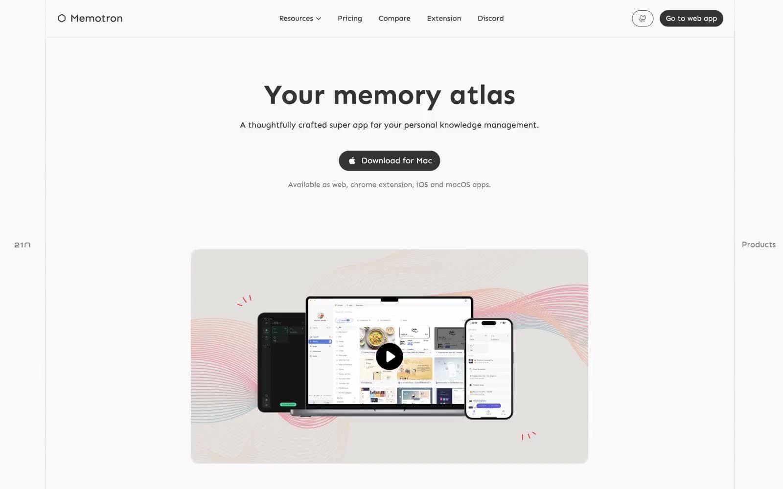
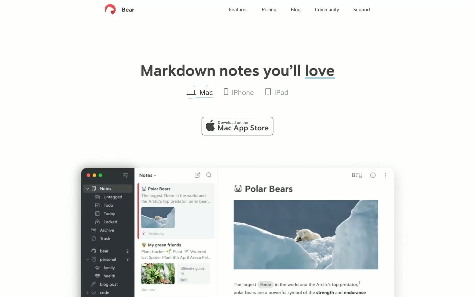
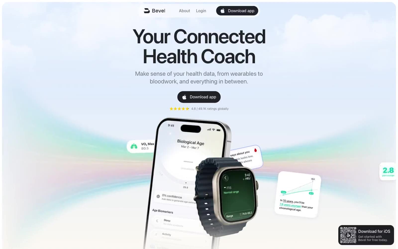
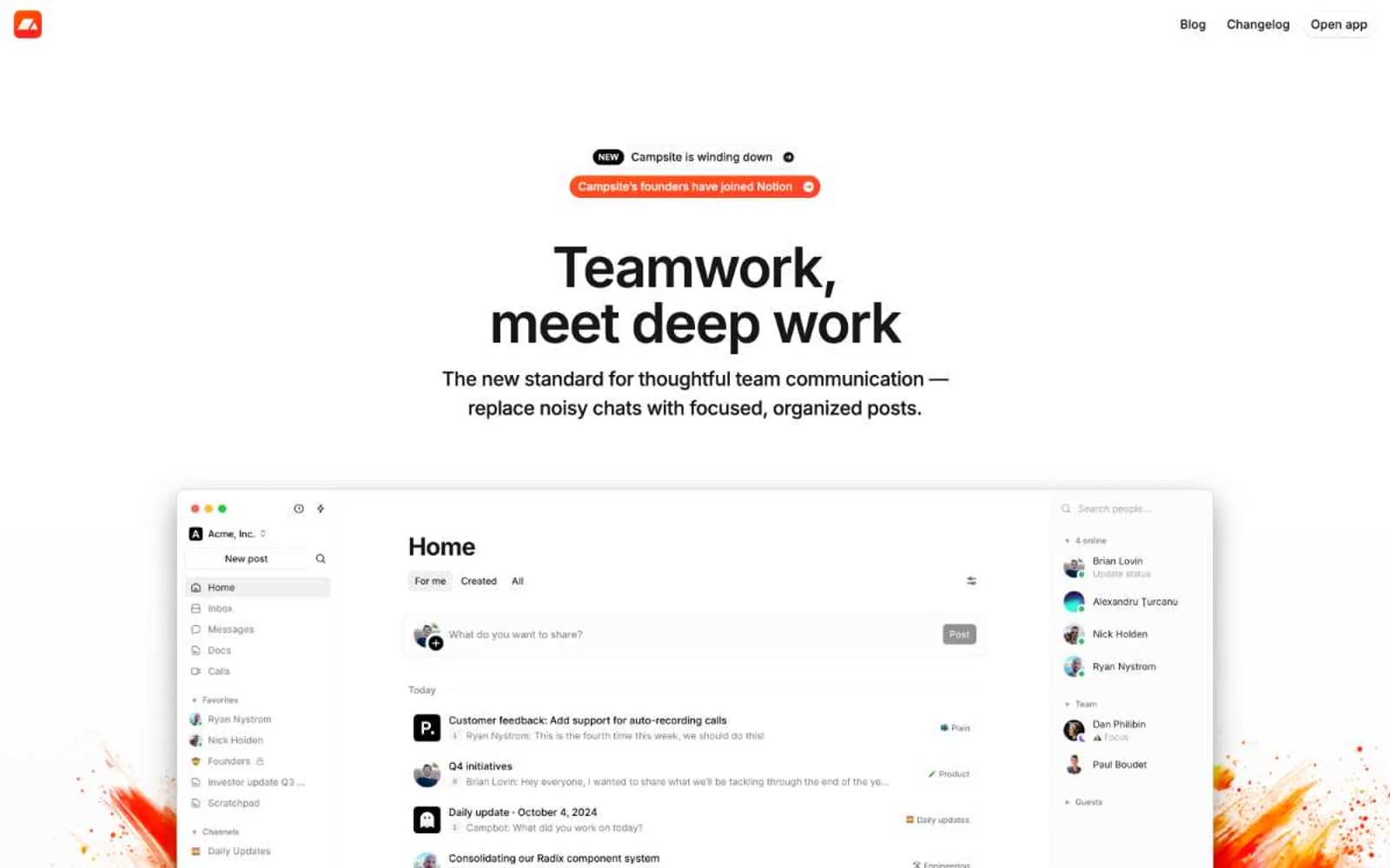
ClickUp™. Hardworking dashboard on white marble.
- Productivity
- Light theme
- 20 colors
- 4 typefaces
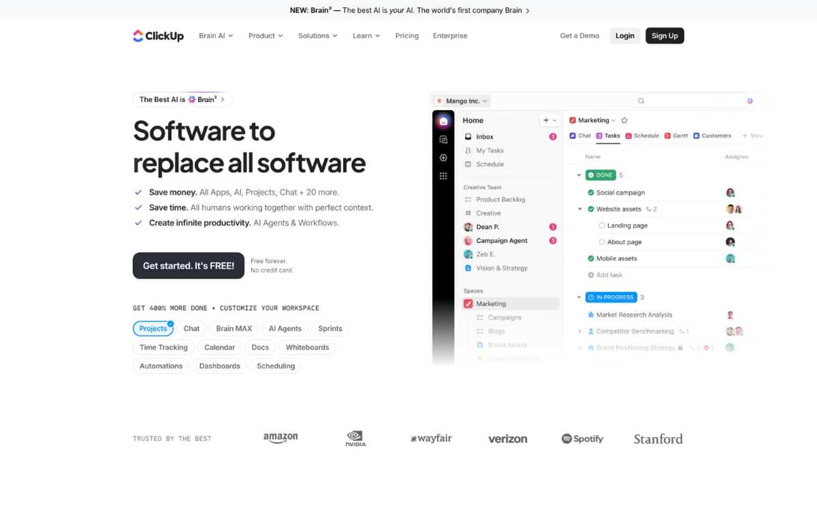
ClickUp speaks in a sharp, high-contrast productivity dialect: a white canvas where oversized bold headlines (52-80px, weight 650-800, tracking pulled to -0.04em) collide with compact 14px button labels and a black filled CTA. The signature move is the 9999px pill — chips, tags, nav items, and badges all share one relentless full-radius curve, giving the interface a soft, rounded personality against otherwise hard typographic weight. Color is used surgically: a single vivid purple (#6647f0) stamps brand identity, blue (#0091ff) handles interactive links, and the rest of the system is pure grayscale. Rotating conic-gradient borders animate around hero elements, the only moment the page lets its hair down. The product UI screenshot on the right of the hero anchors the brand: real, dense, working software — not abstract gradients or stock illustration.
ClickUp™ design system

Brand3
Violet state accent for badges, validation surfaces, and short status labels.
Animated conic-gradient border rotating around hero CTAs and Brain² element — the brand's most expressive moment
Cyan-to-magenta linear gradient for premium brand moments, 83deg angle — the system gradient for hero text and premium badges
Accent3
Blue accent for outlined action borders, linked labels, and lightweight interactive emphasis. Do not promote it to the primary CTA color
Green text accent for links, tags, and emphasized short phrases
Green outline accent for tags, dividers, and focused UI edges
Neutrals13
Headlines at maximum scale (48-80px display) — the deepest near-black with a barely perceptible cool tint
Section-level dark gradient from charcoal to true black — used on dark feature panels
Primary action fills, headline text, filled CTA buttons — near-black at 12.9:1 on white for confident authority without pure #000 harshness
Card borders, button text on light fills, section dividers — the workhorse dark neutral for structural elements
Body text secondary, link text, nav labels, icon fills — carries the 153-occurrence body copy load
Tertiary text, muted nav, meta labels, disabled states — recedes into the background hierarchy
Card borders at low contrast, subtle dividers, placeholder accents — the lightest border that still reads on white
Hairline borders, dashed dividers, input outlines — appears 49× as borderColor
Default border color (88× in buttons), the most-used border tone in the system
Body section background band — appears 500×, the large neutral that breaks white sections
Badge text, card accents, neutral chip backgrounds — soft contrast for non-interactive surfaces
Light neutral action fill for buttons on dark surfaces.
Page background, card surfaces, button fills — the default canvas against which every other color is placed
semantic1
Teal state accent for badges, validation surfaces, and short status labels.
Try a pairing
Pick any two colors from the palette to check whether text stays readable on top.
Aa
Signal White on Brand Violet
5.64 : 1 contrast
- Body textPasses AA 4.5
- Large textPasses AA 3
- StrictFails AAA 7