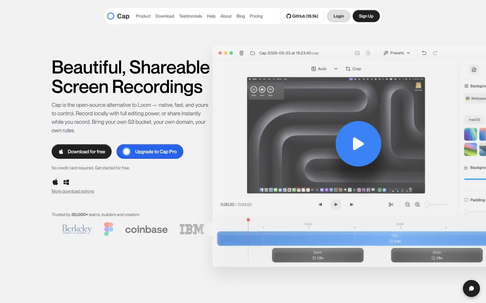
Cap. Quiet white studio with a single blue spark.
- Productivity
- Light theme
- 22 colors
- 3 typefaces
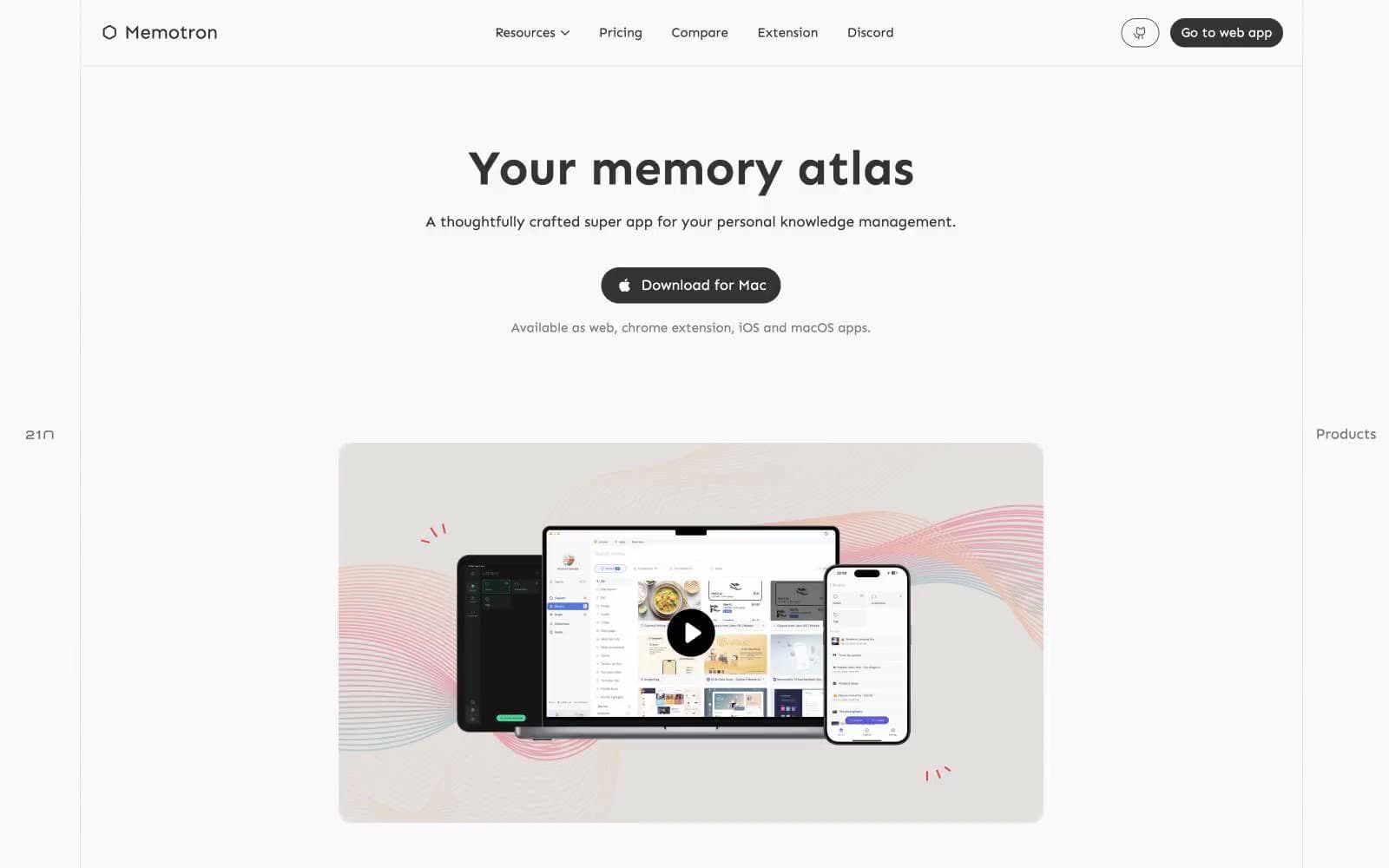
Cap reads as a calm, white-canvas workspace with a single confident blue accent — the visual language of a focused native desktop tool that happens to live in a browser. Surfaces are nearly white with hairline gray borders doing most of the structural work; elevation is barely-there, leaning on 1px strokes and subtle inset highlights rather than heavy drop shadows. Typography is a single geometric sans at three weights, set generously tight on display sizes, with uppercase eyebrow labels floating at 20% letter-spacing above section headings. The two-color button system — black for download/ownership, blue for upgrade/purchase — carries all the decision-making in the layout; everything else stays quiet. Multi-color gradients appear only inside the product mockup (the wave/ribbon artwork) and never bleed into UI chrome, keeping the interface disciplined.
Cap design system

Brand2
Primary brand accent — links, active nav indicators, icon highlights, the inner play-button of the product mockup. Saturated enough to be the one color users remember, restrained enough to never compete with copy
Filled CTA buttons (Upgrade to Cap Pro), focus rings, and the strongest interactive state. One shade deeper than Signal Blue to give pressed actions a subtle weight shift
Accent11
Violet accent for outlined action borders, linked labels, and lightweight interactive emphasis.
Violet text accent for links, tags, and emphasized short phrases
Lighter violet companion to Spark Violet for secondary decorative strokes and gradient endpoints
Orange text accent for links, tags, and emphasized short phrases.
Icon stroke variant within the mode selector — the paired companion to Ember for the three-mode icon set
Tinted blue surface wash — a barely-perceptible cool tint used for soft highlight backgrounds and the outer glow ring on the product mockup play button
Bright cyan accent for the glow/shadow halo behind the play button overlay in the product mockup
Red wash for highlight backgrounds, decorative bands, and soft emphasis behind content. Use as a supporting accent, not as a status color
Red wash for highlight backgrounds, decorative bands, and soft emphasis behind content. Use as a supporting accent, not as a status color
Yellow wash for highlight backgrounds, decorative bands, and soft emphasis behind content. Use as a supporting accent, not as a status color
Green wash for highlight backgrounds, decorative bands, and soft emphasis behind content. Use as a supporting accent, not as a status color
Neutrals9
Pure black reserved for the highest-emphasis text and icon fills where maximum contrast is required
Headings, body text, the dark CTA button fill (Download for free). Off-black rather than pure #000 to avoid harsh edges on white
Button text on light surfaces, tertiary metadata text. One step deeper than Graphite for buttons that need a touch more presence
Muted captions, helper text, and de-emphasized UI labels.
Mid-gray for secondary icon strokes and placeholder-like elements that should recede but remain visible
Hairline borders on cards, buttons, and the nav bar. The structural divider of the design system
Borders and dividers at the lowest visual layer; also appears as a subtle backdrop wash behind the footer card
Secondary surface for subtle differentiation — the segmented control track, inset highlights, and muted button backgrounds
Page and card canvas — the dominant surface across the entire site. Near-white, not pure white, to soften the reading field
Try a pairing
Pick any two colors from the palette to check whether text stays readable on top.
Aa
Carbon on Signal Blue
5.71 : 1 contrast
- Body textPasses AA 4.5
- Large textPasses AA 3
- StrictFails AAA 7