
Campsite. Warm cream paper with one orange stamp of intent.
- Productivity
- Light theme
- 14 colors
- 3 typefaces
Campsite is a sunlit editorial workspace — warm cream canvas, near-black Inter typography, and a single vivid orange that marks brand moments. The interface reads like a thoughtfully arranged bulletin board: compact rows, pill-shaped controls, soft 5%-black shadows, and generous breathing room between sections. Color is rationed — chromatic notes appear only in the logo, the paint-splash decorative motifs, a few tags, and semantic states. The density is compact but the layout feels open because of wide gutters and generous section padding; everything important sits on pure white cards floating just above the cream paper beneath them.
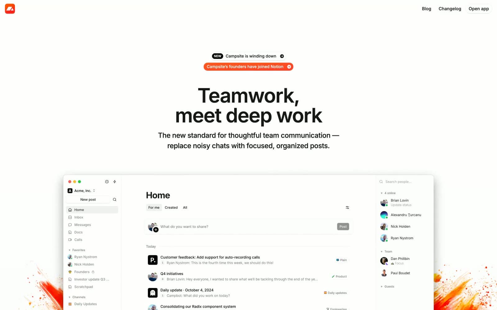
Campsite design system

Brand2
Logo badge, notification pills, and brand-punctuation moments — a single warm coral that anchors the entire palette against the cream canvas
Deep brown accent for paint-splash illustration shadows and inline highlight text in testimonials
Accent3
Soft warm wash behind tags, badges, and inline highlights
Green supporting accent for decorative details and low-frequency emphasis. Use as a supporting accent, not as a status color
Red supporting accent for decorative details and low-frequency emphasis. Use as a supporting accent, not as a status color
Neutrals9
Primary text, headings, icon strokes, and dark filled buttons
Tertiary text and muted icon strokes
Secondary text, timestamps, and metadata in lists
Warm muted accent for body copy that should feel quieter than Midnight Ink
Muted helper text, placeholder copy, and disabled labels
Subtle dividers, hover wash on rows, and tag backgrounds
Muted backgrounds, secondary surface fills, and input field chrome
Page canvas — a barely-warm off-white that gives the whole site its sunlit feel
Card surfaces, elevated panels, and the top of the surface stack
Try a pairing
Pick any two colors from the palette to check whether text stays readable on top.
Aa
Midnight Ink on Campfire Orange
6.29 : 1 contrast
- Body textPasses AA 4.5
- Large textPasses AA 3
- StrictFails AAA 7























