
Wrike. Vivid green accents powered against deep navy authority, floating on white.
- SaaS
- Light theme
- 11 colors
- 2 typefaces
Wrike's design language is built on a stark white canvas punctuated by a single vivid lime green that acts as a power switch across the interface. The system uses a deep midnight navy for authority text and dark sections, with cool blue-gray neutrals providing soft surface separation rather than warm grays or heavy shadows. Typography is carried by TT Norms Pro at comfortable 4px-grid spacing, with weight 700 headlines that command attention against whisper-thin 400 body text. Components are pill-shaped (40px radius) and card-soft (20px radius), using one signature shadow recipe that floats product mockups off the page. The overall feel is enterprise-confident but energetic — a work-management tool that looks like a productivity OS, not a form.
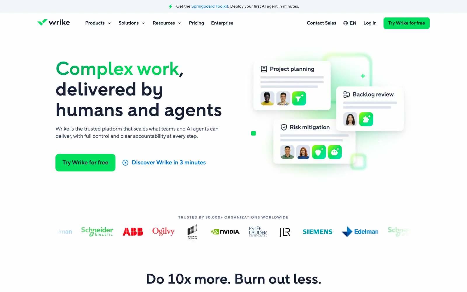
Wrike design system

Brand1
Green supporting accent for decorative details and low-frequency emphasis. Do not promote it to the primary CTA color; Decorative geometric shapes, radial glow accents in dark sections, gradient endpoints
Accent1
Blue supporting accent for decorative details and low-frequency emphasis. Do not promote it to the primary CTA color
Neutrals9
Icon strokes, high-contrast text, SVG fills, decorative geometric accents
Headlines, primary body text, navigation, dark footer sections — the structural anchor of the entire hierarchy
Secondary headings, card titles, muted dark text — a softened navy for sub-hierarchy
Helper text, secondary copy, muted labels, dropdown menus — the cool-toned equivalent of mid-gray
Disabled button states, inactive controls, de-emphasized metadata
Hairline borders, dividers, input borders, subtle separators
Shadow tones, elevated surface edges, decorative background shapes
Feature card backgrounds, subtle wash sections, ghost button hovers — the softest cool tint
Page canvas, card surfaces, inverse text on dark, input fills
Try a pairing
Pick any two colors from the palette to check whether text stays readable on top.
Aa
Paper White on Link Blue
4.78 : 1 contrast
- Body textPasses AA 4.5
- Large textPasses AA 3
- StrictFails AAA 7























