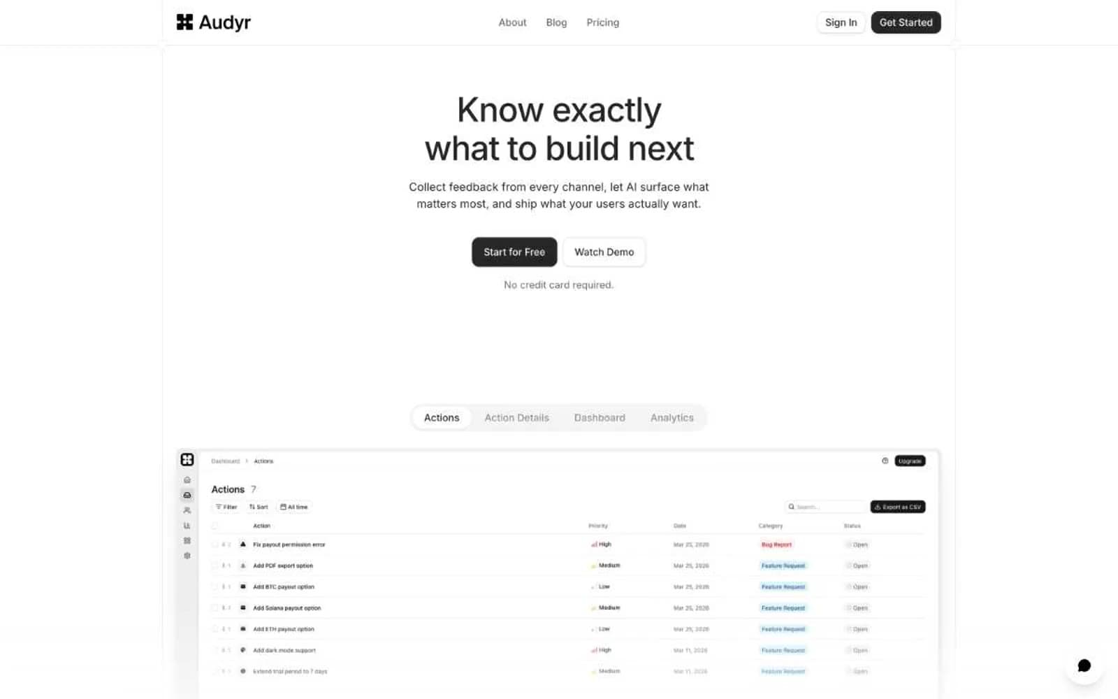
Ada. A quiet off-white room where four jewel-tone colors are allowed to speak, and everything else stays in charcoal.
- SaaS
- Light theme
- 9 colors
- 1 typeface
Ada operates as a daylight gallery: an off-white canvas with generous breathing room, a single humanist sans-serif doing all the voice work, and jewel-toned accent colors that appear only as deliberate punctuation marks. The visual system resists decoration — no gradients on buttons, no drop shadows on cards, no chrome competing with content. Instead, identity comes from a small, disciplined palette (forest green, periwinkle blue, candy pink, butter yellow) used as left-edge accent bars on stat cards and as filled pill buttons. Hierarchy is built through size contrast and whitespace, not color volume. Surfaces sit on a warm #f9f9f9 ground with #ffffff cards floating above. The hero's defining move is a heavily blurred photographic background that feels like looking through frosted glass — it adds warmth and depth without competing with the white headline that reads like editorial typography.

Ada design system

Brand2
Primary brand identity, filled dark buttons, dark accent bar on stat cards, announcement bar background — deep green that signals authority and trust without corporate blandness
Blue action color for filled buttons, selected navigation states, and focused conversion moments.
Accent2
Accent bar on stat cards, decorative soft surface washes — the most playful of the four accents, used sparingly to add warmth
Accent bar on stat cards, warmth punctuation — the warmest accent, appearing only on the 4th stat card as a visual rhythm closer
Neutrals5
Primary text, body copy, headings, hairline borders, dark UI surfaces — the near-black backbone of the entire interface, used at massive scale for borders and typography
Muted card borders and dark surface tints — a desaturated plum that appears on secondary containers
Decorative SVG fills, disabled input borders, neutral dividers
Page canvas, section backgrounds, subtle surface tier beneath cards — a warm off-white that softens the contrast of the interface
Card surfaces, elevated panels, chat widget container, inputs — the brightest tier of the surface stack
Try a pairing
Pick any two colors from the palette to check whether text stays readable on top.
Aa
Paper on Forest Depth
8.99 : 1 contrast
- Body textPasses AA 4.5
- Large textPasses AA 3
- StrictPasses AAA 7