
Workflow. A designer's working notebook spread open on white paper.
- SaaS
- Light theme
- 10 colors
- 3 typefaces
Workflow uses an editorial-manuscript language: a white paper canvas, whisper-weight serif headlines in Crimson Pro 300, and Inter as the working sans for body and UI. The palette is aggressively monochrome — nearly every surface is white, off-white, or warm gray, with the only chromatic note being a dusty sage green used as functional punctuation (active states, approved indicators). Components are thin and flat: hairline borders, 4–8px radii, and shadows so faint they barely register. The aesthetic reads more like a printed design quarterly than a SaaS dashboard — authority comes from typographic restraint and generous whitespace, not from saturated color or heavy elevation. An AI agent building for this brand should treat serif headings at weight 300 as the signature move, keep color to near-zero, and let borders and spacing do the structural work.
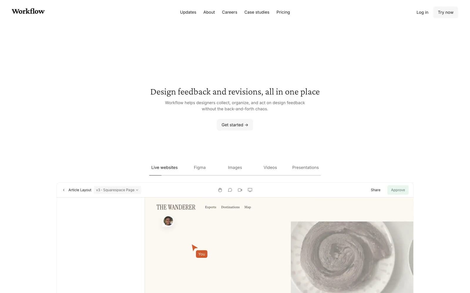
Workflow design system

Brand1
Green outline accent for tags, dividers, and focused UI edges
Accent1
Primary page canvas and white card surfaces
Neutrals8
Primary text, icon strokes, card and section borders, nav links
Warm-toned text and borders — the brown-tinted dark used where the system needs a softer, paper-friendly alternative to pure black
Secondary text, helper copy, muted borders, image strokes
Tertiary icon strokes, decorative image borders
Dividers and borders where a softer separator is needed
Card surface tint, secondary background panels, body section fills
Subtle section backgrounds, button hover fills, nav border, badge surfaces
Page canvas, card surfaces, button text on dark fills
Try a pairing
Pick any two colors from the palette to check whether text stays readable on top.
Aa
Paper White on Sage
4.60 : 1 contrast
- Body textPasses AA 4.5
- Large textPasses AA 3
- StrictFails AAA 7























