
Workable. Warm newsroom with teal ink.
- SaaS
- Light theme
- 14 colors
- 1 typeface
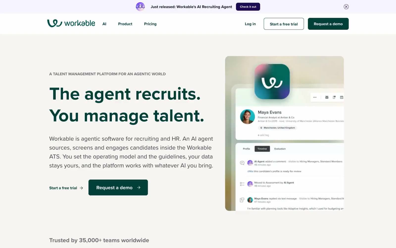
Workable uses a warm, editorial HR-platform language: off-white canvas with deep-ink typography and a single confident teal-green that doubles as the primary action and brand voice. Soft pastel cards (lavender, peach, butter, sky) create section-level color rhythm instead of flat gray alternation, giving every band a quiet identity without competing with copy. Typography is heavy at display sizes (700 weight, tight 1.14 line-height) and relaxes to a comfortable 400/1.56 for body — a clear editorial hierarchy that reads as confident rather than decorative. The teal CTA is the only saturated action color on the page; everything else is surface, illustration, or chrome, so buttons always feel switched on against the warm neutral field.
Workable design system

Brand2
Teal text accent for links, tags, and emphasized short phrases. Do not promote it to the primary CTA color
Secondary action (Check it out pill), stat callout headings — deep indigo-violet used sparingly for the announcement bar and number highlights
Accent6
Soft feature card background — pastel lavender for the most prominent colored card surface, gives sections a calm purple identity
Section background wash, hero-adjacent panels — warm peach-cream used as a large surface band, the dominant chromatic neutral
Card background for warm-themed feature panels — muted butter for secondary colored cards
Violet wash for highlight backgrounds, decorative bands, and soft emphasis behind content.
Cool-tone card background — pale sky blue for variety in the pastel card rotation
Gradient brand accent for the AI agent visual identity — the mint→lime→violet spectrum used in product illustration and the Workable 'w' logo glow
Neutrals6
Headlines, body copy, icon fills, dark UI surfaces — near-black with a blue-ink undertone, softer than pure black
Body paragraph text, secondary link color — softened dark gray for readable prose without the weight of ink-black
Eyebrow labels, helper text, metadata — medium gray for de-emphasized copy like section kickers and timestamps
Disabled button background, subtle dividers — the lightest neutral surface
Default page background and warm card surface — slightly cream-tinted off-white that gives the whole site a paper-like warmth
Elevated card surfaces on warm canvas, nav background — true white used sparingly for crisp product panels against the cream page
Try a pairing
Pick any two colors from the palette to check whether text stays readable on top.
Aa
Pure White on Forest Teal
11.73 : 1 contrast
- Body textPasses AA 4.5
- Large textPasses AA 3
- StrictPasses AAA 7























