
Wiza. Twilight prospecting observatory bathed in lavender mist.
- SaaS
- Light theme
- 15 colors
- 2 typefaces
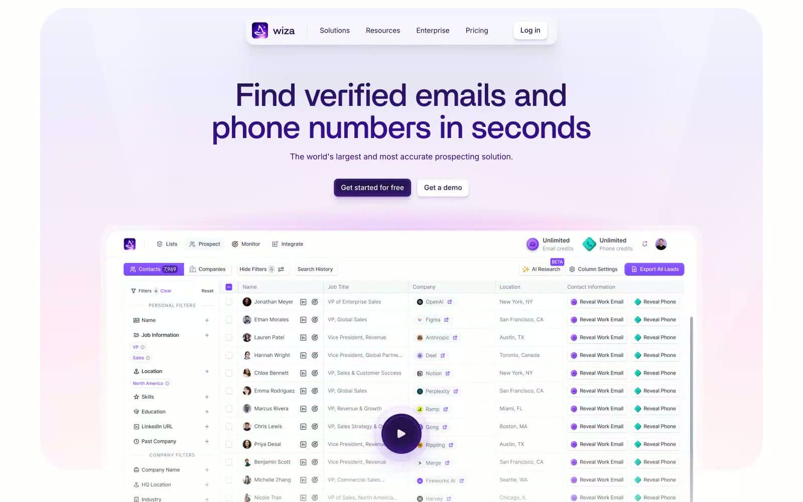
Wiza operates in a light-mode universe where deep violet ink commands attention against a soft lavender atmosphere. The brand lives between a confident enterprise tool and an approachable consumer product—white surfaces, thin borders, and compact Inter type for dense data interfaces, paired with Britti Sans display headlines that feel geometric and assured. The signature move is the gradient wash: pale lavender backgrounds bleeding white-to-violet-to-peach, making even a sprawling data table feel sunlit. Purple is reserved for authority—headlines, logo, filled actions—while the rest of the UI stays in quiet neutrals, letting contact data breathe.
Wiza design system

Brand3
Violet supporting accent for decorative details and low-frequency emphasis. Do not promote it to the primary CTA color
Navigation text, secondary headings, card titles, footer copy — slightly lighter companion to Deep Iris
Links, input focus rings, accent strokes, icon highlights — the most saturated violet
Accent3
Soft highlight washes, tinted section backgrounds, decorative blurs — the lavender atmosphere
Decorative gradient stops and hero atmosphere
Multi-stop decorative gradient for hero glow effects
Neutrals9
Maximum contrast text and borders in specific dark UI elements
Dark UI elements, near-black accents
Body text, link text, icon strokes in neutral contexts
Secondary body text, descriptions, table metadata
Muted helper text, placeholder copy, secondary metadata
Disabled states, skeleton placeholders, muted background blocks
Hairline borders, dividers, subtle separators
Subtle surface lift, table row alternation, secondary card backgrounds
Page background, card surfaces, input fields, button text on dark fills
Try a pairing
Pick any two colors from the palette to check whether text stays readable on top.
Aa
Canvas on Deep Iris
16.65 : 1 contrast
- Body textPasses AA 4.5
- Large textPasses AA 3
- StrictPasses AAA 7























