
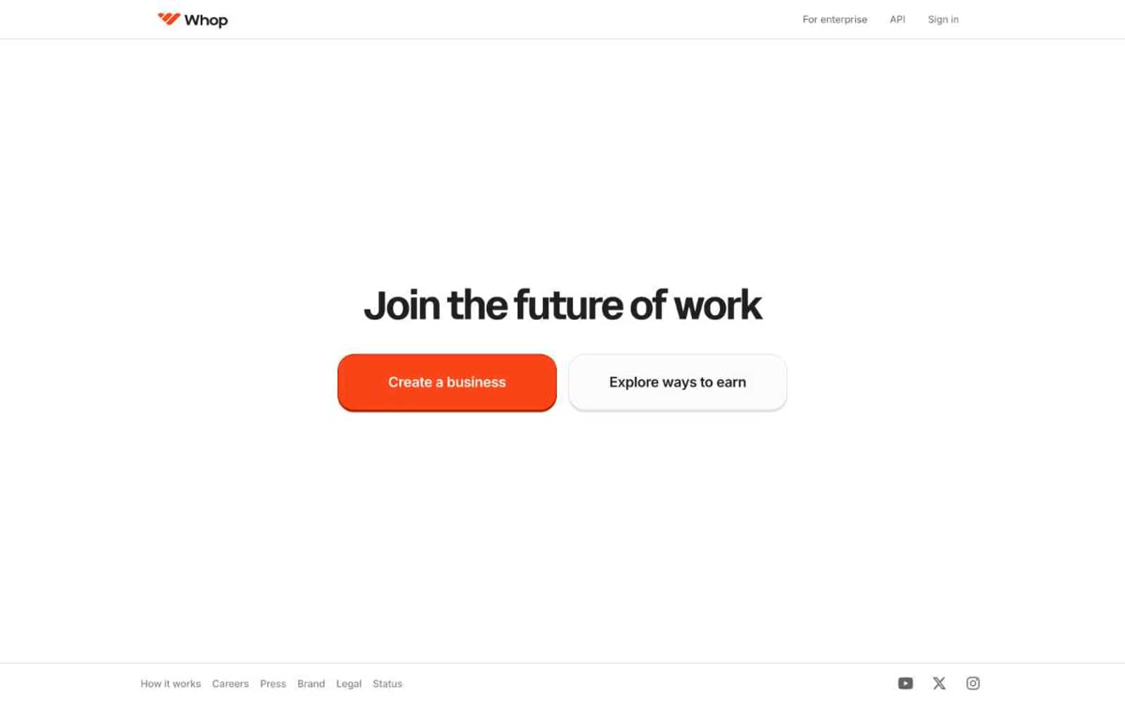
Whop. A minimal light canvas with a single orange button that casts a hard burnt-orange shadow.
- SaaS
- Light theme
- 10 colors
- 3 typefaces
Whop uses a high-contrast light canvas with a single saturated orange as the entire chromatic vocabulary. The system is typographically polarized: a custom geometric display face (acidGrotesk) at near-mega sizes for hero and section headlines, and Inter for all functional UI at 14-20px. Surfaces stay flat — no gradients, minimal shadows — with one signature move: the primary orange button carries a hard 3px offset shadow in a deeper burnt-orange rather than a soft drop shadow, giving the interface a slightly retro, almost sticker-like weight. Card corners are pillowy at 24px while buttons stay compact at 8px, creating a clear hierarchy of softness between content containers and interactive elements. The overall rhythm is spacious and confident: large display headlines, generous 64-80px section gaps, and white phone mockups floating on a near-white canvas.
Whop design system

Brand2
Orange wash for highlight backgrounds, decorative bands, and soft emphasis behind content. Do not promote it to the primary CTA color
Hard 3px offset shadow beneath Ember Orange buttons — a deeper burnt orange instead of a soft drop shadow
Neutrals8
Dark surface variant for inverted cards or code-editor panels
Primary text, heading strokes, heavy borders, icon fills
Muted body text, secondary links, inactive nav items, mid-weight borders
Tertiary text, placeholder text, disabled labels
Light borders, icon outlines, low-emphasis strokes
Hairline dividers, card borders, subtle structural separators
Page canvas — the near-white background that all sections sit on
Card surfaces, button text on dark fills, the elevated layer above the page canvas
Try a pairing
Pick any two colors from the palette to check whether text stays readable on top.
Aa
Obsidian on Ember Orange
5.61 : 1 contrast
- Body textPasses AA 4.5
- Large textPasses AA 3
- StrictFails AAA 7























