
Wellfound. Constellation of opportunity tags on editorial white.
- SaaS
- Light theme
- 10 colors
- 3 typefaces
Wellfound speaks in the language of opportunity constellations: a crisp white editorial canvas where job-title pills float freely like sticky notes on a research wall. The brand is almost achromatic at its core — near-black ink text, generous white space, and whisper-thin borders — but punctuates this restraint with two signature chromatic notes: a signal-red used as accent punctuation (the colon in the wordmark, dot ornaments, border highlights) and a deep aubergine that turns the stats band into a velvet curtain of dark authority. Type is the workhorse: Graphik at every weight and size, with aggressive negative tracking on display sizes that pulls headlines into tight, confident shapes. Components stay flat and honest — pill-shaped tags, 12px-radius buttons, hairline borders, a single soft shadow reserved for elevation moments. The mood is 'startup-editorial': more The Information than SaaS dashboard.
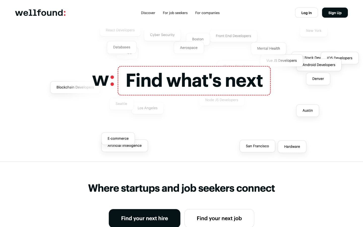
Wellfound design system

Brand2
Brand accent — the colon in the wordmark, dot ornaments beside display headlines, card highlight borders, feature icon strokes. Carries the entire chromatic identity of the system
Warmer secondary red for text and border accents where Signal Red reads too cool
Accent2
Dark hero/stat-band background, inverse-mode surface — turns the stats counter into a velvet authority moment against the otherwise light page
Deeper purple link background, secondary dark accent for hover or emphasis on the aubergine family
Neutrals6
High-contrast neutral action fill for primary buttons on light surfaces.
Nav text in dark sections, alternative ink tone for darker surface contexts
Secondary text on images, subdued link color — slightly lighter than Ink for hierarchy
Ghost-button borders, hairline dividers, muted tag outlines — present without demanding attention
Soft warm card surface for feature blocks, gentle wash on two-column benefit sections
Canvas, card surface, button fill, nav surface — the dominant background across nearly every screen
Try a pairing
Pick any two colors from the palette to check whether text stays readable on top.
Aa
Wellfound Ink on Signal Red
4.52 : 1 contrast
- Body textPasses AA 4.5
- Large textPasses AA 3
- StrictFails AAA 7























