
Vetric. A white room with one glass diamond that throws pink, blue, yellow, and green light across every surface.
- SaaS
- Light theme
- 14 colors
- 2 typefaces
Vetric uses an iridescent-prism visual language: a bright white canvas, near-black ink for text and actions, and a four-color rainbow accent set (blue, pink, yellow, green) that refracts across soft pastel washes like light through a glass diamond. The system pairs a humanist serif (Noto Serif) for headlines with a geometric sans (Manrope) for UI, creating a deliberate tension between editorial calm and technical confidence. Components stay light and flat — thin borders, gentle radii, no drop shadows — so the prismatic gradients and colored accents carry all the visual energy. The result reads as 'data made luminous': the chrome recedes, the color talks.
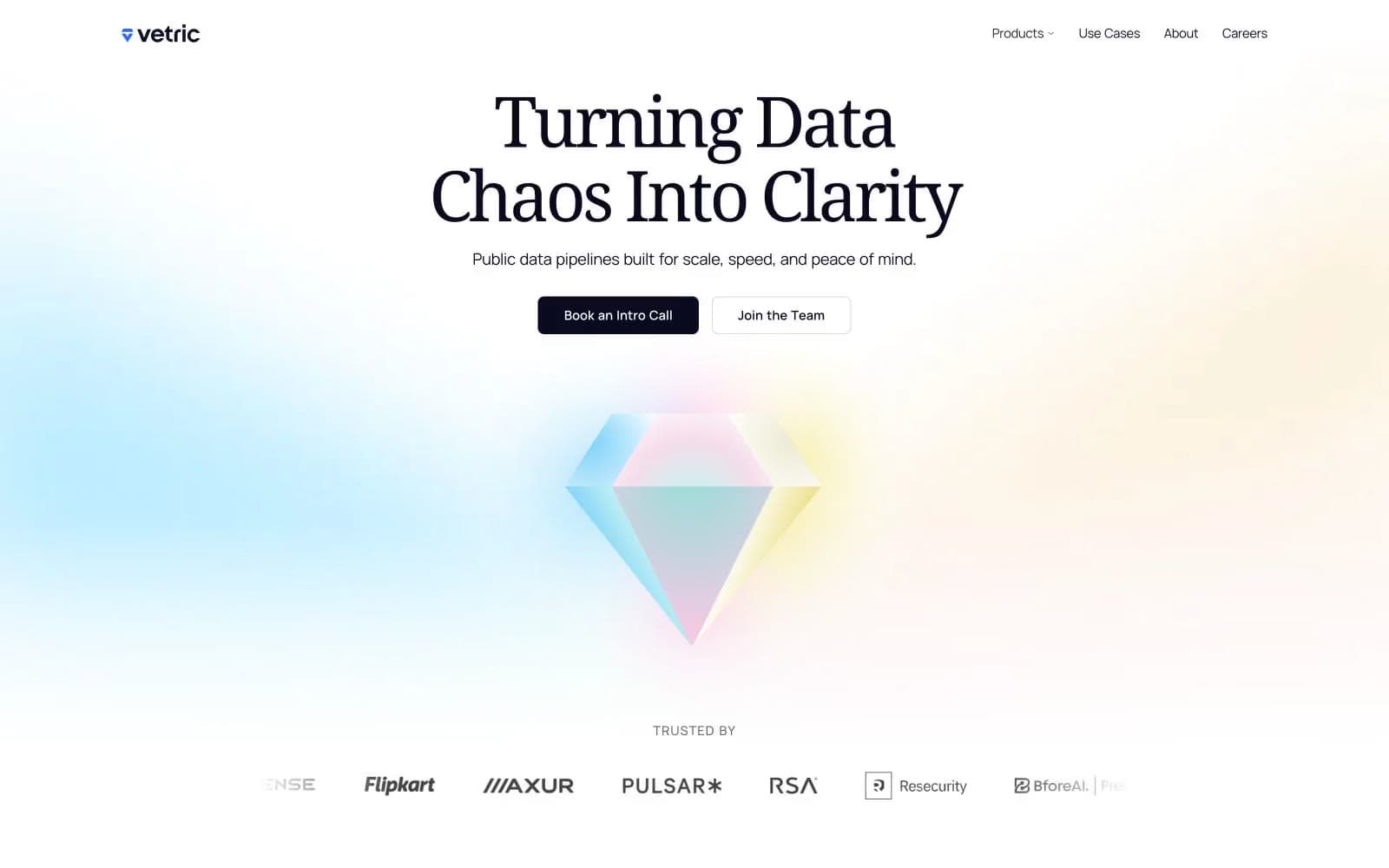
Vetric design system

Brand1
Brand accent and logo mark — the cool anchor of the rainbow; also acts as info/state accent on badges and borders; Signature iridescent gradient — the through-line of the brand, sweeping pink → blue → yellow → green like light through a prism
Accent2
Accent stroke and badge accent — warm half of the prism spectrum
Accent stroke and warning/state highlight
Neutrals10
SVG fills, icon glyphs, and high-contrast decorative shapes only — not used for UI text or backgrounds
Primary text, primary CTA fill, strong borders — the dominant brand dark; a slightly blue-tinted near-black that reads warmer than pure black on white
Navigation text and thin nav borders — sits one step lighter than Midnight Ink
Cool-tinted card borders and subtle section dividers
Default hairline borders, button outlines, icon strokes
Soft tinted surface tied to the blue accent — appears in gradient fills and decorative washes
Soft tinted surface for cards and badges tied to the green accent
Soft tinted surface for cards and badges tied to the pink accent
Soft tinted surface for cards and badges tied to the yellow accent
Page canvas, card surfaces, button text on dark fills
semantic1
Accent stroke and success state highlight
Try a pairing
Pick any two colors from the palette to check whether text stays readable on top.
Aa
Pure Black on Prism Pink
7.27 : 1 contrast
- Body textPasses AA 4.5
- Large textPasses AA 3
- StrictPasses AAA 7























