
Ventriloc. A single orange ember punctuating monochrome precision.
- SaaS
- Light theme
- 10 colors
- 2 typefaces
Ventriloc speaks in a quiet, editorial voice: warm paper-white canvas, monospaced-precision data cards, and a single orange ember that punctuates the monochrome like a highlighter on a printed report. The system pairs a custom neo-grotesque (PolySans) at weight 400 for headings — unusual restraint that trades authority-through-volume for authority-through-precision — against Inter for body and UI chrome. Surfaces are warm grays and ivory rather than cool tech-blue, cards wear asymmetric corner radii (sharp top-right, soft elsewhere), and interactive elements split into two clear dialects: sharp-cornered text-style buttons and pill-shaped navigation containers. Color is rationed: pages should read 95% achromatic with orange appearing only as functional punctuation for highlights, link underlines, and decorative data accents.
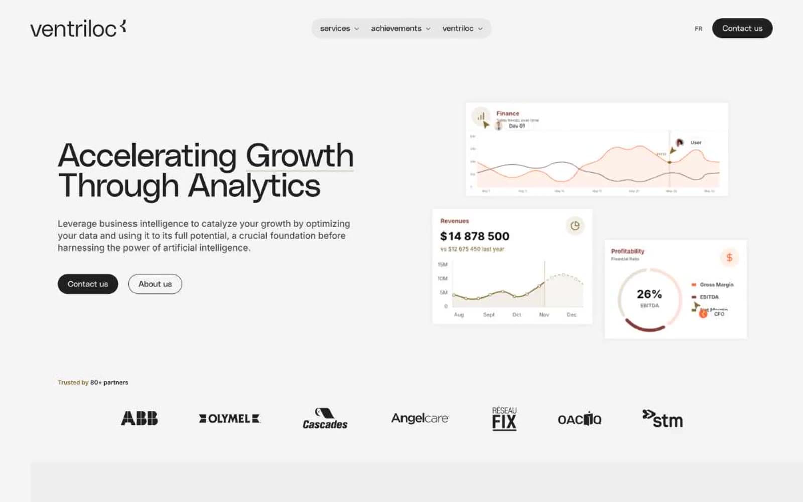
Ventriloc design system

Brand1
Orange text accent for links, tags, and emphasized short phrases. Do not promote it to the primary CTA color
Accent1
Secondary accent for chart strokes, decorative SVG lines, and tag text — a muted warm counterpoint to Ember
Neutrals8
Primary text, headings, nav links, icon strokes — the typographic anchor of every surface
Secondary body text, long-form paragraph copy
Muted helper text, tertiary nav items, inactive controls
Warm accent background wash for featured blocks — the paper-stock feel
Hairline dividers, nav background fills
Primary card and section background, nav pill container — the dominant warm-gray surface
Subtle background tone for nested surfaces and secondary containers
Page background, card elevation, icon fills — the brightest surface in the system
Try a pairing
Pick any two colors from the palette to check whether text stays readable on top.
Aa
Graphite on Ember Orange
5.64 : 1 contrast
- Body textPasses AA 4.5
- Large textPasses AA 3
- StrictFails AAA 7























