
User Interviews. Hand-drawn research field notes on warm paper.
- SaaS
- Light theme
- 16 colors
- 5 typefaces
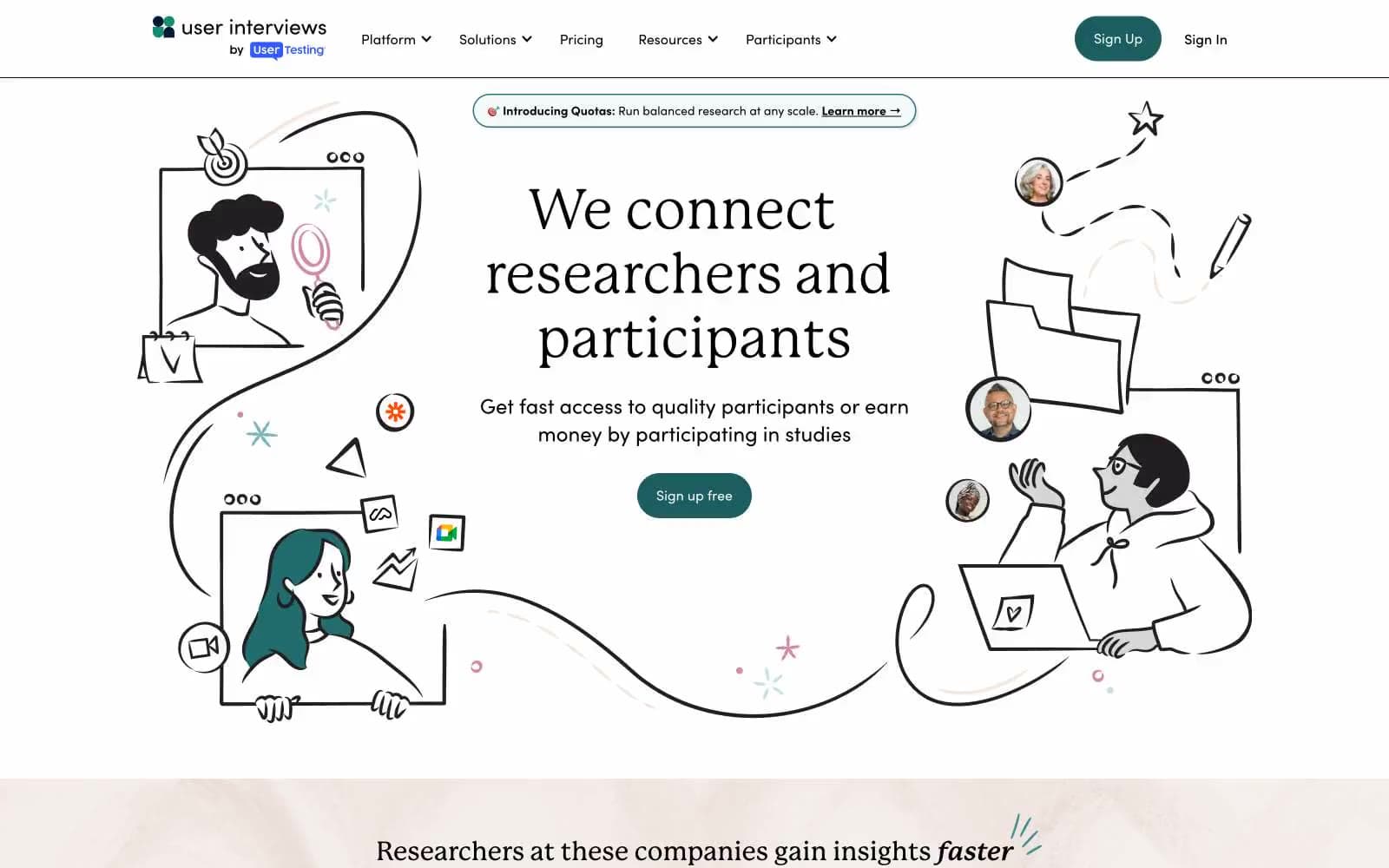
User Interviews is a sunlit research-platform language built on a warm off-white canvas with pale mint and blush accent surfaces. Typography pairs a literary serif (P22 Mackinac Pro) for editorial headlines with a geometric sans (Sofia Pro) for confident UI, while IBM Plex Mono labels in spaced uppercase act as section eyebrows — the overall rhythm feels like a well-edited research journal translated into a SaaS product. A single deep teal (#1c5d5f) drives all primary action, with dusty rose, sage, and navy secondary buttons that never compete for the same attention. Hand-drawn line illustrations of people inside browser frames make the interface feel human and process-oriented rather than dashboard-heavy; the product stays flat, low-elevation, and pill-buttoned throughout.
User Interviews design system

Brand6
Primary action button fill, filled CTA — a desaturated dark teal reads as confident and scholarly rather than aggressive or corporate
Outlined/ghost action borders, secondary link underlines — same hue family as the primary, one step deeper for quiet secondary actions
Outlined action borders, decorative illustrations, and soft accent strokes — the mid-tone teal for secondary interactive elements
Mid-saturation teal for decorative illustration fills and accent borders
Dark variant of the brand teal used for filled button hover and selected states
Blue action color for filled buttons, selected navigation states, and focused conversion moments.
Accent3
Outlined/ghost action borders for accent buttons, decorative illustration tints — soft warm contrast to the cool teal primary
Outlined action borders, soft illustration washes — pale teal for ghost buttons and decorative panels
Soft highlight washes and decorative illustration backgrounds — the lightest cool accent
Neutrals7
Link text and image fallback borders — the true near-black for text contrast
Hand-drawn illustration outlines and fill — a warm near-black that feels inked rather than digital
Primary navigation text and nav borders — the darkest neutral, slightly blue-shifted to harmonize with the teal palette
Body text fallback and secondary headings
Warm-toned panel surface for alternating sections and illustration backgrounds — breaks the cool palette with a warm counter-rhythm
Card and panel surfaces — a slightly deeper mint that lifts cards off the canvas without contrast shock
Page canvas — a warm near-white with a barely-perceptible mint tint instead of pure white, giving the whole site a printed-on-paper warmth
Try a pairing
Pick any two colors from the palette to check whether text stays readable on top.
Aa
Paper White on Deep Teal
7.03 : 1 contrast
- Body textPasses AA 4.5
- Large textPasses AA 3
- StrictPasses AAA 7























