
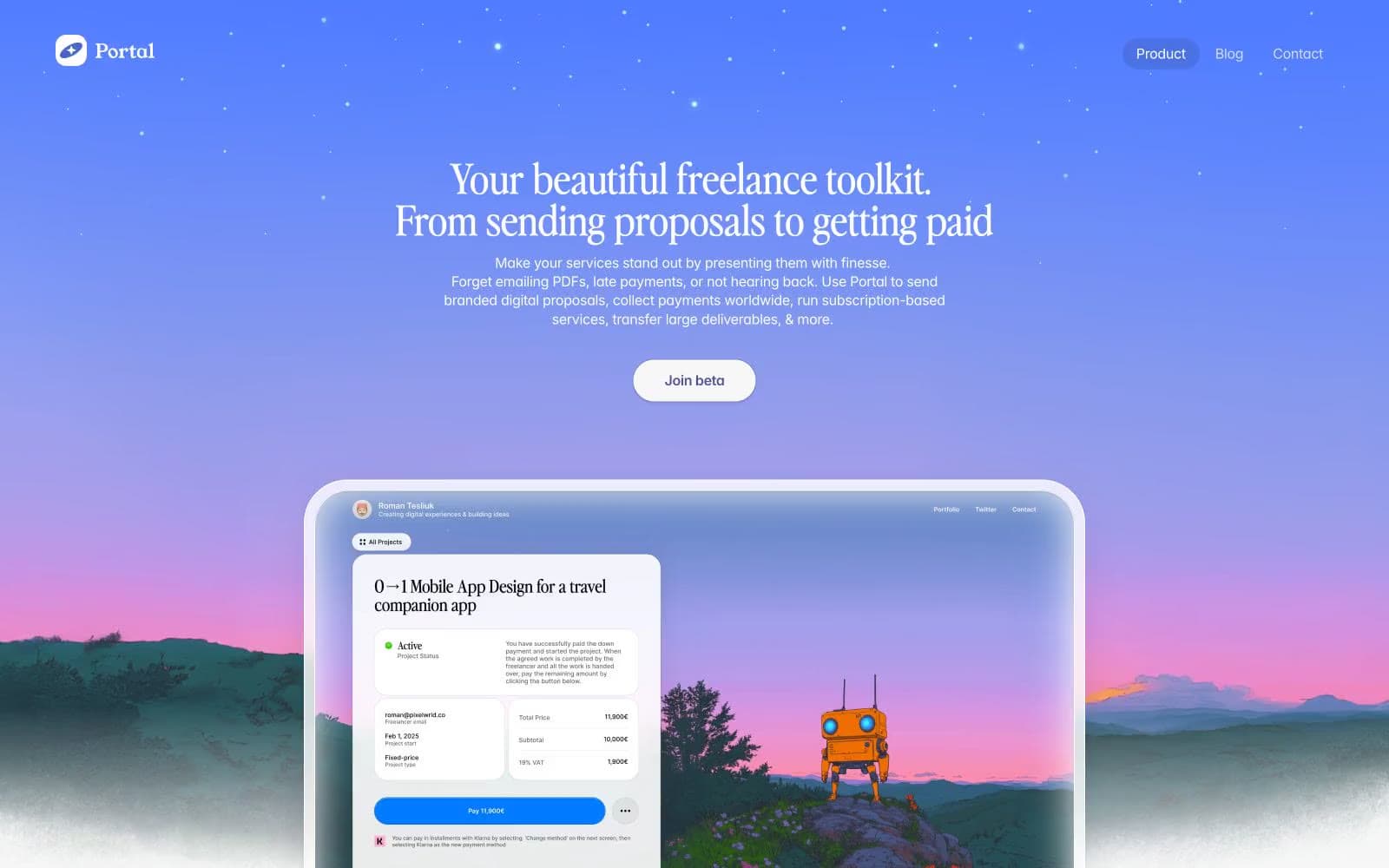
Portal. A premium indie magazine spread sitting inside a native iOS aesthetic.
- SaaS
- Light theme
- 7 colors
- 3 typefaces
Portal uses a twilight-editorial visual language: a dramatic sunset gradient hero (sky-blue fading through violet to warm coral) gives way to a clean, paper-white editorial canvas below. Display headlines are set in Perfectly Nineties — a confident retro serif that signals craft over typical startup sans. Body and UI copy stay in Inter at restrained sizes, with one vivid iOS-blue accent (#007aff) punctuating an otherwise achromatic system. Surfaces are flat and generously rounded: cards at 22-30px, buttons as full pills at 50px, and the floating nav as a soft white capsule. Elevation is whispered rather than dropped — the system prefers 1px outlines and pale #f7f7f7 glow rings over heavy shadows.
Portal design system

Brand1
Primary action buttons, active states, brand icon highlights, inline links — the only chromatic accent in an otherwise achromatic system. iOS-native vivid blue that makes functional elements feel switched on
Accent1
Hero background — sky-blue descending through violet to warm coral sunset with landscape silhouettes at the base. Defines the system's only atmospheric moment
Neutrals5
Headings, primary borders, button text — maximum-contrast structural color
Body text, secondary borders — softer than black for sustained reading on white
Muted helper text, metadata labels, subtle borders
Page canvas background, soft glow rings around cards and images, pale elevation halos
Hairline borders, dividers, input outlines, and card edges on light surfaces. Do not promote it to the primary CTA color
Try a pairing
Pick any two colors from the palette to check whether text stays readable on top.
Aa
Ink Black on Signal Blue
5.23 : 1 contrast
- Body textPasses AA 4.5
- Large textPasses AA 3
- StrictFails AAA 7























