
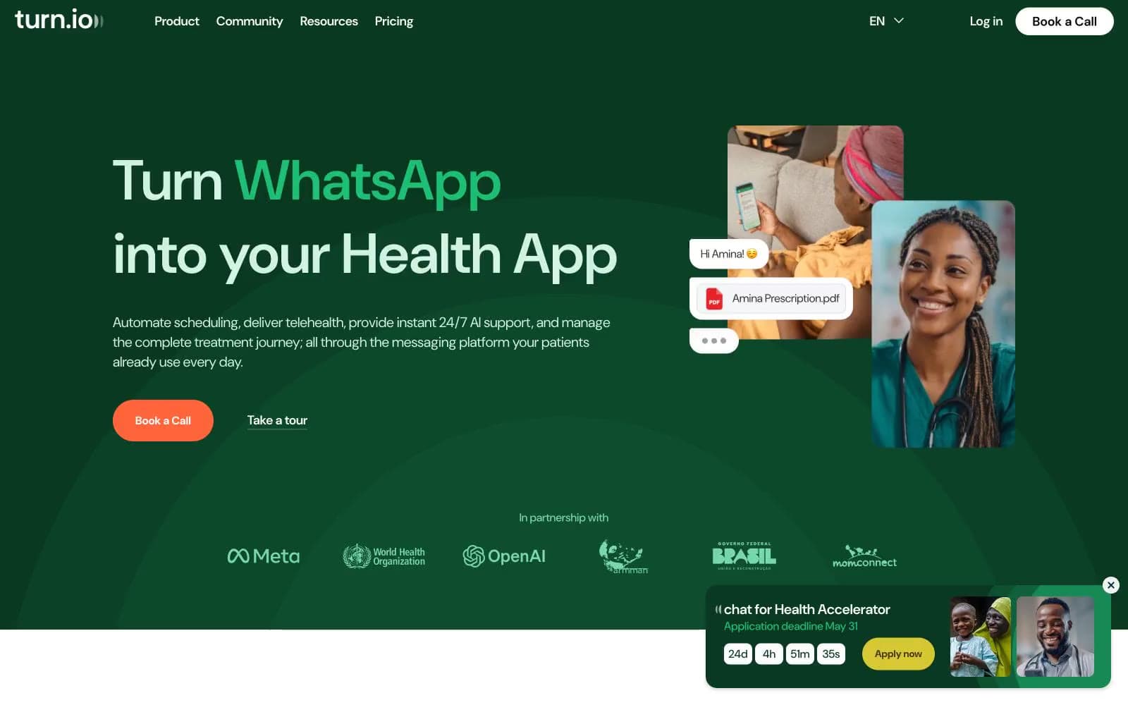
Turn. Forest-green clinic with pastel rooms.
- SaaS
- Light theme
- 24 colors
- 1 typeface
Turn.io runs on a warm, healthcare-optimistic visual system: a deep forest green acts as the dominant brand surface and hero canvas, while soft pastel washes (mint, lavender, peach, cream, sky) create section rhythm like colored rooms in a clinic. The single vivid coral CTA (#ff643b) is the only high-saturation action color and it sits on a near-monochrome field, so every 'Book a Call' reads as the obvious next step. Typography is DM Sans everywhere, pushed to enormous display sizes (69–116px) with tight negative tracking, which gives even the hero a conversational softness rather than corporate weight. Components stay flat and borderless — the system communicates through color blocks and 16–24px rounded cards, not shadows or chrome. Pastel feature cards and a lavender page canvas give the whole site a hand-drawn, almost editorial warmth, while the green hero and purple toolkit band inject the brand's two anchor colors at full saturation.
Turn design system

Brand6
Hero canvas, dark section backgrounds, primary heading color on light backgrounds — establishes the dominant brand surface
Primary action buttons, filled CTAs — the only warm high-saturation color in the system, creates urgency without aggression
Toolkit section background overlay, secondary brand headings — anchors the purple-lavender pastel system
Green outline accent for tags, dividers, and focused UI edges
Blue outline accent for tags, dividers, and focused UI edges. Do not promote it to the primary CTA color
Muted plum for body text on lavender backgrounds and plum-section headings — warm dark that pairs with #460095
Accent2
Decorative pink accent for badges, tag chips, and pink-section heading underlines
Cyan accent for icons, chart lines, and notification-style data visualization inside cards
Neutrals16
Primary body text, borders, icon strokes — used aggressively for 1px dividers and outline icon set
Headlines on white/pastel surfaces, link text color when not using brand purple
Strong secondary text, icon strokes at full opacity, dark borders on light pastel cards
Body meta text, subtle list dividers, caption-tier typography
Mid-gray for secondary borders, placeholder text, disabled list items, icon strokes at reduced weight
Hairline dividers, subtle card separators on white sections
Pale cyan card backgrounds, cooling counterpoint to the warm greens and corals
Green-tinted card and section background, pale green data viz fills
Dominant page background canvas — the near-gray violet that sets the overall atmospheric tint of the site
Warm beige background variant, rarely used neutral surface
Very pale green card surface, lighter than Mint Wash for secondary cards
Soft section background, alternate surface, and quiet card fill. Do not promote it to the primary CTA color
Neutral card surface when no pastel is appropriate, footer background, table stripes
Pale lavender card background, pink-adjacent pastel
Warm cream card background, editorial yellow-tinted sections
Card surfaces, text on dark backgrounds, nav background, white phone-mockup surfaces
Try a pairing
Pick any two colors from the palette to check whether text stays readable on top.
Aa
Paper White on Canopy Green
12.95 : 1 contrast
- Body textPasses AA 4.5
- Large textPasses AA 3
- StrictPasses AAA 7























